CSS3 box size
CSS3 box size
CSS3 box-sizing property can set the width and height properties, which include padding (inner margin) and border (border).
Do not use the CSS3 box-sizing property
By default, the width and height of an element are calculated as follows:
width(width) + padding(padding) + border(border) = actual width of element
height(height) + padding(padding) + border(border) = actual height of element
This means that when we set the width/height of an element, the actual displayed height and width of the element will be larger (because the border and padding of the element will also be calculated in width/height).

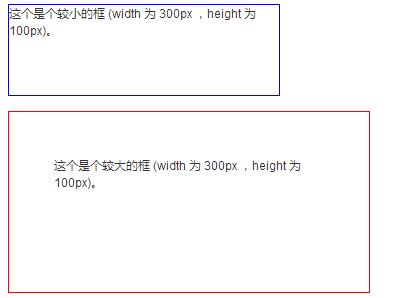
Although the width and height settings of the two <div> elements in the above picture are the same, the actual displayed sizes are inconsistent because div2 specifies padding:
Example
<!DOCTYPE html>
<html>
<head>
    <meta charset="utf-8">
    <title>php中文网(php.cn)</title>
    <style>
        .div1 {
            width: 300px;
            height: 100px;
            border: 1px solid blue;
        }
        .div2 {
            width: 300px;
            height: 100px;
            padding: 50px;
            border: 1px solid red;
        }
    </style>
</head>
<body>
<div class="div1">这个是个较小的框 (width 为 300px ,height 为 100px)。</div>
<br>
<div class="div2">这个是个较大的框 (width 为 300px ,height 为 100px)。</div>
</body>
</html>
Run and try it
Use this method if you want to get a smaller box And including padding, you have to consider the width of the border and padding.
The box-sizing property of CSS3 solves this problem very well.
Use the CSS3 box-sizing property
The CSS3 box-sizing property includes padding (inside) in the width and height of an element margin) and border (border).
If box-sizing: border-box; is set on the element, padding (padding) and border (border) are also included in width and height:
Example
The following is a simple example of adding the box-sizing: border-box; attribute to two <div> elements.
<!DOCTYPE html>
<html>
<head>
<meta charset="utf-8">
<title>php中文网(php.cn)</title>
<style>
.div1 {
    width: 300px;
    height: 100px;
    border: 1px solid blue;
    box-sizing: border-box;
}
.div2 {
    width: 300px;
    height: 100px;
    padding: 50px;
    border: 1px solid red;
    box-sizing: border-box;
}
</style>
</head>
<body>
<div class="div1">两个 div 现在是一样大小的!</div>
<br>
<div class="div2">php中文网!</div>
</body>
</html>
Run and try it
box-sizing: border-box; works better, which is exactly what many developers need.
The following code can display the size of all elements in a more intuitive way. Many browsers already support box-sizing: border-box; (but not all - that's why input and text elements with width: 100%; have different widths).
It is recommended to use box-sizing for all elements:
<!DOCTYPE html>
<html>
<head>
<meta charset="utf-8">
<title>php中文网(php.cn)</title>
<style>
* {
    box-sizing: border-box;
}
input, textarea {
    width: 100%;
}
</style>
</head>
<body>
<form action="action_page.php">
用户名:<br>
<input type="text" name="username" value="php"><br>
邮箱:<br>
<input type="text" name="email" value="429240967@qq.com"><br>
评论:<br>
<textarea name="message" rows="5" cols="30">
</textarea>
<br><br>
<input type="submit" value="Submit">
</form>
<p><strong>提示:</strong> 可以尝试移除样式中的 box-sizing 属性,看看会发生什么。注意移除后部分浏览器 input, textarea, 和 submit 按钮的宽度不一致。</p>
</body>
</html>
Run and try it


