HTML+CSS Easy to Get Started Box Model
Box Model is the core of CSS. Modern Web layout design is simply the arrangement and nesting of a bunch of boxes. Once you master the box model and their placement control, you will find that no matter how complex the page is, it is nothing more than that. , however, all good things have shortcomings. The box model has two different interpretations, one from IE6 and one from W3C standard browser
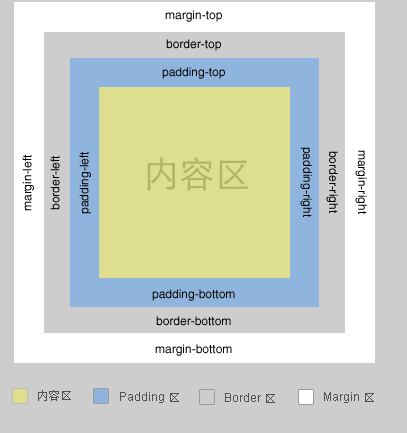
in the content area Outside, it is surrounded by padding area, border area, and margin area. This model structure is consistent in all mainstream browsers. Through the box model, we can set borders, white space, and margins for our content. The most typical application of the box model is this: we have a piece of content, and we can set a border for this piece of content to prevent the content from being next to each other. For the border, you can set padding. In order to prevent this box from being too close to other boxes, you can set margin.
So far, everything is perfect, until when we want to set a size for the box
IE6 and W3C standard browsers have different interpretations of the box model
The problem arises when we try to set the size of a box. IE6 and W3C standard browsers have different interpretations of the box model. This different interpretation is reflected in the size of the box. The following figure is a schematic diagram of the different interpretations of the box size by the two types of browsers
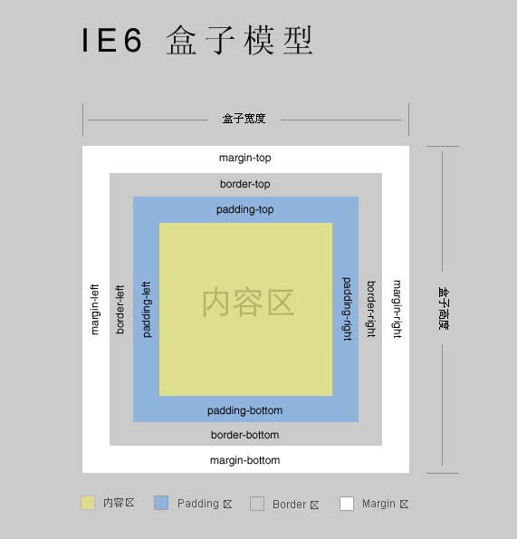
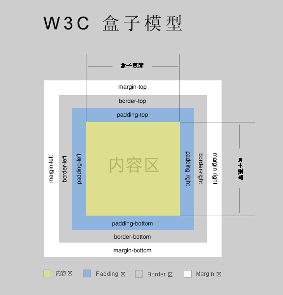
It can be seen that in the IE6 box model, the size of the box includes the content area, padding, border and margin, while in the W3C box model, the size of the box only includes the content area. padding, border and margin are excluded from the box dimensions.
Why IE6’s box model is more reasonable
In the real world, when we describe a physical box, if we talk about size, we will not only calculate the size of the object it contains, we will also count the gaps and the box itself. Take container packing as an example. We have 100 vases, and each vase is packed in a carton. In order to prevent the vases from breaking, we put foam around the vases, which is equivalent to padding. The outer cardboard of the carton is equivalent to border. When loading containers, in order to prevent the cartons from colliding with each other, straw is stuffed between the cartons, which is equivalent to margin. Obviously, when we report the size of our goods to the freight company, we must add the size of the entire carton , as well as the gaps between the cartons that need to be filled with straw, told them that if they only reported the size of the vase, the freight company would not be able to pack it.
To give another example, if we have a wall and want to hang 10 oil paintings on it, the oil paintings are mounted with photo frames. The frame of the photo frame is equivalent to the border, and the distance between the oil painting and the border is equivalent to padding. The spacing between photo frames is equivalent to margin. This example is very close to Web layout design. For anyone, it is easier to layout the entire photo frame, including the oil painting, as a whole using the box model of IE6. When you know the entire After the size of the photo frame, there is no need to consider the influence of padding, border, and margin. Each photo frame is a whole. As for padding, border, and margin, this is the browser's own business and does not require designers to care.
In specific Web design
In specific Web design, especially when complex grid layout is involved, the box model of IE6 is easier to control. We might as well take a look at the following designs Scenes.
1. Panel interface design
The page contains several panels, such as a login panel, a latest news panel, and a voting panel. The typical approach to this type of design is to use background images The method is to first design the appearance pictures of these panels one by one, and leave the places that need to be replaced with specific content empty. These panels are nothing more than boxes using the appearance pictures of the panels as background images. Then, in these boxes, put specific contents. content, use padding to control the placement of the content, and use margin to adjust the placement of the panel itself. Since the size of the panel is fixed, after we establish the size of the box accordingly, we no longer need to worry about the size issue. Then, regardless of No matter how you adjust padding and margin, it will not affect the structure of the panel itself. This is the IE6 box model.
In the W3C box model, adjusting padding and margin will affect the size of the box. When you adjust the placement of content, it is very likely to disrupt the structure of the panel itself.
2. Percent-level size + pixel-level boundary problem
The most troublesome thing about the W3C box model in design is that if you have a container with an uncertain width and want to place two boxes of the same size inside, the most reasonable way is to set the width of each box. is 50%, so that no matter how wide your container is, the two boxes can always automatically adapt to this width. However, the premise is that you do not set any padding or border. In reality, in order to prevent the content in the two boxes from If they are too close to each other, you must set padding. Once padding is set, you will find that your container is burst.
Of course you will say that instead of setting the width of each box to 50%, you can set it to 45%, and then add a 5% padding to each box. This is a solution, but we are There is often such a habit in design. Although the width of a piece of content may be uncertain, we always like it to have fixed padding. We do not want the padding to adapt automatically. Moreover, in many cases, we want a box with an adaptive width. Set a 1 pixel border, in which case the W3C box model will get into trouble.
When encountering this situation, the IE6 box model does not require any twists and turns. You just set the width of each box to 50%, and they will automatically adapt to the width of the container. Then, no matter how you set the padding and borders will not burst your container.


