rounded corner effect border-radius
Traditional rounded corner generation scheme must use multiple pictures as background patterns. The emergence of CSS3 means that we no longer have to waste time creating these images. We only need the border-radius attribute and supports browsers IE 9, Opera 10.5, Safari 5, Chrome 4 and Firefox 4
1. Border-radius attribute
CSS3 rounded corners only need to set one attribute: border-radius (meaning "border radius"). You provide a value for this property to set the radii of all four corners at the same time. All legal CSS measurements can be used: em, px, percentage, etc.
For example, the following is a div box (width and height are 200, background is red, border is 2px solid #000)
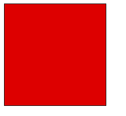
css3(border -radius) Detailed explanation of border fillet
Now set its fillet radius to 50px, that is:
border-radius:50px;
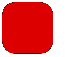
css3 (border-radius) border fillet Detailed explanation
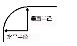
This statement simultaneously sets the "horizontal radius" and "vertical radius" of each rounded corner to 50px.
css3(border-radius) border rounded corners detailed explanation
border-radius:50px 25px; //表示左上角和右下角使用第一个值,右上角和左下角使用第二个值
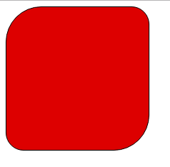
border-radius:25px 10px 50px; //左上角使用第一个值,右上角和左下角使用第二个值,右下角使用第三个值
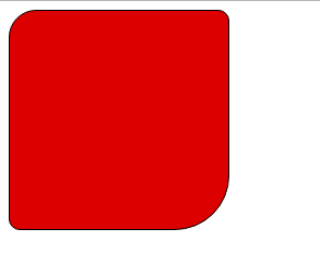
border-radius:25px 10px 50px 0;//左上角、右上角、右下角、左下角(顺时针顺序)
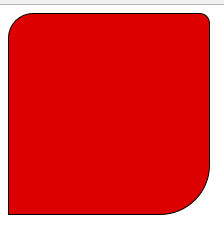
border-radius:50px/25px;Detailed explanation of css3 (border-radius) border rounded corners
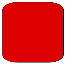
border-radius: 100px 25px 80px 5px / 45px 25px 30px 15px;
css3(border-radius) border rounded corners detailed explanation
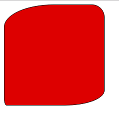
## 2. Single rounded corner Setting
In addition to setting the four rounded corners at the same time, you can also set each corner individually. Corresponding to the four corners, CSS3 provides four separate properties:* border-top-left-radius
* border-top-right-radius
* border-bottom-right-radius
## * border-bottom-left-radiusThis Each of the four attributes can set 1 to 2 values at the same time. If you set a value of 1, it means that the horizontal radius is equal to the vertical radius. If 2 values are set, the first value represents the horizontal radius and the second value represents the vertical radius.
border-top-left-radius: 50px;
css3(border-radius) border rounded corners detailed explanation
border-top-left-radius: 50px 100px;//第一个值表示水平半径,第二个值表示垂直半径。
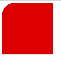 css3(border-radius) border rounded corners detailed explanation
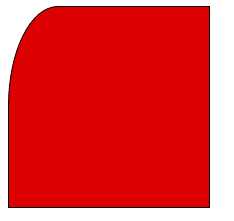
3. Effectcss3 (border-radius) border rounded corners detailed explanation
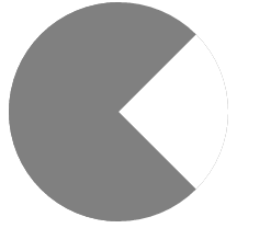 Implementation code:
width:0;
height:0;
border:100px solid gray;
border-radius:100px;
border-right-color:#fff;
css3(border-radius) border rounded corners detailed explanation
##Implementation code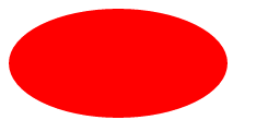
height:100px;
width:200px;
background: red;
border-radius:100px/50px;


