Shadow box-shadow (2)
<!DOCTYPE html>
<html>
<head>
<meta content="text/html; charset=utf-8" http-equiv="Content-Type">
<title>CSS3属性:box-shadow测试</title>
<script type="text/javascript" src="js/jquery.min.js"></script>
<script type="text/javascript" src="js/jquery.boxshadow.js"></script>
<style type="text/css">
.box-shadow-1{
  -webkit-box-shadow: 3px 3px 3px;
  -moz-box-shadow: 3px 3px 3px;
  box-shadow: 3px 3px 3px;
}
.box-shadow-2{
  -webkit-box-shadow:0 0 10px #0CC;
  -moz-box-shadow:0 0 10px #0CC;
  box-shadow:0 0 10px #0CC;
}
.box-shadow-3{
  -webkit-box-shadow:0 0 10px rgba(0, 204, 204, .5);
  -moz-box-shadow:0 0 10px rgba(0, 204, 204, .5);
  box-shadow:0 0 10px rgba(0, 204, 204, .5);
}
.box-shadow-4{
  -webkit-box-shadow:0 0 10px 15px #0CC;
  -moz-box-shadow:0 0 10px 15px #0CC;
  box-shadow:0 0 10px 15px #0CC;
}
.box-shadow-5{
  -webkit-box-shadow:inset 0 0 10px #0CC;
  -moz-box-shadow:inset 0 0 10px #0CC;
  box-shadow:inset 0 0 10px #0CC;
}
.box-shadow-6{
box-shadow:-10px 0 10px red, /*左边阴影*/
10px 0 10px yellow, /*右边阴影*/
0 -10px 10px blue, /*顶部阴影*/
0 10px 10px green; /*底边阴影*/
}
.box-shadow-7{
box-shadow:0 0 10px 5px black,
0 0 10px 20px red;
}
.box-shadow-8{
box-shadow:0 0 10px 20px red,
0 0 10px 5px black;
}
.box-shadow-9{
box-shadow: 0 0 0 1px red;
}
.obj{
width:100px;
height:100px;
margin:50px auto;
background:#eee;
}
.outer{
width: 100px;
height: 100px;
border: 1px solid red;
}
.inner{
    width: 60px;
    height: 60px;
    background-color: red;
    -webkit-box-shadow: 50px 50px blue;
    -moz-box-shadow: 50px 50px blue;
    box-shadow: 50px 50px blue;
  }
</style>
</head>
<body>
<div class="obj box-shadow-1"></div>
<div class="outer">
<div class="inner"></div>
</div>
<div class="obj  box-shadow-2" ></div>
<div class="obj  box-shadow-3" ></div>
<div class="obj  box-shadow-4" ></div>
<div class="obj  box-shadow-5" ></div>
<div class="obj  box-shadow-6" ></div>
<div class="obj  box-shadow-7" ></div>
<div class="obj  box-shadow-8" ></div>
<div class="obj  box-shadow-9" ></div>
<script type="text/javascript">
$(document).ready(function(){
   if($.browser.msie) {
     $('.obj').boxShadow(-10,-10,5,"#0cc"); //obj元素使用了box-shadow
   }
 });
</script>
</body>
</html>
In order to understand the characteristics of box-shadow more clearly, use the above code for a more in-depth explanation.
Conclusion:
1) From the effect of .box-shadow-1, it can be concluded that without specifying the attribute shadow color, the shadow behaves under the safari and chrome browsers under the webkit kernel. It is a transparent color and appears black under Firefox/Opera.

2) From the comparison of the two DIV blocks and OUTER inside and outside, all the mainstream browsers supporting Box-SHADOW are manifested as: the inner shadow supports the outside of the outside. The layer container brings out the entire shadow effect. The W3C standard explains the principle and performance of box-shadow with diagrams:
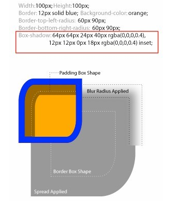
We can understand from the picture : How rounded border-radius, shadow expansion radius, shadow blur radius and padding affect the object shadow: A non-zero value of border-radius will have the same effect on the shape of the shadow, but border-image will not affect the object shadow. Any shape; the object shadow has the same level as the box model. The outer shadow will be under the object background, and the inner shadow will be under the border and above the background. We know that by default the background image is on top of the background color. So the entire hierarchy is: border>inner shadow>background image>background color>outer shadow.
3) From the effect of box-shadow-2 to box-shadow-5, we can understand the role of box-shadow value.
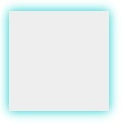
. box-shadow-2 is xy with no offset, shadow size 10px, no expansion radius, color #0CC is rgba(0, 204,204, 1), here we use the color HEX value; effect
And box-shadow-3 is based on the effect of box-shadow-2, and applies rgba color values. The advantage is that it adds alpha to the box-shadow shadow. Transparency effect. Effect:

. box-shadow-4 adds a shadow expansion radius of 15px based on the box-shadow-2 effect.
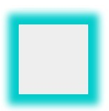
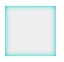
. box-shadow-5 sets the outer shadow to the inner shadow based on the effect of box-shadow-2.
4). box-shadow-6 An element uses multiple shadows, and multiple shadows are separated by commas. To set the shadow effect on the four sides of the object, we achieve it by changing the positive and negative values of x-offset and y-offset. When x-offset is a negative value, the left shadow is generated. When it is a positive value, the right shadow is generated. The y-offset is Positive values produce a bottom shadow, negative values produce a top shadow. And set the blur radius to 0. If it is not set to 0, the other three sides will also have shadows. This needs attention!
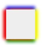
Note that this writing is wrong: {box-shadow:-10px 0 10px red, box-shadow:10px 0 10px blue,box-shadow:0 -10px 10px yellow,box-shadow:0 10px 10px green}
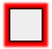
And there is also a multi-shadow order issue involved here. When using multiple shadow attributes for the same element, you need to pay attention to their order. The shadow written first will be displayed at the top, such as. box-shadow-7 is set to different blur values:
. box-shadow-7{
box-shadow:0 0 10px 5px black,
0 0 10px 20px red;
}
will be able to see The cascading sequence effect:
If you adjust the two shadow effects, change it to the following:
. box-shadow-8{
box-shadow:0 0 10px 20px red,
0 0 10px 5px black;
}
will only be displayed The red shadow effect is because the red shadow layer is on top and the blur radius is large, completely blocking the black shadow behind it.
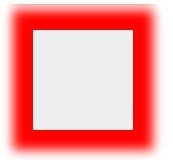
The conclusion is: if the blur value of the shadow in the front is less than the blur value of the shadow in the back, then the front one is displayed above the back. If the blur value of the front shadow is greater than The shadow in the back is blurred, so the shadow in the front will cover the shadow effect in the back.
4) Border-like border effect (only set shadow expansion radius and shadow color)
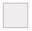
.box-shadow-9 has the same effect as boder: 1px solid red is similar, but the box-shadow effect and the border effect are different in the object height, which is exactly one expansion radius larger than the border height. And the shadow does not affect any layout of the page, which can be confirmed by viewing the layout diagram under firebug.


