The previous article talked about the solution of vertical alignment of inline elements. If you are interested, you can read my previous articles. In the previous article we mentioned the issue of movement within 1px. This article gives solutions to problems within one pixel.
You may have seen the one-pixel border issue on Retina screens. Note that this is the border width and not the mobile element.
What? border less than 1px?
Yes, because someone has given relevant solutions before and there are many solutions. I will not repeat the implementation principle here. I will give you two links. If you are interested, you can jump to it.
How to implement a true 1px line on mobile devices with Retina screens?
The secret of moving web points by 5 pixels
After reading it, I was enlightened, admired, and had many ideas. Back to the focus of this article
Think about the methods to achieve movement position(top,right,bottom,left), margin, padding, vertical -align.
The above are only some methods that can be moved by specific units (px, em, rem, etc.)
Based on the principle of practice, the above solutions are not feasible. In the latest chrome, when it is less than 0.5px, it is 0 , when it is greater than or equal to 0.5px, it becomes 1px.
Because the case is too simple, I won’t do a demo. Those who are interested can practice it by themselves. I believe most of you have tried it.
So what other properties are there that can move in specific units?
Solution
Maybe you already know that there is a translate attribute of transform . That’s right, it can move within 1px!
Basic syntax:
transform: translate(12px, 50%);
transform: translateX(2em);
transform: translateY(3in);
gives the demo code of this article,
<div class="parent">
  <div class="child-first"></div>
  <div class="child-second"></div>
  <div class="child-third"></div>
</div>

<style>
  .parent {
    width: 310px;
    height: 150px;
    background-color: #666;
  }

  .parent div {
    display: inline-block;
  }

  .child-first {
    width: 100px;
    height: 100px;

    margin-top: .5px;

    transform: translateY(.3px);

    background-color: #f66;
  }

  .child-second {
    width: 100px;
    height: 100px;

    transform: translateY(.5px);

    background-color: #ff0;
  }

  .child-third {
    width: 100px;
    height: 100px;

    transform: translateY(1px);

    background-color: #06c;
  }
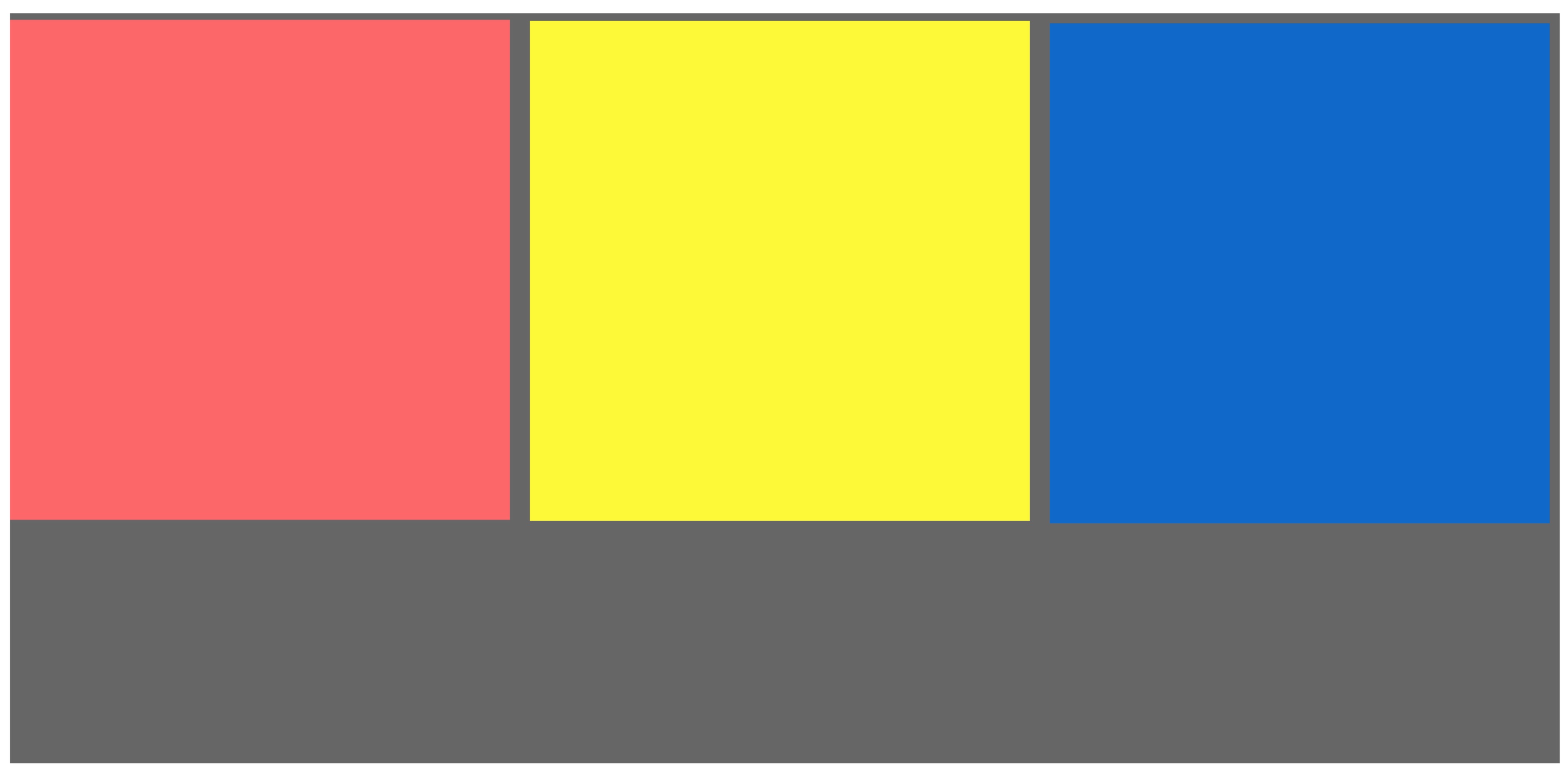
</style>The screenshot is as follows

Here for easier observation, we changed the layout to inline-block, and we found that there are gaps between elements. Looking at the code again, I found that there is no problem. So what caused this distance?
Is it a space? That’s right! When using inline-block, be sure to pay attention to unnecessary trouble caused by code indentation or line breaks (spaces are added unintentionally).
Modify as follows
<div class="parent">
  <div class="child-first"></div><div class="child-second"></div><div class="child-third"></div>
</div>
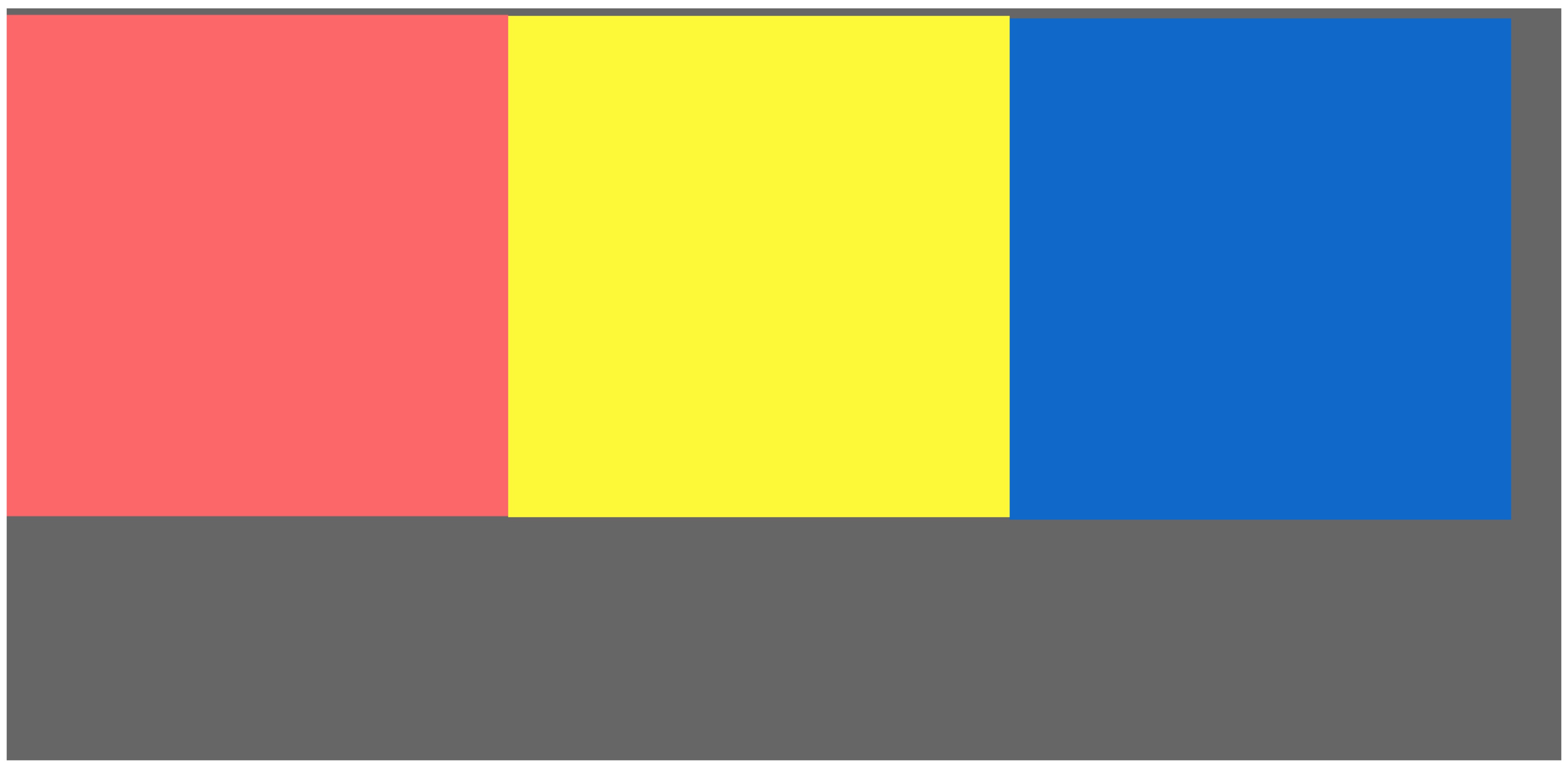
Get the final result, as shown below

Here we specially distinguish the colors of the small blocks, and the browser view is enlarged to the maximum multiple. If you still can’t see clearly, I recommend everyone to try it with your own hands,
Summary
This is the end of my method. I welcome everyone to discuss at the end. There is more than one solution. Orange has only found this one solution so far. You can also judge the screen based on js and give an offset of .5 pixels, which is also feasible. I personally think this method is simpler.


