This series mainly summarizes the understanding of some new features of CSS3, which comes from the book "CSS Revealed".
1. Translucent border
It is best to use hsla instead of rgba for css3. hsla is: h: color value (0~360); s: saturation (0%~100%); l: brightness (0% ~100%); a: Transparency (0~1)
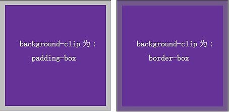
background-clip: clip the background color, the default is border-box (the background color spreads to the border); padding-box (the background color spreads to the padding); content-box (Background color extends to content)
Sample code:
width:200px;
height:200px;
background: rebeccapurple;
border: 10px solid hsla(300, 0%, 50%, 0.5);
background-clip: padding-box; //去掉和添加上此项可以看出效果

2. Multiple border implementation
box-shadow: Set or retrieve object shadow, format: box-shadow: none |
length<1>: Horizontal offset, negative value
length<2>: Vertical offset, negative value
length< 3 >: Shadow blur value, non-negative value Value
length<4>: extension length, negative value
inset: expressed as inner shadow, empty means outer shadow
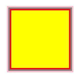
You can set multiple sets of effects, and use between multiple sets Separate by commas (use the box-shadow and overlapping features to set multiple borders, but the border style cannot be striped, dotted, etc.)
If you want to set the search text shadow, use the text-shadow attribute

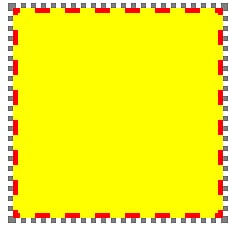
outline Realize two borders (only two borders can be realized, but the border style is flexible)

3. Background positioning
background-position: background positioning, the value description is as follows
center, left, top, bottom, right etc. all indicate where the background starts to display. If you set repeated tiles, there will be different effects. The value can be a numerical value or a percentage: background-position: right 20px bottom 30px;
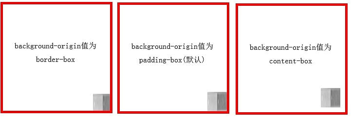
background-origin: the positioning parameter of the background image , three-valued context-box, padding-box, border-box, etc.
clac() function to calculate width
The sample code is as follows:
background-image: url('../img/bck.png');
background-repeat: no-repeat;
background-size: 40px 40px;
width:200px;
height:200px;
margin-top:10px;
border: 5px solid red;
--background-position: right 0px bottom 0px;
background-origin: content-box;
background-position: calc(100% - 50px);
padding: 10px;
 4. Multiple rounded corners
box-shadow: Its rounded corners will follow the border-radius, but outline does not meeting.
The minimum shadow (box-shadow) calculation formula is: Pythagorean theorem, when setting the shadow, it should be greater than this value
Sample code:
margin: 10px auto;
width: 10em;
height: 8em;
background: tan;
border-radius: .8em;
padding: 1em;
box-shadow: 0 0 0 .6em #655;
outline: .6em solid #556;


