
Continue, when a group of floating elements encounters that there is not enough space on the right, it will automatically go down and will not leave the outermost layer. That is to say, although it will not follow the flow pattern on the ground, it will still follow the flow in the air. Pattern, ps: they all float at the same height. .
<html>
<head>
<style type="text/css">
body{
margin:0;
padding:0;
} #a{
width:500px;
height:500px;
border:solid;
}
.div{
width:100px;
height:100px;
border:soild;
margin:5px;
background:green;
float:left;
}
#b{
width:100px;
height:100px;
border:soild;
background:green;
float:left;
margin:5px;
}
</style>
<head>
<body>
<div id="a">
<div id="b"></div>
<div class="div"></div>
<div class="div"></div>
<div class="div"></div>
<div class="div"></div>
</div>
</body>
</html>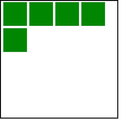
This shows the same in Firefox and IE6
What happens when the first floating div is taller than other floating divs?
<html>
<head>
<style type="text/css">
body{
margin:0;
padding:0;
} #a{
width:500px;
height:500px;
border:solid;
}
.div{
width:100px;
height:100px;
border:soild;
margin:5px;
background:green;
float:left;
}
#b{
width:100px;
height:110px;
border:soild;
background:green;
float:left;
margin:5px;
}
</style>
<head>
<body>
<div id="a">
<div id="b"></div>
<div class="div"></div>
<div class="div"></div>
<div class="div"></div>
<div class="div"></div>
</div>
</body>
</html>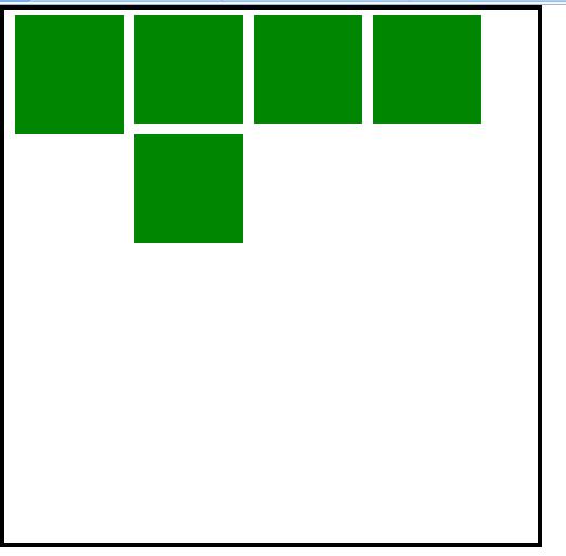
You will find that the last one is stuck there. It will not squeeze through. If you squeeze it hard, it will crash, right? The div still needs to be polite, but It will also not automatically adjust the top margin to the left, because it is not that smart yet and needs to be adjusted manually. If it can run automatically, it will be a bunker, right? .
Let’s look at an example
<html>
<head>
<style type="text/css">
body{
margin:0;
padding:0;
} #a{
width:500px;
height:500px;
border:solid;
} #b{
width:130px;
height:350px;
border:soild;
background:green;
float:left;
margin:5px;
}
#c{
width:350px;
height:350px;
border:soild;
background:green;
float:left;
margin:5px;
}
</style>
<head>
<body>
<div id="a">
<div id="b"></div>
<div id="c"></div>
</div>
</body>
</html>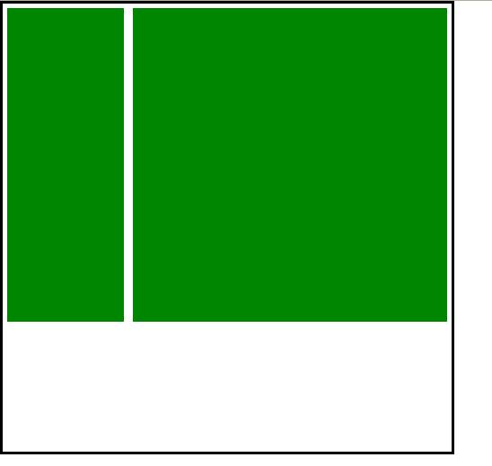
This is the structure of a general web page, the head is not done, here is the middle, the left is the list, and the right Display content
Now get the tail
I want to get this effect

The code is as follows
<html>
<head>
<style type="text/css">
body{
margin:0;
padding:0;
} #a{
width:500px;
height:500px;
border:solid;
} #b{
width:130px;
height:350px;
border:soild;
background:green;
float:left;
margin:5px;
}
#c{
width:350px;
height:350px;
border:soild;
background:green;
float:left;
margin:5px;
}
#d{
width:490px;
height:100px;
border:soild;
background:red;
float:left;
margin:5px;
}
</style>
<head>
<body>
<div id="a">
<div id="b"></div>
<div id="c"></div>
<div id="d"></div>
</div>
</body>
</html>But many people forget to add float at the bottom layer :left;
That’s it
#d{
width:490px;
height:100px;
border:soild;
background:red;
margin:5px;
}The result will be like this
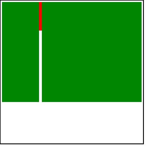
Remember what I said before, the div on the ground will not know the existence of the div in the sky, So I don’t know that the floating div has occupied the area.
In addition to adding float:left;
to the bottom layer, there is another way, which is clear
clear means to clear the float. I didn’t understand it at first, and probably most people don’t understand it either.
Clearing here does not mean deleting the floating div, nor does it change its position.
It should be understood this way.
Add clear to an ordinary div. , which is equivalent to installing an eye that can see the air. The div on the ground can see the situation of the div in the air, so as to know what area the div in the air occupies, so as to avoid occupying the area of the div in the air.
clear There are left right, both, and none attributes. The default is none, which means it is not set.
left means you can see the upper left space of the div on the ground itself, and right is the upper right space.
both means both sides, generally use both
<html>
<head>
<style type="text/css">
body{
margin:0;
padding:0;
} #a{
width:500px;
height:500px;
border:solid;
} #b{
width:130px;
height:350px;
border:soild;
background:green;
float:left;
margin:5px;
}
#c{
width:350px;
height:350px;
border:soild;
background:green;
float:left;
margin:5px;
}
#d{
width:490px;
height:100px;
border:soild;
background:red;
margin:5px;
clear:both;
}
</style>
<head>
<body>
<div id="a">
<div id="b"></div>
<div id="c"></div>
<div id="d"></div>
</div>
</body>
</html>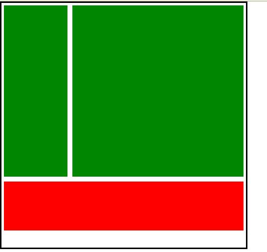
The above is the content of a new beginning of div+css web layout design (8). For more related content, please pay attention to the PHP Chinese website (www.php.cn)!


