
rem This is a low-key css unit that has begun to emerge in the past year or two. Many students have different evaluations of rem. Some are trying to use it, while others have abandoned it after encountering pitfalls during use. But my overall evaluation of rem is that it is definitely one of the most suitable candidates for making web apps.
rem (font size of the root element) refers to the unit of font size relative to the root element. Simply put, it is a relative unit. When you see rem, you will definitely think of the em unit. Em (font size of the element) refers to the unit of font size relative to the parent element. They are actually very similar, except that one calculation rule relies on the root element and the other relies on the parent element for calculation.
Here I particularly emphasize that web app and web page cannot use rem. In fact, of course you can, but for compatibility reasons, using it under web app can better highlight the value and capabilities of this unit. Next, we Let’s take a look at how some corporate web apps implement screen adaptation.
Recently, iPhone 6 has been released in two sizes, which has led to even more confusion in the types of mobile screens. Remember to do web work a year or two ago One way to adapt apps is to use 320 width as the standard. If the size exceeds 320, it will still be displayed in 320 specifications. This implementation method is represented by Taobao web app, but recently the mobile Taobao homepage has been revised and uses rem In this unit, the home page is still as confusing as before, with pages with fixed widths and pages with a fluid layout.
The commonly used unit we use for page layout is px, which is an absolute unit. There are many methods for web app screen adaptation, such as: fluid layout, limited width, and Do it through responsiveness, but these solutions are not the best solutions.
For example, the fluid layout solution has many disadvantages. Although it can adapt to various screens, the display effect is extremely poor because only a few sizes of mobile phones can display it perfectly. The effect that visual designers and interactions want most, but currently there are many companies in the industry that use fluid layout for web apps. Take a look at some of the cases I collected below:
Amazon:

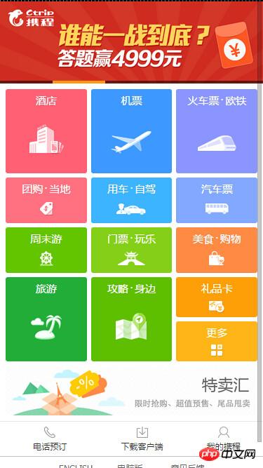
Ctrip:
Lanting:

The above websites are all used Fluid layout technology is implemented. They define the width by percentage when laying out the page, but the height is mostly fixed by px, so the display effect on a large-screen mobile phone will become that the width of some page elements is stretched. is very long, but the height is still the same as before. The actual display is very uncoordinated. This is the most fatal shortcoming of the fluid layout. The effect seen on mobile phones with only a few sizes is often satisfactory. In fact, many visual Designers should not be able to accept this effect, because the effect of their design drawings when viewed on a large-screen mobile phone is equivalent to being stretched horizontally.
Flow layout is not the most ideal way to implement it. Through a large number of percentage layouts, many bugs will often appear, and there are many restrictions on the designer's design, because they have Fluid layout needs to be considered, and only horizontally stretched element layout can be designed. There are many limitations during design.
There is also a method of fixing the page width. In the early days, some websites set the page width to 320, and left the excess part blank. This way, it looks good on the front end. Happily, the visual design no longer needs to be limited by the fluid layout, and the front-end does not need to engage in deceptive fluid layouts. However, there are some problems with this solution. For example, there are blank spaces on both sides on large-screen mobile phones. Another is that the page looks very small on large screens. This was how the mobile Taobao homepage was originally done, but it has been revised recently. But the Tmall homepage has not been revised yet.
Responsive approach In China, very few complex websites of large enterprises use this approach on the mobile terminal. The main reason is that the work is large. Maintenance is difficult, so generally small and medium-sized portals or blog sites will use the responsive method to directly go from web page to web app in one step, because this can save costs and no longer need to build a web app specifically for their own website. version of.
< meta name = "viewport" content = "width = 320 , maximum - scale = 1 .3 , user - scalable = no" >
The homepage of Tmall's web app is made in this way. It uses 320 width as the benchmark for scaling. The maximum scaling is 320*1.3 = 416. It can be compatible with basic scaling up to 426. The screen of iphone6 plus is broken. This method is simple, crude and efficient. To be honest, I think it is very efficient in using rem, which we will talk about next. However, some students reported that the scaling process was a bit blurry during use. I have never encountered this situation when using it.
The above has talked about a lot of web app adaptation solutions that are currently mainstream in most companies. Next, let’s talk about how rem works. of.
As mentioned above, rem is adapted through the root element. The root element in the web page refers to html. We can control the size of rem by setting the font size of html. For example:
html {
     font-size: 20px ;
}

.btn   {
     width:   6rem ;
     height:   3rem ;
     line-height:   3rem ;
     font-size:   1.2rem ;
     display:   inline-block ;
     background:   #06c ;
     color:   #fff ;
     border-radius:   .5rem ;
     text-decoration:   none ;
     text-align:   center ;
}Demo
The result button size of the above code is as follows:
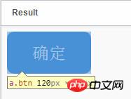
I put the html It is set to 10px to facilitate our calculation, why 6rem is equal to 60px. If the style of our .btn remains unchanged at this time, we will change the font-size value of the html and see the above changes in the button:
html {
     font-size: 40px ;
}Demo
The button size results are as follows:
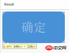
The above width and height become twice the above results. We only changed the font-size of the html, but the width of the .btn style , the size of the button in the web is changed while the properties set by height's rem remain unchanged.
In fact, from the above two cases, we can calculate how much rem is 1px:
First example:
120px = 6rem * 20px (the root element sets a large value )
Second example:
240px = 6rem * 40px (root element sets a large value)
Calculated:
10px = 1rem at the root element (when font-size = 10px);
20px = 1rem in the root element (when font-size = 20px);
40px = 1rem in the root element (font-size = 40px);
In the above two examples, we found that the first case button is enlarged to the second button in equal proportions. The change of html font-size will cause the size of the button to change. We There is no need to change the width and height previously set for the button. In fact, this is what we want to see most. Why do we say that? Next, let’s look at an example:
Demo
From the above two demos, we know that changing the font-size of html can change all elements using rem units equally, so everyone You can use the debugging tool of the Chrome browser to switch the display effect of the third demo on different devices, or you can view the effect by zooming the width of the browser. We can see that no matter what the resolution, the layout of the page is Switch according to equal proportions, and the layout is not messy. I simply achieved the above effect by simply changing the font-size value according to the browser's current resolution through a piece of js. All elements of the page did not need to be changed in any way.
First of all, assume that the page design draft above was given to me in the standard size of 640. (Of course, this size is definitely not necessarily 640, it can be 320, or 480, or 375 ) to look at a set of tables.
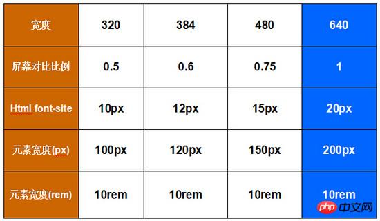
The blue column in the above table is the size of the page in Demo3. The page is cut with a width of 640. How to calculate the font under different widths? You should be able to understand the value of -site by looking at the numerical changes in the table. For example: 384/640 = 0.6, 384 is 0.6 times of 640, so the font-size under the page width of 384 is also equal to 0.6 times of it. At this time, the font-size of 384 is equal to 12px. The width of different devices is calculated in the same way.
In Demo3, I used JS to dynamically calculate the font-size of the root element. The advantage of this is that all device resolutions can be compatible and adapted. Taobao's homepage currently uses JS for calculation. But in fact, we can do adaptation without JS. Generally, when we make web apps, we will first count the mainstream screen devices of our website, and then set media query settings for those devices to achieve adaptation, for example, as follows:
html  {
     font-size  :  20px ;
}
@media only screen and  ( min - width :  401px ) {
     html  {
         font-size:   25px  ! important ;
     }
}
@media only screen and  ( min - width :  428px ) {
     html  {
         font-size:   26.75px  ! important ;
     }
}
@media only screen and  ( min - width :  481px ) {
     html  {
         font-size:   30px  ! important ;
     }
}
@media only screen and  ( min - width :  569px ) {
     html  {
         font-size:   35px  ! important ;
     }
}
@media only screen and  ( min - width :  641px ) {
     html  {
         font-size:   40px  ! important ;
     }
}Of course the above settings cannot be fully adapted to all devices, but full adaptation can be achieved using JS. Which one to use depends on your actual work scenario.
Below we recommend two domestic mobile sites that use rem technology. You can refer to them to see their practices. Currently, only the homepage of mobile Taobao uses rem, and the homepage of native apps is an embedded web app homepage.
Taobao homepage: m.taobao.com
D X: m.dx.com
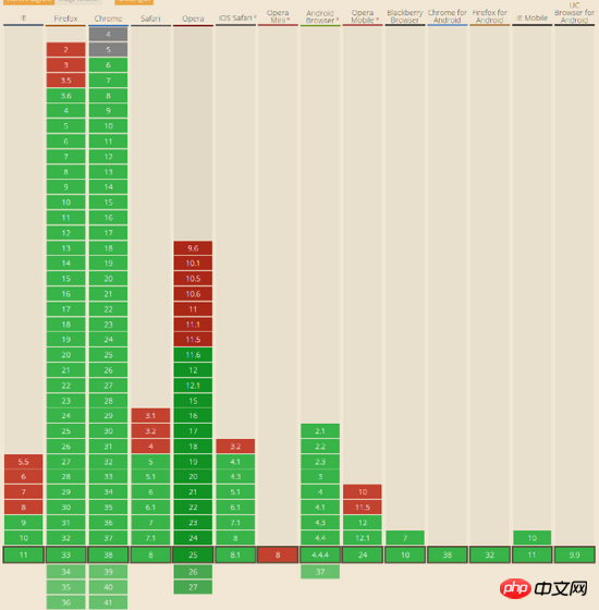
For more rem - low-key css unit related articles, please pay attention to the PHP Chinese website!


