 Web Front-end
 CSS Tutorial
 Detailed explanation of iconfont font icons and various css small icons
Detailed explanation of iconfont font icons and various css small icons
Foreword: This is the author’s own understanding and organization after studying. If there are any errors or questions, please correct me and I will continue to update!
1. iconfont font icon
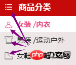
In our needs, we often see some small graphics, or icons, such as on the Tmall website:


We can replace these small graphics with pictures. Usually we cut these graphics into sprite charts (also called sprite charts);
The principle of sprite charts: Collect many small pictures into one large picture, and then display the picture by setting the position of the background image;
Advantages of sprites: reduce the number of server requests and reduce server pressure;
sprites are a A very good sprite making tool;
Of course there are other ways to make these small graphics, such as the font icon iconfont used by Tmall in the picture above;
Font icon, as the name suggests, is a font. Like a font, it is a vector. We also call it a vector icon. It can be enlarged or reduced without distortion;
There are many font icon libraries on the Internet. Here I will introduce the use of iconfont:
Official website: http://www.iconfont.cn/
I won’t tell you how to make it, let’s use it directly (Haha, actually the picture I drew is too ugly);
I originally planned to write about how to use it, but iconfont seems to have been upgraded again, adding symbol writing and supporting multi-color icons (this involves the knowledge of SVG ), the GIF image of the help document on the official website also explains how to apply it very well. I will write about the pitfalls I encountered when I used it for the first time:
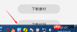
"Download Code" button, I hope you can can be found directly. Well, I searched for a while, and by default it asked me to set the color and size. This is to get the materials. The front-end only needs code, click Undo, and then...;
I don’t know Is it a problem with my computer (1366*768) or something else? This "Download Code" button is half blocked by the toolbar at the bottom of my windows. Well, this...

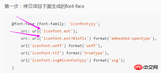
- ## When we download the font icon, it is a file. When we define the font type in css, don’t forget to set the path correctly;

- If We are using iconfont's online project (no downloaded files). When project members update the icon, if we also want to use the new icon, we must also update the "online link";
- The font does not support multi-color. If we use the download file method, we can only use the font color to set a single color. If you want to use multi-color icons, you have to use symbol to reference online links; symbol refers to js files, and font-class refers to css files. The writing methods of the two methods are also different;
Triangle, please read this article, the summary of border triangle shadow and multiple borders;
Menu (three stripes), use border to double the border The line and the solid line of the lower border can also be reversed:

<!DOCTYPE html><html>
    <head>
        <meta charset="UTF-8">
        <title></title>
        <style type="text/css">
            *{
                padding: 0;
                margin: 0;
            }
            .menu{
                margin: 100px;
                width: 55px;
                height: 10px;
                border-top: 30px double #f00;
                border-bottom: 10px solid #f00;
                /*用border上边框双线和下边框实线,也可以反着来*/
            }
        </style>
    </head>
    <body>
        <p class="menu"></p>
</body></html>Inner concave corner, the master's method, click here, use the css3 attribute radial gradient radial-gradient to do:
The radial gradient of the background image can be set: the center position of the circle, the size of the gradient, the shape of the gradient, and the color at the center of the circle Width, ... , color width at the end;

代码如下:
<!DOCTYPE html><html>
    <head>
        <meta charset="UTF-8">
        <title></title>
        <style type="text/css">
            *{padding: 0;margin: 0;}
            a{text-decoration: none;cursor: pointer;}
            li{list-style: none;}
            /*清除浮动*/
            .clearfix:before, /*:before处理margin上下重叠*/
            .clearfix:after {
                content: "";
                display: table;
            }
            .clearfix:after {
                clear: both;
            }
            .clearfix {
                zoom: 1;
            }

            .test{
                margin: 100px 0 0 100px ;
            }
            .list{
                margin-left: -20px;
            }
            .content{
                width: 320px;
                background: #7fd6f1;
                min-height: 200px;
            }
            .item .active{
                background: #7fd6f1;
                color: #333;
            }
            .item{
                float: left;
                margin-left: 30px;
            }
            .item a{
                display: block;
                background: #ce4be2;
                width: 80px;
                height: 35px;
                text-align: center;
                line-height: 35px;
                color: #fff;
                border-radius: 10px 10px 0 0;
                position: relative;
            }
            .item a:after{
                content: "";
                display: block;
                position: absolute;
                right: -9px;
                 /*不知大家是否发现,在边缘处其实是有1px的变化的,弧度到最后不是很自然,这里我们其实可以把位置往里1px*/
                bottom: 0;
                width: 10px;
                height: 10px;
                 background: -webkit-radial-gradient(100% 0%, farthest-side, transparent 0%, transparent 8px, transparent 9px, #ce4be2 100%);
                 background: -o-radial-gradient(100% 0%, farthest-side, transparent 0%, transparent 8px, transparent 9px, #ce4be2 100%);
                 background: -moz-radial-gradient(100% 0%, farthest-side, transparent 0%, transparent 8px, transparent 9px, #ce4be2 100%);
                 background: radial-gradient(100% 0%, farthest-side, transparent 0%, transparent 8px, transparent 9px, #ce4be2 100%);
                 /*背景图径向渐变可以设置:圆心位置,渐变的大小,渐变的形状,圆心处的颜色 宽度, ... ,结尾处的颜色宽度*/
                 /*圆心位置默认为center,我们这里设置圆心为元素左顶点和右顶点*/
                 /*渐变的大小默认为farthest-corder ,我们这里设置的farthest-side*/
                 /*渐变的形状默认为ellipse(椭圆),我们这里得设置成circle(圆形),但是宽高一样的椭圆不就是圆形么,so...*/
                 /*颜色和宽度的设置,我们在离元素宽度还有1px的时候变化,所以这里是10-1=9px;*/
            }
            .item a:before{
                content: "";
                display: block;
                position: absolute;
                left: -9px;
                bottom: 0;
                width: 10px;
                height: 10px;
                 background: -webkit-radial-gradient(0% 0%, farthest-side, transparent 0%, transparent 8px, transparent 9px, #ce4be2 100%);
                 background: -o-radial-gradient(0% 0%, farthest-side, transparent 0%, transparent 8px, transparent 9px, #ce4be2 100%);
                 background: -moz-radial-gradient(0% 0%, farthest-side, transparent 0%, transparent 8px, transparent 9px, #ce4be2 100%);
                 background: radial-gradient(0% 0%, farthest-side, transparent 0%, transparent 8px, transparent 9px, #ce4be2 100%);
            }
            .item .active:after{
                background: -webkit-radial-gradient(100% 0%, farthest-side, transparent 0%, transparent 8px, transparent 9px, #7fd6f1 100%);
                 background: -o-radial-gradient(100% 0%, farthest-side, transparent 0%, transparent 8px, transparent 9px, #7fd6f1 100%);
                 background: -moz-radial-gradient(100% 0%, farthest-side, transparent 0%, transparent 8px, transparent 9px, #7fd6f1 100%);
                 background: radial-gradient(100% 0%, farthest-side, transparent 0%, transparent 8px, transparent 9px, #7fd6f1 100%);
            }
            .item .active:before{
                background: -webkit-radial-gradient(0% 0%, farthest-side, transparent 0%, transparent 8px, transparent 9px, #7fd6f1 100%);
                 background: -o-radial-gradient(0% 0%, farthest-side, transparent 0%, transparent 8px, transparent 9px, #7fd6f1 100%);
                 background: -moz-radial-gradient(0% 0%, farthest-side, transparent 0%, transparent 8px, transparent 9px, #7fd6f1 100%);
                 background: radial-gradient(0% 0%, farthest-side, transparent 0%, transparent 8px, transparent 9px, #7fd6f1 100%);
            }
        </style>
    </head>
    <body>
        <p class="test">
            <ul class="list clearfix">
                <li class="item">
                    <a href="javascript:;" >新闻</a>
                </li>
                <li class="item">
                    <a href="javascript:;" class="active">娱乐</a>
                </li>
                <li class="item">
                    <a href="javascript:;">体育</a>
                </li>
            </ul>
            <p class="content"></p>
        </p>
</body></html>还有很多css制作的经典图形,以后再整理吧;
其实,css制作的图标和图片代替的图片都很棒,根据需求吧。我更喜欢字体图标和图片的方式,效率更高,简单。
更多Detailed explanation of iconfont font icons and various css small icons相关文章请关注PHP中文网!

Hot AI Tools

Undresser.AI Undress
AI-powered app for creating realistic nude photos

AI Clothes Remover
Online AI tool for removing clothes from photos.

Undress AI Tool
Undress images for free

Clothoff.io
AI clothes remover

Video Face Swap
Swap faces in any video effortlessly with our completely free AI face swap tool!

Hot Article

Hot Tools

Notepad++7.3.1
Easy-to-use and free code editor

SublimeText3 Chinese version
Chinese version, very easy to use

Zend Studio 13.0.1
Powerful PHP integrated development environment

Dreamweaver CS6
Visual web development tools

SublimeText3 Mac version
God-level code editing software (SublimeText3)

Hot Topics
 1653
1653
 14
14
 1413
1413
 52
52
 1306
1306
 25
25
 1251
1251
 29
29
 1224
1224
 24
24
 Google Fonts Variable Fonts
Apr 09, 2025 am 10:42 AM
I see Google Fonts rolled out a new design (Tweet). Compared to the last big redesign, this feels much more iterative. I can barely tell the difference
 How to Create an Animated Countdown Timer With HTML, CSS and JavaScript
Apr 11, 2025 am 11:29 AM
Have you ever needed a countdown timer on a project? For something like that, it might be natural to reach for a plugin, but it’s actually a lot more
 HTML Data Attributes Guide
Apr 11, 2025 am 11:50 AM
Everything you ever wanted to know about data attributes in HTML, CSS, and JavaScript.
 How to select a child element with the first class name item through CSS?
Apr 05, 2025 pm 11:24 PM
When the number of elements is not fixed, how to select the first child element of the specified class name through CSS. When processing HTML structure, you often encounter different elements...
 Why are the purple slashed areas in the Flex layout mistakenly considered 'overflow space'?
Apr 05, 2025 pm 05:51 PM
Questions about purple slash areas in Flex layouts When using Flex layouts, you may encounter some confusing phenomena, such as in the developer tools (d...
 A Proof of Concept for Making Sass Faster
Apr 16, 2025 am 10:38 AM
At the start of a new project, Sass compilation happens in the blink of an eye. This feels great, especially when it’s paired with Browsersync, which reloads
 In front-end development, how to use CSS and JavaScript to achieve searchlight effects similar to Windows 10 settings interface?
Apr 05, 2025 pm 10:21 PM
How to implement Windows-like in front-end development...
 How We Created a Static Site That Generates Tartan Patterns in SVG
Apr 09, 2025 am 11:29 AM
Tartan is a patterned cloth that’s typically associated with Scotland, particularly their fashionable kilts. On tartanify.com, we gathered over 5,000 tartan


