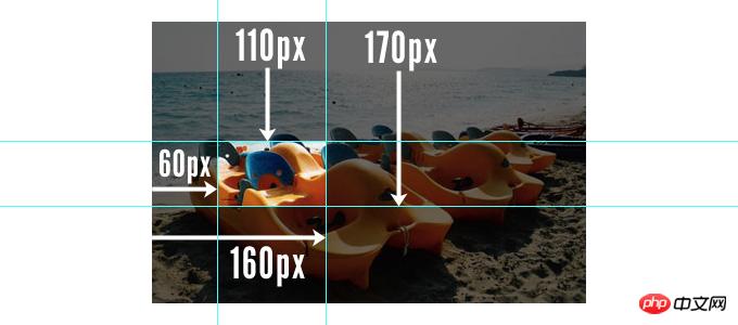
clip-path can divide the elements of the page into the areas to be displayed according to the set size, or it is equivalent to masking rather than actually cutting off a certain part. Here we will take a look at clip-path in CSS Area clipping attribute usage tutorial
clip-path in CSS allows you to specify the display area of a web page element instead of the default display of all.
.clip-me {

  /* 已被标志为不推荐使用的写法 */
  position: absolute; /* 需要 absolute 和 fixed 定位 */
  clip: rect(110px, 160px, 170px, 60px); /* 或 "auto" */
  /* 值描述的是一个 top/left 点和一个 bottom/right 点 */

  /* 最新规范写法 (没有定位要求), */
  clip-path: inset(10px 20px 30px 40px); /* or "none" */
  /* 值指的是 top, right, bottom, left 四个点 */


}There are four values in the inset() function in the clip-path attribute value, which express the four points of top/left and bottom/right respectively, and circle a rectangle area. The parts outside this rectangular area will be cropped and hidden.
It should be noted that the values are separated by spaces, while the old-fashioned ones use commas. 
Example: 
Look at this effect and crop this p.
The code is as follows:
<p class="haorooms-small" style="background-image: url('http://sandbox.runjs.cn/uploads/rs/216/0y89gzo2/idtga8h3.png');"> </p>
.haorooms-small {
    background-size: cover;
    width: 300px;
    height: 300px;
    -webkit-clip-path: polygon(0% 50%, 25% 0%, 75% 0%, 100% 50%, 75% 100%, 25% 100%);
    clip-path: polygon(0% 50%, 25% 0%, 75% 0%, 100% 50%, 75% 100%, 25% 100%);
}The inset attribute of clip-path is applied
<img  class="clip-me lazy"  src="/static/imghw/default1.png"  data-src="thing-to-be-clipped.png"    alt="Detailed explanation of how to use the clip-path area cropping attribute in CSS" >
.clip-me {
  /* 最新规范写法 (没有定位要求), */
  clip-path: inset(10px 20px 30px 40px); /* or "none" */
  /* 值指的是 top, right, bottom, left 四个点 */
}in There are four values in the inset() function in the attribute value of clip-path, which respectively express the four points of top/left and bottom/right, and circle a rectangular area. The parts outside this rectangular area will be cropped and hidden.
Other properties of clip-path are applied
.clip-me {

  /* 引用一个内联的 SVG <clipPath> 路径*/
  clip-path: url(#c1);

  /* 引用一个外部的 SVG  路径*/
  clip-path: url(path.svg#c1);

  /* 多边形 */
  clip-path: polygon(5% 5%, 100% 0%, 100% 75%, 75% 75%, 75% 100%, 50% 75%, 0% 75%);

  /* 圆形 */
  clip-path: circle(30px at 35px 35px);

  /* 椭圆 */
  clip-path: ellipse(65px 30px at 125px 40px);

  /* inset-rectangle() 将会替代 inset() ? */
  /* rectangle() 有可能出现于 SVG 2 */

  /* 圆角 */
  clip-path: inset(10% 10% 10% 10% round 20%, 20%);

}SVG clipping path example:
<clipPath id="clipping">
  <circle cx="150" cy="150" r="50" />
  <rect x="150" y="150" width="100" height="100" />
</clipPath>
The above is the detailed content of Detailed explanation of how to use the clip-path area cropping attribute in CSS. For more information, please follow other related articles on the PHP Chinese website!
 What is j2ee
 Solutions to unknown software exception exceptions in computer applications
 Introduction to the meaning of += in C language
 How to install the driver
 What are the main characteristics of computers?
 MySQL password change method
 Ripple currency today's market price
 modify ip
 What are the C language programming software?


