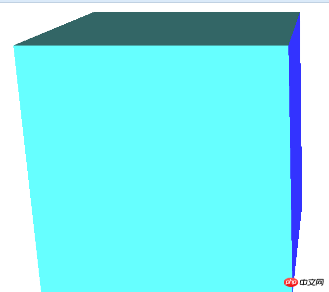
Sample code for implementing 3D cube rotation effects using css
This article introduces the sample code for implementing 3D cube rotation effects using css
Let’s first look at the effect after running


It is a cube that is constantly running
Let’s look at the html part of the code first
<p class="rect-wrap">   <!--舞台元素,设置perspective,让其子元素获得透视效果。-->
    <p class="container">   <!-- 容器,设置transform-style: preserve-3d,让其子元素在3D空间呈现-->
        <p class="top slide"></p>   <!--立方体的六个面-->
        <p class="bottom slide"></p>
        <p class="left slide"></p>
        <p class="right slide"></p>
        <p class="front slide"></p>
        <p class="back slide"></p>
    </p>
</p>Let’s take a look at their style sheets
<style type="text/css">
.rect-wrap {
    position: relative;
    perspective: 1600px;
}
.container {
    width: 800px;
    height: 800px;
    transform-style: preserve-3d;
    transform-origin: 50% 50% 200px;    /*设置3d空间的原点在平面中心再向Z轴移动200px的位置*/
}
.slide {
    width: 400px;
    height: 400px;
    position: absolute;  //定位
}
.top {
    left: 200px;
    top: -200px;
    transform: rotateX(-90deg);
    transform-origin: bottom;
    background-color:#C69
}
.bottom {
    left: 200px;
    bottom: -200px;
    transform: rotateX(90deg);
    transform-origin: top;
    background-color:#6FF
}
.left {
    left: -200px;
    top: 200px;
    transform: rotateY(90deg);
    transform-origin: right;
    background-color:#9F0
}
.right {
    left: 600px;
    top: 200px;
    transform: rotateY(-90deg);
    transform-origin: left;
    background-color:#33F
}
.front {
    left: 200px;
    top: 200px;
    transform: translateZ(400px);
    background-color:#366  /*立方体前面正对着屏幕,所以不用旋转,只需向Z轴前移动距离*/

}
.back {
    left: 200px;
    top: 200px;
    transform: translateZ(0);
    background-color:#09F   /*立方体后面正对着屏幕,所以不用旋转,只需向Z轴后移动距离*/
}
@keyframes rotate-frame {
    0% {
        transform: rotateX(0deg) rotateY(0deg);
    }
    10% {
        transform: rotateX(0deg) rotateY(180deg);
    }
    20% {
        transform: rotateX(-180deg) rotateY(180deg);
    }
    30% {
        transform: rotateX(-360deg) rotateY(180deg);
    }
    40% {
        transform: rotateX(-360deg) rotateY(360deg);
    }
    50% {
        transform: rotateX(-180deg) rotateY(360deg);
    }
    60% {
        transform: rotateX(90deg) rotateY(180deg);
    }
    70% {
        transform: rotateX(0) rotateY(180deg);
    }
    80% {
        transform: rotateX(90deg) rotateY(90deg);
    }
    90% {
        transform: rotateX(90deg) rotateY(0);
    }
    100% {
        transform: rotateX(0) rotateY(0);
    }
}
.container{
    animation: rotate-frame 30s linear infinite;
}


</style>Only these codes can achieve 3D rotation
Also To turn it into a picture, you can do this

Add a picture to each p, and then set a unified name for each picture, and then give them a unified style and set Just the height and width are fine
You can paste and copy the code, come and try it
Related articles:
Easy to make HTML5 page turning effect text effects
CSS more commonly used flip effects
Details introduction to how to implement HTML5 3D clothes swing animation special effects
The above is the detailed content of Sample code for implementing 3D cube rotation effects using css. For more information, please follow other related articles on the PHP Chinese website!

Hot AI Tools

Undresser.AI Undress
AI-powered app for creating realistic nude photos

AI Clothes Remover
Online AI tool for removing clothes from photos.

Undress AI Tool
Undress images for free

Clothoff.io
AI clothes remover

Video Face Swap
Swap faces in any video effortlessly with our completely free AI face swap tool!

Hot Article

Hot Tools

Notepad++7.3.1
Easy-to-use and free code editor

SublimeText3 Chinese version
Chinese version, very easy to use

Zend Studio 13.0.1
Powerful PHP integrated development environment

Dreamweaver CS6
Visual web development tools

SublimeText3 Mac version
God-level code editing software (SublimeText3)

Hot Topics
 1659
1659
 14
14
 1415
1415
 52
52
 1309
1309
 25
25
 1257
1257
 29
29
 1231
1231
 24
24
 How to use bootstrap in vue
Apr 07, 2025 pm 11:33 PM
Using Bootstrap in Vue.js is divided into five steps: Install Bootstrap. Import Bootstrap in main.js. Use the Bootstrap component directly in the template. Optional: Custom style. Optional: Use plug-ins.
 Understanding HTML, CSS, and JavaScript: A Beginner's Guide
Apr 12, 2025 am 12:02 AM
WebdevelopmentreliesonHTML,CSS,andJavaScript:1)HTMLstructurescontent,2)CSSstylesit,and3)JavaScriptaddsinteractivity,formingthebasisofmodernwebexperiences.
 The Roles of HTML, CSS, and JavaScript: Core Responsibilities
Apr 08, 2025 pm 07:05 PM
HTML defines the web structure, CSS is responsible for style and layout, and JavaScript gives dynamic interaction. The three perform their duties in web development and jointly build a colorful website.
 How to insert pictures on bootstrap
Apr 07, 2025 pm 03:30 PM
There are several ways to insert images in Bootstrap: insert images directly, using the HTML img tag. With the Bootstrap image component, you can provide responsive images and more styles. Set the image size, use the img-fluid class to make the image adaptable. Set the border, using the img-bordered class. Set the rounded corners and use the img-rounded class. Set the shadow, use the shadow class. Resize and position the image, using CSS style. Using the background image, use the background-image CSS property.
 How to write split lines on bootstrap
Apr 07, 2025 pm 03:12 PM
There are two ways to create a Bootstrap split line: using the tag, which creates a horizontal split line. Use the CSS border property to create custom style split lines.
 How to set up the framework for bootstrap
Apr 07, 2025 pm 03:27 PM
To set up the Bootstrap framework, you need to follow these steps: 1. Reference the Bootstrap file via CDN; 2. Download and host the file on your own server; 3. Include the Bootstrap file in HTML; 4. Compile Sass/Less as needed; 5. Import a custom file (optional). Once setup is complete, you can use Bootstrap's grid systems, components, and styles to create responsive websites and applications.
 How to resize bootstrap
Apr 07, 2025 pm 03:18 PM
To adjust the size of elements in Bootstrap, you can use the dimension class, which includes: adjusting width: .col-, .w-, .mw-adjust height: .h-, .min-h-, .max-h-
 How to use bootstrap button
Apr 07, 2025 pm 03:09 PM
How to use the Bootstrap button? Introduce Bootstrap CSS to create button elements and add Bootstrap button class to add button text


