Home > Web Front-end > CSS Tutorial > Detailed instructions on CSS floating and positioning

Detailed instructions on CSS floating and positioning

高洛峰
Release: 2017-03-15 11:20:35
Original
1943 people have browsed it

Detailed description of CSS floating and positioning

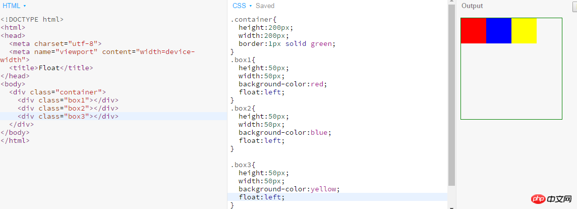
1. What does the concept of document flow mean? Is there any way to get elements out of the document flow?

  • Document flow refers to the process of element typesetting and layout, where elements will automatically flow from left to right and top to bottom. arrangement. And finally the form is divided into rows from top to bottom, and the elements are arranged in order from left to right in each row. Breaking out of the document flow means that the element disrupts this arrangement, or is taken away from the layout.

  • Methods to get elements out of the document flow are: floating and positioning.

2. There are several positioning methods, how to achieve positioning, and what are the usage scenarios?

CSS positioningThere are four methods: default positioning (static), relative positioning (relative), absolute positioning (absolute) and fixed Positioning (fixed)

  • static: Default value. There is no positioning, the element is in the normal flow, top, right, bottom, left and z-index attributesinvalid. Examples are as follows:

Detailed instructions on CSS floating and positioning

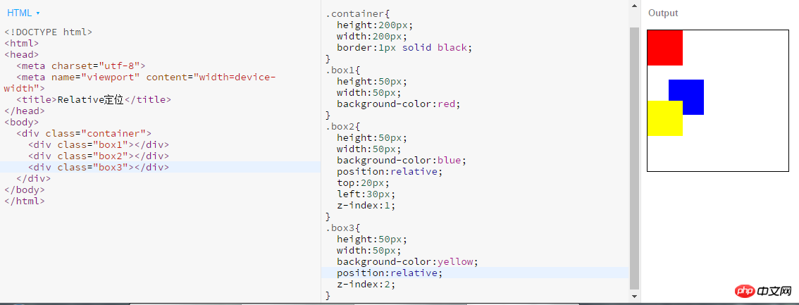
  • ##relative: Generates relatively positioned elements, using the positions of top, bottom, left, and right relative to its normal position. The relative refers to the element's position in the default flow.

Note:

1. After setting the

position attribute of the element to relative, then adjust it through the top, bottom, left, and right attributes. Offset relative to the original position;

2. After the element is offset, the position it originally occupied in the default document flow still exists, and the positioning of the element immediately following it is based on its original position;

3. After the element is offset, it may cover other elements. You can use the z-index attribute to display a limited level of hierarchy.

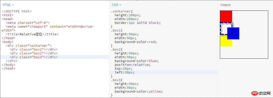
Example:

Detailed instructions on CSS floating and positioning

The second box element is translated downward by 20px and 30px to the right relative to the previous position (dashed line part).

To make the blocked part of the third block-level element emerge, we can use the following code to achieve it:

Detailed instructions on CSS floating and positioning

Note: Use z-index You must ensure that the element's style contains a positioning method. I forgot to add a positioning method to box3 before, causing z-index to not work for box3.

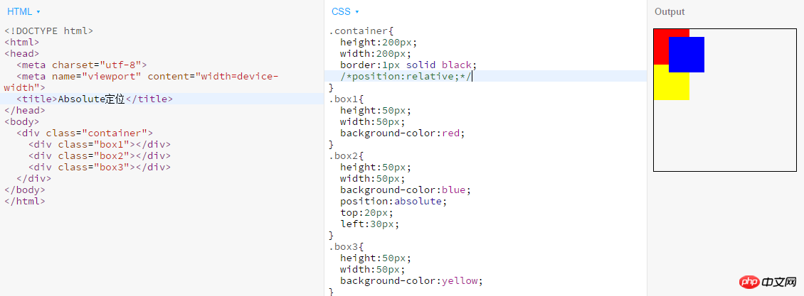
  • absolute: Generate an absolutely positioned element, positioned relative to the first parent element outside of static positioning.

Note:

1. The absolutely positioned element has been separated from the document flow, and other elements in the ordinary flow are laid out as if the absolute element does not exist;

2. The position of an absolutely positioned element is relative to the nearest positioned ancestor element. If the element has no positioned ancestor element, its position is relative to the body;

3. Absolutely positioned Boxes can cover other elements of the page.

Example:
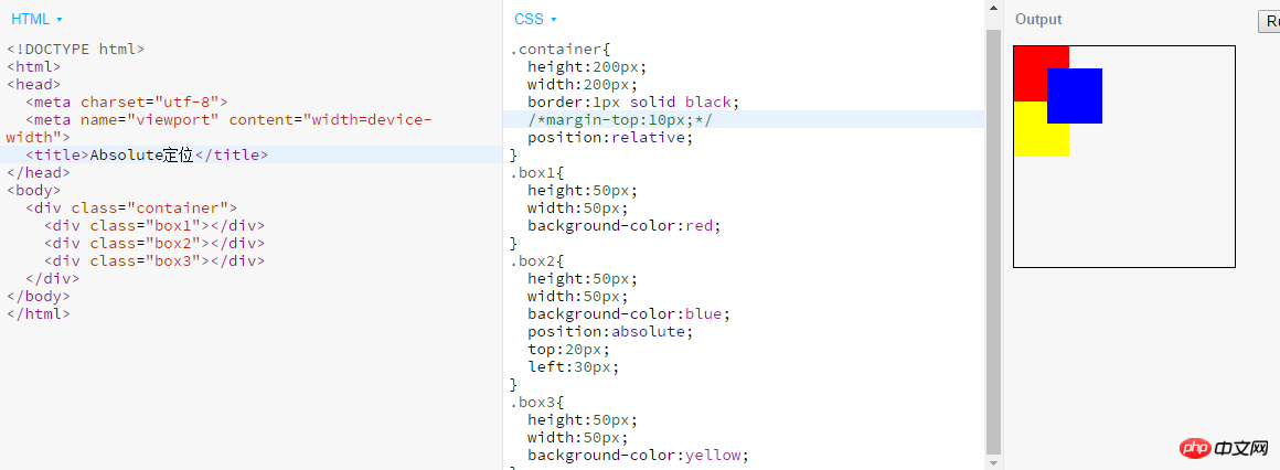
Detailed instructions on CSS floating and positioning

This situation is when the parent element closest to box2 has been positioned. If the parent element closest to box2 is not positioned, example As follows:

Detailed instructions on CSS floating and positioning

Example:

Detailed instructions on CSS floating and positioning

3. What are the reference points of absolute, relative, and fixed offsets?

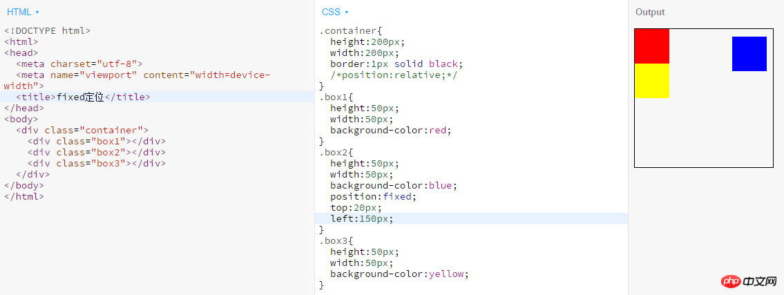
The reference point of absolute offset is: relative to the nearest positioned parent element, if not, relative to the body element;

The reference point of relative offset is: relative to the element The original position in the normal stream; the reference point of the

fixed offset is: relative to the browser window.

4. What is the role of z-index? How to use it?

The z-index attribute is used to set the stacking order of nodes. Nodes with higher stacking order will be displayed in lower stacking order. in front of the node.

Usage: Example
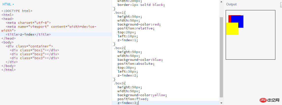
Detailed instructions on CSS floating and positioning

##1.z-index is only valid for positioned elements (position: relative||absolute||fixed);

2.z-index can only compare elements of the same level

5. Both position: relative and negative
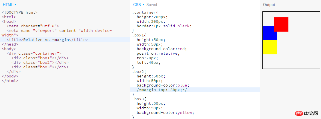
margin can offset the position of the element? What is the difference between the two?

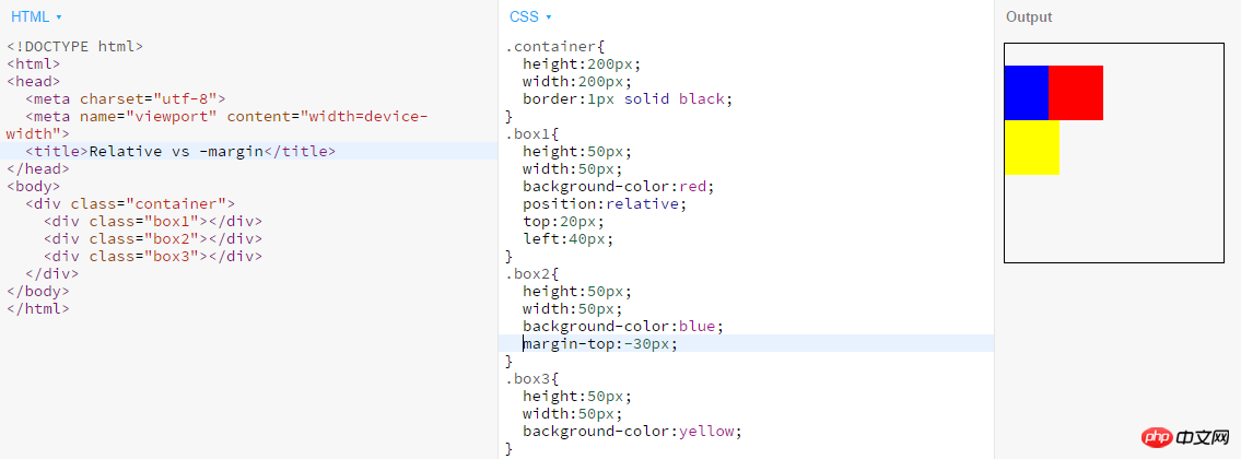
Position:relative and negative margin can both offset the position of the element. The difference between the two is:

  • Negative margin will cause the element to move in the document flow. If the position is shifted, it will give up the space occupied before the shift, and the elements immediately following it will fill this space;

  • If the element position is shifted after relative positioning, it will still It will stick to the space it originally occupied and will not let other elements of the document flow flow in.

Example:

Detailed instructions on CSS floating and positioning

Detailed instructions on CSS floating and positioning

6. How to make an element with a fixed width and height appear on the page Vertically and horizontally centered?

You can use absolute positioning and negative margin, example:

Detailed instructions on CSS floating and positioning

7. What are the characteristics of floating elements? What impact does it have on other floating elements, ordinary elements, and text?

  • The characteristics of floating elements are:

1. Blocks are in a row Display;

2.

Inline elementsSupport width and height;

3.Whether it is a block element or an inline element, when there is no width, the default content will expand the width;

4. Break away from the document flow;

5. Increase the level by half a level.

Floating example:

Detailed instructions on CSS floating and positioning

Eight,

Clear Float# What does ## mean? How to clear floats? Clearing floats means: in non-

IE browsers

(such as Firefox), when the height of the container is auto and the content of the container is There are floating elements (float is left or right). In this case, the height of the container cannot automatically extend to adapt to the height of the content, causing the content to overflow outside the container and affect the layout. In order to prevent this phenomenon from occurring, The CSS processing performed is called CSS clear float. Methods to clear floats:

1. Use empty elements with

clear

attributes

Use an empty element after the floating element such as <p class="clear"></p>, and assign .clear{clear:both;} in CSS Properties can be used to clean up floats. You can also use <br class="clear"> or <hr class="clear"> to clean.

2. Use the overflow attribute of CSS

to add overflow:hidden; or overflow:auto; to the container of the floating element to clear the float. In addition, it is also required in IE6 Trigger hasLayout, such as setting the container width and height for the parent element or setting zoom:1.

3. Use CSS :afterpseudo-element

Additional: I have never quite understood the use of clear:both to clear floats, and there is also the method of clearing floats. I misunderstood. I thought that after clearing floats, the rendering order of elements is the same as that of ordinary flow. This is not actually the case. Here is my own understanding. If there are any deficiencies, everyone is welcome to criticize and correct me.

  • About floating

In the following code:

Add a background in the parent containerPicture , the image will be rendered according to the normal flow

Detailed instructions on CSS floating and positioning

If you add float to the background image on this basis, the effect will be as follows:

Detailed instructions on CSS floating and positioning

We can see that the height of the parent element has collapsed and the background image is out of the document flow, so at this time the parent container p has replenished its height. Let us add some text to the parent container to see its height change

Detailed instructions on CSS floating and positioning

The height of the parent container has been stretched, is there any! Is there any!

So the reason why the child element floats and the parent element collapses is: because the p height is not set in advance, the p height is determined by the height of the child element it contains. Floating is out of the document flow, so the height of the image is not calculated. At this time, in p, it is equivalent to the height of the neutron element in p being 0.

  • A problem that has troubled me for a long time, I would like to share it with you and give you the code:

Detailed instructions on CSS floating and positioning

Detailed instructions on CSS floating and positioning

##What I don’t understand is: Why is the width of box2 in case 2 larger than the width of box2 in case 1? Box2 in case 2 can float, but box2 in case 1 cannot?

The answer is: Because the width is limited to 100px in case 1, the text in box2 cannot be surrounded on the right, so it can only go down. For case 2, because the width is 200px, box2 can surround box1 within this width

  • Understanding of clear:both:

Clear :both; In fact, we use clear float to open the outer p. So sometimes, after we set all the inner p to float, we will find that the background of the outer p is not displayed. The reason is that the outer p It's not stretched out and is too small, so the visible background is limited to a line.

Examples are as follows:

Detailed instructions on CSS floating and positioning

I have just said this much about CSS floating and positioning. If there are any deficiencies, you are welcome to correct me.

The above is the detailed content of Detailed instructions on CSS floating and positioning. For more information, please follow other related articles on the PHP Chinese website!

Related labels:
source:php.cn
Statement of this Website
The content of this article is voluntarily contributed by netizens, and the copyright belongs to the original author. This site does not assume corresponding legal responsibility. If you find any content suspected of plagiarism or infringement, please contact admin@php.cn
Popular Tutorials
More>
Latest Downloads
More>
Web Effects
Website Source Code
Website Materials
Front End Template