Detailed introduction to properties related to css background
In my impression, css only controls the background background, but background is a composite attribute
which includes:
background -color: background color, color representation methods supported by css, you can use
background-image: background image (url)
background-repeat: Whether the background is repeated (repeat, no-repeat, repeat-x, repeat-y)
background-position: Background positioning (keyword, percentage, pixels)
##background-size: Background size
background-origin:Background positioning area
background-clip:Background drawing area
background-attachment: Specifies whether the background image is fixed or scrolls with the rest of the page
 .p{
 background: #000 url("1.jpg") no-repeat left center;/*颜色、图片、是否平铺、定位*/
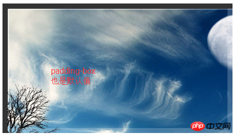
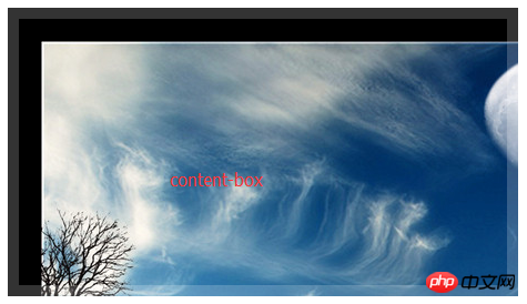
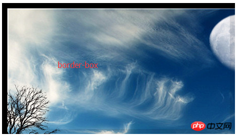
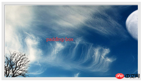
}Let’s talk about other attributesBackground positioning area (background-origin): The value is the keyword, there are 3
.div{
        width: 400px;
        height: 200px;
        padding: 20px;
        border:10px solid rgba(255,255,255,.2);
        background: #000 url("1.jpg") no-repeat;
        background-origin:border-box;
        /*background-origin:padding-box;*/
        /*background-origin:content-box;*/
    }
Copy after login
.div{
width: 400px;
height: 200px;
padding: 20px;
border:10px solid rgba(255,255,255,.2);
background: #000 url("1.jpg") no-repeat;
background-origin:border-box;
/*background-origin:padding-box;*/
/*background-origin:content-box;*/
}- border-box

- padding-box
 ##content-box
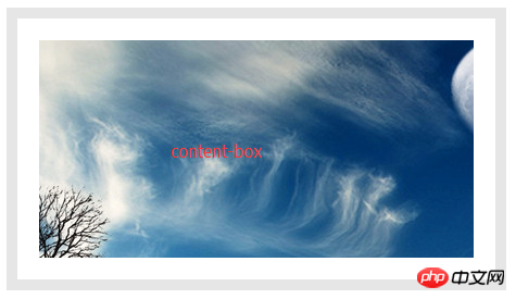
  The above is the effect of background-origin, but it seems to be a little different from what I want. There are still background images on the bottom and right sides during padding and content, and it seems that the background color (#000 ) Didn’t work
Supplement: It can determine the starting point of background positioning.
Background positioning area (background-origin): The value is a keyword, and there are also 3
.div{
    width: 400px;
    height: 200px;

    padding: 20px;
    border:10px solid rgba(0,0,0,.1);

    background:#000 url("1.jpg") no-repeat;
    /*background-clip:border-box;*/
    /*background-clip:padding-box;*/
    background-clip:content-box;
}- border-box:
-
 padding-box:
 -
##content-box:
-
The above is the effect of background-clip, it feels a little better than background-origin, ha.
Now to achieve the above effect, just one p is enough. Link: demo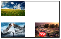
nbsp;html>


    <meta>
    <title>Title</title>
    <style>
        .div{
            width: 240px;
            height: 150px;
            border:1px solid #000;

            background: url("1.jpg") no-repeat left top,
                        url("2.jpg") no-repeat left bottom,
                        url("3.jpg") no-repeat right bottom;
            background-size:100px auto, 100px auto, 100px auto;
        }
    </style>


<div></div>


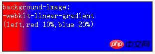
多个背景-webkit-linear-gradient(起点[方向],color1 定位,color2 定位,...,colorN 定位);

渐变参数-起点:关键字、百分比、像素、角度(逆时针旋转)
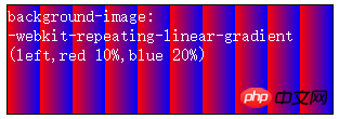
渐变重复:-webkit-repeating-linear-gradient(起点,color1 定位,color2 定位,...,colorN 定位);

径向渐变:参考
radial-gradient(position,shape,size,color);
position:定义径向渐变的圆心位置
shape:定义径向渐变的形状
size:确定径向渐变的结束形状大小
color:颜色


-
图中的at前的2个值是渐变大小(就是控制渐变形状的),at后的两个值是圆心
重复径向渐变:repeating-radial-gradient
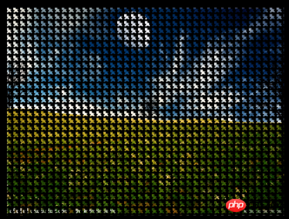
遮罩:-webkit-mask
div{
    /* 要配合背景使用 */
    background:url("1.jpg") no-repeat 50% 50%/100% 100%;
    -webkit-mask: url(1.png) 30px 10px/10px 10px;
}
nbsp;html>


    <meta>
    <title>Title</title>
    <style>

        body{
            background: #000;
        }
        div{
            width: 400px;
            height: 300px;
            border:12px solid #000;/* 没起作用 */
            background:url("1.jpg") no-repeat 50% 50%/100% 100%;
            -webkit-mask: url(1.png) 30px 10px/10px 10px;
        }
    </style>


<div></div>
图片大小:background-size
关键字:cover 等比缩放,保证填满容器,(配合背景定位,就实现图片居中了)
关键字:contain 等比缩放,容器可能会有缝隙
数值:x-控制图片宽, y-控制图片高
The above is the detailed content of Detailed introduction to properties related to css background. For more information, please follow other related articles on the PHP Chinese website!

Hot AI Tools

Undresser.AI Undress
AI-powered app for creating realistic nude photos

AI Clothes Remover
Online AI tool for removing clothes from photos.

Undress AI Tool
Undress images for free

Clothoff.io
AI clothes remover

Video Face Swap
Swap faces in any video effortlessly with our completely free AI face swap tool!

Hot Article

Hot Tools

Notepad++7.3.1
Easy-to-use and free code editor

SublimeText3 Chinese version
Chinese version, very easy to use

Zend Studio 13.0.1
Powerful PHP integrated development environment

Dreamweaver CS6
Visual web development tools

SublimeText3 Mac version
God-level code editing software (SublimeText3)

Hot Topics
 1675
1675
 14
14
 1429
1429
 52
52
 1333
1333
 25
25
 1278
1278
 29
29
 1257
1257
 24
24
 How to use bootstrap in vue
Apr 07, 2025 pm 11:33 PM
Using Bootstrap in Vue.js is divided into five steps: Install Bootstrap. Import Bootstrap in main.js. Use the Bootstrap component directly in the template. Optional: Custom style. Optional: Use plug-ins.
 Understanding HTML, CSS, and JavaScript: A Beginner's Guide
Apr 12, 2025 am 12:02 AM
WebdevelopmentreliesonHTML,CSS,andJavaScript:1)HTMLstructurescontent,2)CSSstylesit,and3)JavaScriptaddsinteractivity,formingthebasisofmodernwebexperiences.
 The Roles of HTML, CSS, and JavaScript: Core Responsibilities
Apr 08, 2025 pm 07:05 PM
HTML defines the web structure, CSS is responsible for style and layout, and JavaScript gives dynamic interaction. The three perform their duties in web development and jointly build a colorful website.
 How to insert pictures on bootstrap
Apr 07, 2025 pm 03:30 PM
There are several ways to insert images in Bootstrap: insert images directly, using the HTML img tag. With the Bootstrap image component, you can provide responsive images and more styles. Set the image size, use the img-fluid class to make the image adaptable. Set the border, using the img-bordered class. Set the rounded corners and use the img-rounded class. Set the shadow, use the shadow class. Resize and position the image, using CSS style. Using the background image, use the background-image CSS property.
 How to write split lines on bootstrap
Apr 07, 2025 pm 03:12 PM
There are two ways to create a Bootstrap split line: using the tag, which creates a horizontal split line. Use the CSS border property to create custom style split lines.
 How to set up the framework for bootstrap
Apr 07, 2025 pm 03:27 PM
To set up the Bootstrap framework, you need to follow these steps: 1. Reference the Bootstrap file via CDN; 2. Download and host the file on your own server; 3. Include the Bootstrap file in HTML; 4. Compile Sass/Less as needed; 5. Import a custom file (optional). Once setup is complete, you can use Bootstrap's grid systems, components, and styles to create responsive websites and applications.
 How to resize bootstrap
Apr 07, 2025 pm 03:18 PM
To adjust the size of elements in Bootstrap, you can use the dimension class, which includes: adjusting width: .col-, .w-, .mw-adjust height: .h-, .min-h-, .max-h-
 How to use bootstrap button
Apr 07, 2025 pm 03:09 PM
How to use the Bootstrap button? Introduce Bootstrap CSS to create button elements and add Bootstrap button class to add button text


