
display:box; is a newly added box model attribute of CSS3. The classic layout application is the vertical equal height, horizontal division, and proportional division of the layout.
Currently the box-flex attribute is not fully supported by firefox, Opera, and chrome browsers, but their private attributes can be used to define firefox (-moz-), opera (-o-), chrome/safari (-webkit-).
1. box-flex attribute
1. Horizontal equal width box
Code:
<html>
<head>
<style>
.wrap{
    width:600px;
    height:200px;
    display:box;
    display:-moz-box;
    display:-webkit-box;
}
.sectionOne{
    background:orange;
    box-flex:1;
    -moz-box-flex:1;
    -webkit-box-flex:1;
}
.sectionTwo{
    background:purple;
    box-flex:1;
    -moz-box-flex:1;
    -webkit-box-flex:1;
}
.sectionThree{
    background:green;
    box-flex:1;
    -moz-box-flex:1;
    -webkit-box-flex:1;
}
</style>
</head>
<body>
<article class="wrap">
    <section class="sectionOne">01</section>
    <section class="sectionTwo">02</section>
    <section class="sectionThree">03</section>
</article>
</body>
</html>Display effect:

Note: The parent element style must use display:box; to divide the child elements in the parent container; the child element style uses the box-flex attribute to specify the proportion (number of copies) in the parent container . The above is an equal-width division. The three sub-containers have the attribute box-flex: 1; in total, the parent container is divided into three parts according to the width, so the sub-containers are divided into equal widths.
Note: If display:box is specified, the container is defined as an inline element. Using margin:0px auto to center it is invalid. To center it, you can only use the text of its parent container. -align:center.
2. Customize the divided width ratio
Change the box-flex:1; in the above CSS code to a different ratio.
Code:
<style>
.wrap{
    width:600px;
    height:200px;
    display:box;
    display:-moz-box;
    display:-webkit-box;
    text-align:center;
}
.sectionOne{
    background:orange;
    box-flex:1;
    -moz-box-flex:1;
    -webkit-box-flex:1;
}
.sectionTwo{
    background:purple;
    box-flex:2;
    -moz-box-flex:2;
    -webkit-box-flex:2;
}
.sectionThree{
    background:green;
    box-flex:3;
    -moz-box-flex:3;
    -webkit-box-flex:3;
}
</style>Display effect:

Instructions: Understand by yourself.
3. Processing of fixed-width sub-elements (fixed-width margin)
If one or more sub-elements in the parent element have a fixed width set, and other sub-elements have not been set, the calculation method is : The width value of the child element that is set to a fixed width is fixed to the set value, and other child elements that are not set are divided according to the allocation ratio based on the remaining width of (parent element width - width of all fixed-width child elements).
Code (changed to the above code):
.sectionOne{
    background:orange;
    width:300px;//设置固定宽度
}Display effect:
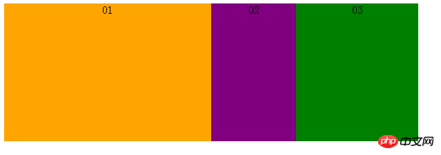
If margin is set, margin is also included in the fixed width Within, the remaining width is divided.
Code (changed to the above code):
<style>
.wrap{
    width:600px;
    height:200px;
    display:box;
    display:-moz-box;
    display:-webkit-box;
    text-align:center;
}
.sectionOne{
    background:orange;
    box-flex:1;
    -moz-box-flex:1;
    -webkit-box-flex:1;
}
.sectionTwo{
    background:purple;
    box-flex:1;
    -moz-box-flex:1;
    -webkit-box-flex:1;
    margin:0 50px;//添加margin宽度
}
.sectionThree{
    background:green;
    box-flex:1;
    -moz-box-flex:1;
    -webkit-box-flex:1;
}
</style>Display effect:
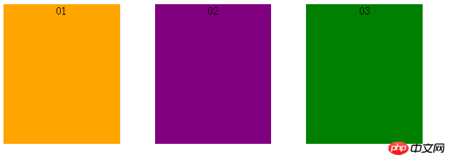
The width of each block is after subtracting the left and right margin: 100px 166.7px instead of 200px, and the layout is also equally distributed.
2. Other attributes of box
Other attributes include: box-orient | box-direction | box-align | box-pack | box-lines.
1. The role of the box-orient attribute: determines the arrangement of child elements in the parent element, whether horizontally or vertically.
Attribute values: horizontal | vertical | inline-axis | block-axis | inherit.
If the parent element box-orient:horizontal; or box-orient:inline-axis;, to arrange the child elements horizontally is to divide the width of the parent element. (At this time, if the parent element defines a height value, the height value setting of its child elements will be invalid. The height of all child elements is equal to the height value of the parent element; if the parent element does not set a height value, the height value of its child elements will be valid. And take the height of the child element with the maximum height value.) The height of the child element will exceed the height set by the parent element, and each child element has its own set height, which is inconsistent. The instructions in parentheses need to be verified, the code and the display effect. as follows.
Code:
<style>
.wrap{
    width:600px;
    height:200px;
    display:box;
    display:-moz-box;
    display:-webkit-box;
    text-align:center;
    -moz-box-orient:inline-axis;
    -webkit-box-orient:inline-axis;
}
.sectionOne{
    background:orange;
    height:100px;
    box-flex:1;
    -moz-box-flex:1;
    -webkit-box-flex:1;
}
.sectionTwo{
    background:purple;
    height:200px;
    box-flex:1;
    -moz-box-flex:1;
    -webkit-box-flex:1;
}
.sectionThree{
    background:green;
    height:300px;
    box-flex:1;
    -moz-box-flex:1;
    -webkit-box-flex:1;
}
</style>Display effect:

If the parent element box-orient:vertical;l or box-orient:block- axis; (this attribute is the default value), vertically arranging child elements is to divide the height of the parent element. (At this time, if the parent element defines a width value, the width value setting of its child elements will be invalid; if the parent element does not set a width value, the width value of its child elements will be valid and the width of the child element with the largest width value will be taken.) Same as above. I personally tested that the width of the child element will exceed the height set by the parent element, and each child element has its own set width, which is inconsistent. The instructions in brackets need to be verified. The code and display effect are as follows.
Code:
<style>
.wrap{
    width:600px;
    height:200px;
    display:box;
    display:-moz-box;
    display:-webkit-box;
    text-align:center;
    -moz-box-orient:vertical;
    -webkit-box-orient:vertical;
}
.sectionOne{
    background:orange;
    width:500px;
    box-flex:1;
    -moz-box-flex:1;
    -webkit-box-flex:1;
}
.sectionTwo{
    background:purple;
    width:600px;
    box-flex:1;
    -moz-box-flex:1;
    -webkit-box-flex:1;
}
.sectionThree{
    background:green;
    width:700px;
    box-flex:1;
    -moz-box-flex:1;
    -webkit-box-flex:1;
}
</style>Display effect:

box-orient:inherit; is set to inherit the value of the parent element.
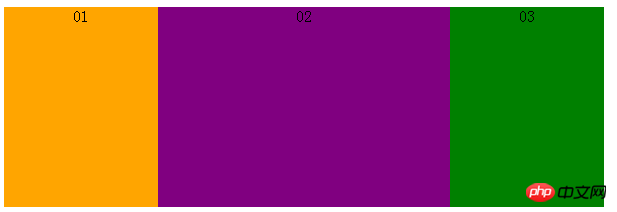
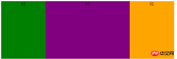
2. Box-direction
Attribute function: Determine the order of child elements in the parent element, whether it is normal order or reverse order.
Attribute value: normal | reverse | inherit.
该属性值很好理解,父元素属性box-direction:normal;指按照html标签的正常顺序排列子元素,box-direction:reverse;指按照反转(反序)顺序排列子元素,box-direction:inherit;指继承父元素的改值。直接给出展示效果。
展示效果(正序):
展示效果(反序):
3.box-align
属性作用:确定父元素里面子元素的垂直对齐方式。
属性值:start | end | center | baseline | stretch。
box-align:start;表示子元素居顶对齐,展示效果:
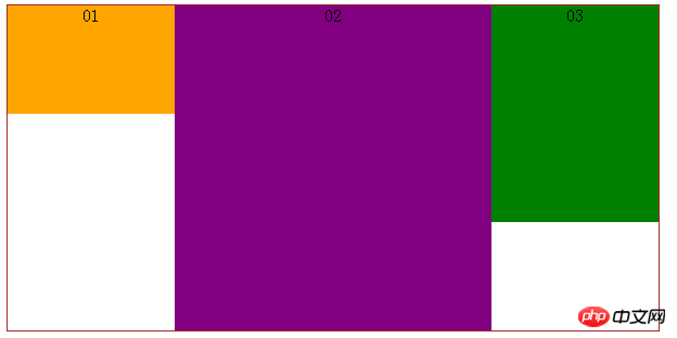
box-align:end;表示子元素居底对齐,展示效果:
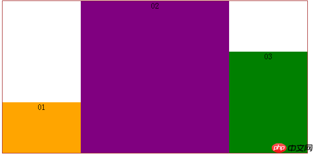
box-align:center;表示子元素居中对齐,展示效果:
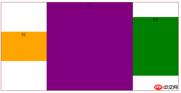
4、box-pack
属性作用:确定父元素里面定宽子元素的水平对齐方式。
属性值:start | end | center | justify。
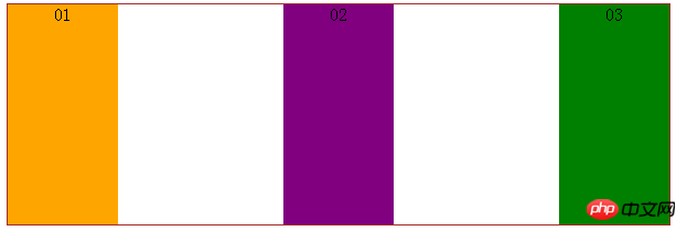
代码:
<style>
.wrap{
    width:600px;
    height:200px;
    display:box;
    display:-moz-box;
    display:-webkit-box;
    text-align:center;
    border:1px solid brown;
    -webkit-box-pack:justify;
}
.wrap section{
    width:100px;
}
.sectionOne{
    background:orange;
}
.sectionTwo{
    background:purple;
}
.sectionThree{
    background:green;
}
</style>box-pack:start;表示子元素整体水平居左对齐,展示效果:
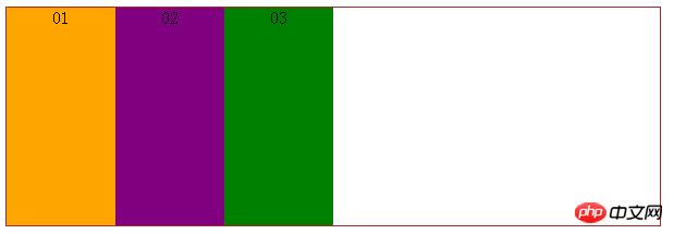
box-pack:end;表示子元素整体居右对齐,展示效果:
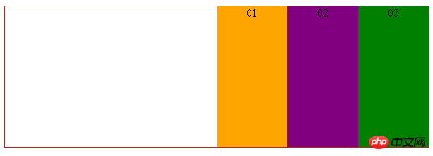
box-pack:center;表示子元素整体居中对齐,展示效果:

box-pack:justify;表示子元素水平等分父元素宽度,展示效果:
The above is the detailed content of Detailed explanation of CSS3's display:box box model attribute. For more information, please follow other related articles on the PHP Chinese website!
 Introduction to java core technology content
 What is the difference between 4g and 5g mobile phones?
 Problems with your wireless adapter or access point
 What are the commonly used functions of informix?
 How to generate random numbers in js
 navigator.appname
 The running environment of java program
 ^quxjg$c
 Computer application areas


