
Foreword
Due to the positioning problem of HTML language, achieving centering in web pages is not as simple as in Word. Especially when the content style is changing and the width and height of the content are variable, achieving reasonable centering also tests the experience of engineers. There are many articles about centering on the Internet, but they are not complete, so Xiaoqie will summarize various solutions to achieve centering using pure CSS today. If there is anything inappropriate in the article, please point it out!
<style type="text/css">
    .wrp {
        background-color: #b9b9b9;
        width: 240px;
        height: 160px;
    }
    .box {
        color: white;
        background-color: #3e8e41;
        width: 200px;
        height: 120px;
        overflow: auto;
    }
    .wrp1 { position: relative; }
    .box1 {
        margin: auto;
        position: absolute;
        left: 0; right: 0; top: 0; bottom: 0;
    }
</style>
<div class="wrp wrp1">
    <div class="box box1">
        <h3>完全居中层1:</h3>
        <h3>开发工具 【 WeX5 】: 高性能轻架构、开源免费、跨端、可视化</h3>
    </div>
</div>Effect:
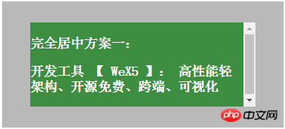
Implementation principle: Use css positioning rules, set the left and right, up and down positioning to 0, margin to auto, let css calculate the margin value based on positioning, and use a hack to achieve centering. The ruler of the center block (green)
The size needs to be controllable, because CSS also needs to refer to the size value when calculating margin. Since the four sides are 0, the automatically calculated size is the same as the parent container. Whether it is setting width, height or max-
height, max-width, all prevent the size from expanding to the same size as the parent.
<style type="text/css">

.wrp2 { position: relative; }
.box2 {
    position: absolute;
    top: 50%; left: 50%;
    margin-left: -100px; /* (width + padding)/2 */
    margin-top: -75px; /* (height + padding)/2 */
}
</style>
<div class="wrp wrp2">

<div class="box box2">
    <h3>完全居中方案二:</h3>
    <h3>开发工具 【 WeX5 】: 高性能轻架构、开源免费、跨端、可视化</h3>
</div>
</div>Effect:
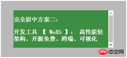
Implementation principle: Since top and left are offset by 50% of the height and width of the parent object , you need to use margin to reversely offset 50% of the width and height of the centered block. Percentage cannot be used in margin, because percentage is for
It belongs to the parent object, so you need to manually calculate the fixed value and specify the margin value. This solution requires a fixed size value to calculate the margin reverse bias value, so solution 2 is slightly worse than solution 1!
<style type="text/css">

.wrp3 { position: relative; }
.box3 {
    margin: auto;
    position: absolute;
    top: 50%; left: 50%;
    -webkit-transform: translate(-50%, -50%);
    -ms-transform: translate(-50%, -50%);
    transform: translate(-50%, -50%);
}
</style>
<div class="wrp wrp3">

<div class="box box3">
    <h3>完全居中方案三:</h3>
    <h3>开发工具 【 WeX5 】: 高性能轻架构、开源免费、跨端、可视化</h3>
</div>Effect:

Implementation principle: Scheme 3 has the same principle as Scheme 2! The difference is that transform is used instead of margin for reverse offset. Since the calculation basis of transform is the element itself, 50% can be used for reverse offset here. This solution also requires a fixed size value, based on which the browser calculates positioning!
<style type="text/css">

.wrp4 { display: table; }
.subwrp4 {
    display: table-cell;
    vertical-align: middle;
}
.box4 {
    margin: auto;
    overflow-wrap: break-word;
    height: auto;
    max-height: 80%;
    max-width: 80%;
}
</style>
<div class="wrp wrp4">

<div class="subwrp4">
    <div class="box box4">
        <h3>完全居中方案四:</h3>
    </div>
</div>
</div>Effect:
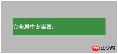
Implementation principle: Option 4 has a better implementation effect. The size of the center block can be used for wrapping. The disadvantage is that a table-cell layer is added to achieve vertical centering. The centered block of option 4 can be set to max-
height, max-width, and the centered block can have vertical wrapping properties. Since the horizontal direction is inside the table-cell, max-width will be displayed directly, that is, the width will become larger.
<style type="text/css">
.wrp5 {
text-align: center;
overflow: auto;
}
.box5 {
display: inline-block;
vertical-align: middle;
width: auto;
height: auto;
max-width: 90%;
max-height: 90%;
}
.wrp5:after {
content: '';
display: inline-block;
vertical-align: middle;
height: 100%;
margin-left: -0.25em;
/* To offset spacing. May vary by font */
}
</style>
<div class="wrp wrp5">
<div class="box box5">
<h3>完全居中方案五:</h3>
<h3>开发工具 【 WeX5 】: 高性能轻架构、开源免费、跨端、可视化</h3>
</div>
</div>Effect:
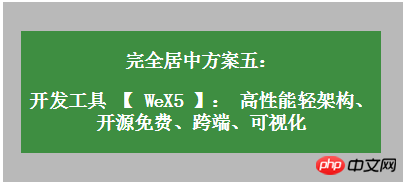
Implementation principle: Principle: Use inline-block's vertical-align: middle to align the after pseudo-element. The height of the after pseudo-element is the same as the parent object, thus achieving alignment in the height direction. Option 5 achieves better results. The size of the center block can be used for wrapping and adaptive content, and the compatibility is also quite good. The disadvantage is that horizontal centering requires consideration of the white space in the inline-block interval (the legacy of code line breaks.). The centered block in Scheme 4 can set max-height and max-width, and the centered block can be adaptive in both horizontal and vertical directions.
<style type="text/css">

.wrp6 {
    display: -webkit-flex;
    display: -moz-box;
    display: -ms-flexbox;
    display: -webkit-box;
    display: flex;
    -webkit-box-align: center;
    -moz-box-align: center;
    -ms-flex-align: center;
    -webkit-align-items: center;
    align-items: center;
    -webkit-box-pack: center;
    -moz-box-pack: center;
    -ms-flex-pack: center;
    -webkit-justify-content: center;
    justify-content: center;
}

.box6 {
    width: auto;
    height: auto;
    max-width: 90%;
    max-height: 90%;
}
</style>
<div class="wrp wrp6">

<div class="box box6">
    <h3>完全居中方案六:</h3>
    <h3>开发工具 【 WeX5 】: 高性能轻架构、开源免费、跨端、可视化</h3>
</div>
</div>Effect:
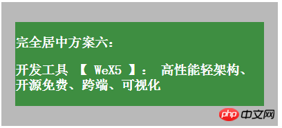
Implementation principle: flexbox layout. This is the ultimate layout method, specially designed to solve various layout and positioning problems! Advantages: It can solve various arrangement and layout problems, and the implementation method is consistent with human cognition. Disadvantages: Some old browsers on PC do not have high support.
The above is the detailed content of Introduction to 6 ways to achieve perfect vertical and horizontal centering using CSS. For more information, please follow other related articles on the PHP Chinese website!


