Preface
One of the most common solutions on the Internet is to relative in the parent element, and then absolute in the child element. This solution is certainly good, but one disadvantage is that it will change the hierarchical relationship of elements. If used in multiple places, such a cascading and nested relationship will be very confusing. This article will temporarily abandon that solution and share with you several CSS background image positioning solutions.
1. Dependency-free absolute positioning
On the Internet, there is a misunderstanding about absolute. It is believed that the use of absolute positioning absolute must set the relative positioning of the parent element relative. . This understanding cannot be considered wrong, it can only be said that the definition is not fully understood. Absolute is defined in the W3C document like this:
Generate an absolutely positioned element and position it relative to the first parent element other than static positioning. The position of the element is specified through the 'left', 'right', 'bottom' and 'top' attributes.
The understanding of this sentence should be as follows (L: left, R: right, B: bottom, T: top)
a: When position:absolute is set to an element, if If the parent element does not set position: relative, the element is positioned according to the upper left corner of the visual window area through LRBT; if the parent element sets position: relative, the element is positioned according to the upper left corner of the parent element container through LRBT.
b: When generating absolutely positioned elements, regardless of whether the parent element is set to position:relative, use two non-opposite directions of margin-top, margin-left, margin-right, and margin-bottom. Positioning, its effect will be like relative positioning, positioning based on its own position. However, the only difference between using margin positioning and relative is that absolute is separated from the document flow and the original physical space has disappeared, while relative is not separated from the document flow and the original physical space is still occupied.
So, you can use absolute without dependencies for positioning. The positioning method is to use margin, but not LRBT.
The code is as follows:
<p class="keith">
        <p class="main"></p>
<p>        </p>
</p>.keith {
margin: 2em;
width: 5em;
height: 5em;
background: lightgreen;
}</p>
<p>.keith .main {
position: absolute;
background: url("../images/my-icons/Loginicon.png") scroll no-repeat 0 0;
width: 21px;
height: 21px;
margin-left: calc(5em - 25px);
margin-top: calc(5em - 25px);
}
In the above code, margin-left, margin-top and position:absolute are used to position the image. Use calc() in CSS3 to calculate the value that needs to be positioned.
The sample picture is as follows: 
2.background-position extended syntax
in CSS3 background and border , the background-position property has been extended, which allows us to specify the offset of the background image from any corner, as long as we specify the keyword in front of the offset.
The code is as follows:
<p class="keith"></p>
.keith{
    margin:2em;
    width:5em;
    height:5em;
    background:lightgreen url('../images/my-icons/Loginicon.png') scroll no-repeat ;
    background-position:right 5px bottom 5px;
};
In the above code, using the background-position extension syntax can achieve positioning 5px away from the lower right corner.
3.background-origin positioning
background-origin is a new attribute in CSS3. It is mainly used to determine the reference origin of the background-position attribute, that is, to determine the background. The starting point for image positioning. By default, the background-position attribute of the background image always positions the background image based on the upper left corner of the element.
Background-origin has three attribute values: content-box, padding-box (default value), and border-box.
Let’s see how to use this attribute to position the background image at 5px in the lower right corner. The code is as follows.
<p class="keith"></p>
.keith {
  margin: 2em;
  width: 5em;
  height: 5em;
  padding: .5em;
  background: lightgreen url("../images/my-icons/Loginicon.png") scroll no-repeat;
  background-position: right bottom;
  -moz-background-origin: content;
  -o-background-origin: content-box;
  -webkit-background-origin: content;
  background-origin: content-box;
  -moz-box-sizing: border-box;
  -webkit-box-sizing: border-box;
  box-sizing: border-box;
}
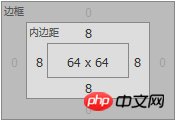
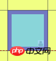
In the above code, the padding value is set for the box. Use the box-sizing attribute to adjust the box model of p under the browser to the IE box model. Border-box means total width = content area + padding + border. The content-box is set for the background-origin attribute here. You may not understand why it is not padding-box. Look at a screenshot under Firefox. 

#In the above picture, the yellow area is margin, the purple area is padding, and the light blue area is content-area. If padding-box is set for the element, then the image will be positioned in the lower right corner without any space from the lower right corner. Therefore, content-box should be used for positioning at this time. The final effect is as follows. 
4.calc() positioning
If we want to expand the width and height of the container through the content, without When fixing the height and width, you need to use the calc attribute + background-position attribute in combination to position the image. Because the height and width of the container are not known at this time, only 100% can be used for calculation.
<p class="keith">
        这是一段文字,用于撑开容器。
</p>.keith{
margin:2em;
padding:2em;
display:inline-block;
background:lightgreen url('../images/my-icons/Loginicon.png') scroll no-repeat;
background-position:calc(100% - 5px) calc(100% - 5px);
}</p>
<p>
Sample pictures are as follows: 
The above is the detailed content of Summary of common methods for positioning background images using CSS. For more information, please follow other related articles on the PHP Chinese website!
 How to uniformly replace ppt background images
 How to set ppt background picture
 WAN access settings
 What to do if the documents folder pops up when the computer is turned on
 What is a MYSQL stored procedure?
 How to set both ends to be aligned in css
 How to open xml file
 How to fix the computer default gateway is unavailable
 jndi connect database


