In CSSAnimation, using Transition technology is an "implicit" animation method, and correspondingly, there is an "explicit" animation technology, that is, you can use it in CSS Directly specify the animation effect, which requires the use of keyframes properties.
Demonstration: Falling Autumn Leaves Animation
The above CSS animation demonstration of "Autumn Leaves Falling Animation" should be very exciting, fully demonstrating the excellent characteristics of CSS animation.
Let’s introduce step by step how to create keyframes animation, starting with a bouncing box.
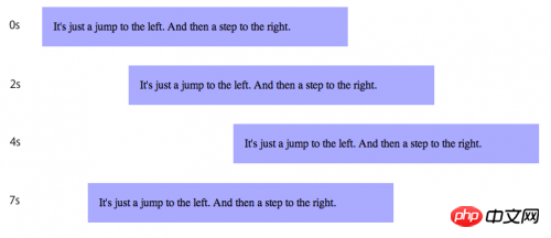
Demonstration: Bouncing Box

It is very simple to declare such an animation effect with CSS. First, use @keyframes to describe animation effect rules.
@keyframes bounce {
 from {
   left: 0px;
 }
 to {
   left: 200px;
 }
}In a @keyframes code block, there is a series of CSS rules, collectively called keyframes. A keyframe defines an animation style at a certain moment in a complete animation. The animation drawing engine will realize the transition between various styles smoothly and smoothly. In the above animation defined as "bounce", there are two keyframes: one is the animation's starting state (the "from" code block) and the ending state (the "to" code block). Once the animation is defined, we can use animation-name to associate it with the animation target element.
p {
 animation-name: bounce;
 animation-duration: 4s;
 animation-iteration-count: 10;
 animation-direction: alternate;
}The “bounce” animation is bound to the above CSS rule, and the duration of the animation is set to 4 seconds. It will be executed 10 times in total, with intervals of reverse execution.
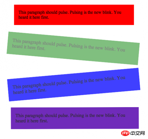
Next, we are going to create a more complex animation, involving rotation, background color, transparency and other technologies, which requires the use of multiple keyframes.
@keyframes pulse {
 0% {
   background-color: red;
   opacity: 1.0;
   transform: scale(1.0) rotate(0deg);
 }
 33% {
   background-color: blue;
   opacity: 0.75;
   transform: scale(1.1) rotate(-5deg);
 }
 67% {
   background-color: green;
   opacity: 0.5;
   transform: scale(1.1) rotate(5deg);
 }
 100% {
   background-color: red;
   opacity: 1.0;
   transform: scale(1.0) rotate(0deg);
 }
}

.pulsedbox {
 animation-name: pulse;
 animation-duration: 4s;
 animation-direction: alternate;
 animation-timing-function: ease-in-out;
} The Keyframes here use percentages to represent the action scenes at each stage of the animation. The previous "from" and "to" keywords are actually equivalent to "0%" and "100%".
The purpose of CSS Keyframes animation is to provide WEB developers with an easier way to create colorful page effects. Most animation effects are expressive in nature and therefore belong to the browser style system. Programmers can create these effect animations by simply declaring styles, completely replacing the previous manual implementation using
JavaScripttechnology. 【Related recommendations】
1.
Free css online video tutorialcss online manual php.cn Dugu Jiujian (2)-css video tutorialThe above is the detailed content of CSS Keyframes Animation Example Tutorial. For more information, please follow other related articles on the PHP Chinese website!


