Sample code sharing for CSS3 fonts and text effects
CSS3 allows us to use custom fonts
There are also some good text effects
Custom fonts
Using custom fonts requires using @font-face rules
Of course you must first have a custom text file
<p class="demo">Payen S.Tsung</p>
@font-face {    font-family: myDIYfont; /*自定义字体名*/
    src: url('Ginga.ttf'); /*字体文件*/}.demo {    font-family: myDIYfont;}
If we also have a font file in bold format
You can use it like this
@font-face { font-family: myDIYfont; src: url('Ginga_bold.ttf'); font-weight: bold;}.demo { font-family: myDIYfont;}@font-face Each browser has compatibility issues
We can add format format after the srcattribute like this src: url('Ginga.ttf') format('truetype');
Browser compatibility:
url('font.eot?#iefix' ) format('embedded-opentype'), /* IE6-IE8 */
url('ont.woff') format('woff'), /* chr ome、firefox */
url('font.ttf') format('truetype'), /* chrome, firefox, opera, Safari, Android, iOS 4.2+*/
- ##url('font.svg#fontname') format('svg'); /* iOS 4.1- */
Introducing two
word-wrap<p class="demo">honorificabilitudinitatibus</p>
Copy after login.demo { width: 100px; height: 100px; border: 1px solid black;}Copy after login
<p class="demo">honorificabilitudinitatibus</p>
.demo { width: 100px; height: 100px; border: 1px solid black;}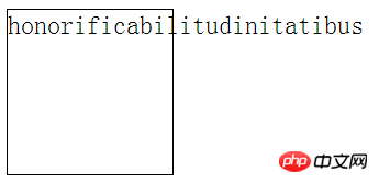
For all line breaking rules for non-Chinese, Japanese and Korean text, we can use word-wrap to force line breaks
.demo { width: 100px; height: 100px; border: 1px solid black; word-break: keep-all;}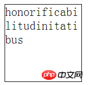
In fact, the two are the same
Text-shadowtext-shadow
This property is very similar to box-shadow but not quite the sameOnly it is the shadow of the text rather than the box shadow
It is also very performance consuming and should be used sparingly
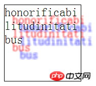
Attribute values include horizontal shadow distance, vertical shadow distance, blur radius (optional), color (optional)
You can also define multiple shadows
The difference between box-shadow It has no shadow size and shadow mode
.demo {    width: 100px;    height: 100px;    border: 1px solid black;    word-break: break-all;    text-shadow: 10px 10px 2px red,                 20px 20px 3px blue;
}
<p class="demo">this is a text</p>
.demo { text-shadow: 2px 2px 5px;}
The above is the detailed content of Sample code sharing for CSS3 fonts and text effects. For more information, please follow other related articles on the PHP Chinese website!

Hot AI Tools

Undresser.AI Undress
AI-powered app for creating realistic nude photos

AI Clothes Remover
Online AI tool for removing clothes from photos.

Undress AI Tool
Undress images for free

Clothoff.io
AI clothes remover

Video Face Swap
Swap faces in any video effortlessly with our completely free AI face swap tool!

Hot Article

Hot Tools

Notepad++7.3.1
Easy-to-use and free code editor

SublimeText3 Chinese version
Chinese version, very easy to use

Zend Studio 13.0.1
Powerful PHP integrated development environment

Dreamweaver CS6
Visual web development tools

SublimeText3 Mac version
God-level code editing software (SublimeText3)

Hot Topics
 1657
1657
 14
14
 1415
1415
 52
52
 1309
1309
 25
25
 1257
1257
 29
29
 1229
1229
 24
24
 win10 font folder path details
Jan 03, 2024 pm 08:37 PM
When inputting text, many friends like to add their favorite personalized fonts, but they do not know where the font folder path of the win10 system is and cannot add fonts. The following will introduce the specific folder path to you. Win10 font folder path: 1. Click "This PC" on the desktop. 2. Enter the system disk C drive. 3. Click the “windows” folder. 4. Pull down to find the "Fonts" folder. 5. You can enter the font library. Friends who have other questions can take a look to learn more about common problems with win10 fonts~
 How to change the font in Outlook on Apple mobile phone
Mar 08, 2024 pm 04:46 PM
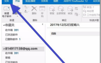
How to change the font in Outlook on Apple mobile phone? First open the Outlook software and click on the file in the upper left corner of the interface. You can set the font according to your own preferences. After the settings are completed, click the OK button. Let’s take a look! How to change the font in Outlook on Apple mobile phone 1. Open the Outlook software and click the "File" option in the upper left corner of the interface. 2. In the list that appears, find "Options" and click to enter. 3. On the left side of the option list, click "Mail". 4. Next, select “Letter and Fonts”. 5. If you want to set the font for new emails, reply emails, or composing, click the corresponding option to enter the settings. 6. Set the font according to personal preference. After the setting is completed, click OK
 How to solve win11 font blur problem
Jan 13, 2024 pm 09:00 PM
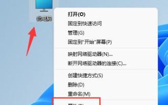
After updating the win11 system, some friends found that their win11 fonts were blurred and very uncomfortable to use. This may be due to a bug in the system version, or it may be that we have turned on special effects. Let’s follow the editor. Let’s see how to solve it. Win11 fonts are blurred: Method 1: 1. First, right-click this computer and open "Properties" 2. Then enter "Advanced System Settings" in the related link 3. Then click "Settings" in Performance to open it. 4. Under "Visual Effects" check "Adjust for Best Performance" and click "OK" to save. Method 2: 1. Right-click a blank space on the desktop and open "Display Settings" 2. Click "Zoom" under Zoom and Layout 3. Then click "Text Size" under relevant settings
 How to adjust the font, style, and size of Notepad in Windows 11
Sep 23, 2023 pm 11:25 PM
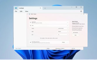
Many users want to change the font in Notepad on Windows 11 because the default font is too small or difficult to read for them. Changing fonts is quick and easy, and in this guide, we'll show you how to customize Notepad and change the font to suit your needs. What font does Windows 11 Notepad use by default? As for the default font options, Notepad uses the Consolas font and the default font size is set to 11 pixels. How to change Notepad font size and style in Windows 11? Use the Edit menu in Notepad to click the search button and type notepad. Select Notepad from the list of results. In Notepad, click the Edit menu and select Fonts. You should now see the settings in the left pane
 How to change the font of Xiaomi 11_How to change the font of Xiaomi 11
Mar 25, 2024 pm 07:26 PM
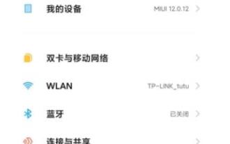
1. Open the phone settings and click [Display]. 2. Click [Font]. 3. Select the font you like or click [More Fonts] to download the application.
 How to make vivo mobile phone font larger and where to set it
Feb 24, 2024 pm 06:16 PM
How to make the font size of vivo mobile phone larger? Where can I set it? In vivo mobile phone, you can make the font size larger, but most users don’t know how to set the font size of vivo mobile phone. Next, the editor brings you the settings of how to make the font size of vivo mobile phone larger. Method graphic tutorials, interested users come and take a look! Vivo mobile phone usage tutorial How to make the font size of vivo mobile phone larger Where to set it 1. First open the [Settings] function in the vivo mobile phone and click on it; 2. Then jump to the settings interface and find the [Display and Brightness] function; 3. Then Reach the page in the picture below and click the [Font Size and Thickness] service; 4. Finally, slide the horizontal line in the picture below to adjust the font size.
 Detailed explanation of Win11 font installation method
Dec 27, 2023 pm 05:16 PM
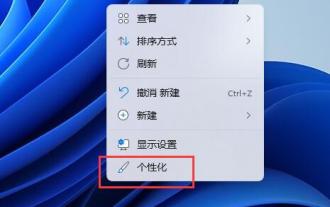
Some friends cannot find where their fonts are installed after installing win11 fonts, so they raise the issue of the installation location of win11 fonts. In fact, we can enter the font management in personalization to find the location where the fonts are installed. Let’s take a look below. Win11 font installation location: 1. First, right-click a blank space on the desktop and open "Personalization" settings. 2. Then enter the "Font" installation management settings. 3. Find the font you want and enter it. 4. If you can’t find it, you can also search directly above. 5. After entering the font, you can see the installation location of the win11 font in "Font File" under metadata. 6. If we want to uninstall the font, click Uninstall here.
 Detailed explanation of how to deal with all font shadows in Win10 computer
Jul 23, 2023 pm 11:13 PM
In the process of using the computer, some problems may occur due to improper operation and other situations. Recently, some netizens said that what to do with all the font shadows on their win10 computers, which affects viewing, and the icons on the desktop have shadows. The editor below will teach you how to clear all font shadows on your computer desktop. The specific steps are as follows: 1. First turn on the computer, enter the win+r key combination, open the run window, and enter gpedit.msc to confirm. 2. Find Enable ActiveDesktop, double-click it to open it, and disable it. 3. Next we need to open the disable ActiveDesktop button below, and then enable it. 4. Then open the system of the control panel, open its advanced system settings properties, and then enter the Properties


