 Web Front-end
 CSS Tutorial
 Detailed introduction to the transform attribute in CSS3 to achieve vertical and horizontal centering of divs with variable width and height
Detailed introduction to the transform attribute in CSS3 to achieve vertical and horizontal centering of divs with variable width and height
May 25, 2017 am 10:05 AMtransforThe role of m
transform AttributeApply 2D or 3D transformation to the element . This property allows us to rotate, scale, move or tilt the element. (w3cschool)
Transform compatibility
The compatibility of transform is relatively optimistic. It is not compatible below IE9. IE9 supports the alternative -ms-transform attribute but only supports 2D conversion.
Google and Safari support the -webkit-transform attribute instead. IE9 and above, Firefox and Open are compatible.
I believe that in actual projects, you will definitely encounter the problem of p's variable width and height, vertical and horizontal centering. I remember that I used js to implement it before.
In fact, there are several ways to use css to achieve it. But I personally think it is simpler and more convenient to use transform, but it is not compatible with browsers below IE9.
Now I will show you the examples used in recent projects

In writing wheel When playing pictures, the number of dots buttons below is determined based on the number of pictures. Therefore, when writing code, the width of these button elements cannot be fixed, and they must be displayed in the center.
       <p class="scroll">
            <p class="scroll_pic">
                <a href="#"><img src="img/pic1.jpg" alt=""/></a>
                <a href="#"><img src="img/pic2.jpg" alt=""/></a>
                <a href="#"><img src="img/pic3.jpg" alt=""/></a>
                <a href="#"><img src="img/pic.jpg" alt=""/></a>
            </p>
            <ul>
                <li class="scroll_in"></li>
                <li></li>
                <li></li>
                <li></li>
            </ul>
</p>.scroll {
width: 720px;
height: 410px;
margin: 0 auto;
margin-top: 100px;
overflow: hidden;
position: relative;
}.scroll ul {
padding: 10px 0px;
-webkit-transform: translateX(-50%);
-ms-transform: translateX(-50%);
transform: translateX(-50%);
position: absolute;
bottom: 0px;
left: 50%;
}.scroll ul li {
float: left;
margin: 0px 5px;
width: 16px;
height: 16px;
border-radius: 16px;
border:1px #73B613 solid;
background: #FCBE47;
box-sizing: border-box;
}.scroll ul li.scroll_in{
background:#FF6600;
}In the above example, these buttons are hosted on an ul element. The ul element does not have a fixed width and height. A positioning left:50% from the left is written. Fifty, if you don't write transform, it will not be centered, and the width on the right will include the width of its own ul.
transform: translateX(-50%); The function of this sentence is to move ul horizontally to the left by 50% of its width relative to its own position. This just achieves the effect we want.

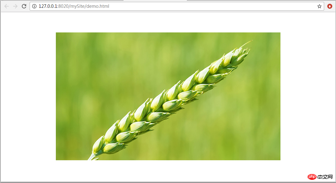
<p class="demo"> <img src="img/pic3.jpg" /></p>
.demo{
    position: fixed;
    top:50%;
    left:50%;
    transform:translate(-50%,-50%);
    -webkit-transform: translateX(-50%);
    -ms-transform: translateX(-50%);
}The above is the detailed content of Detailed introduction to the transform attribute in CSS3 to achieve vertical and horizontal centering of divs with variable width and height. For more information, please follow other related articles on the PHP Chinese website!

Hot Article

Hot tools Tags

Hot Article

Hot Article Tags

Notepad++7.3.1
Easy-to-use and free code editor

SublimeText3 Chinese version
Chinese version, very easy to use

Zend Studio 13.0.1
Powerful PHP integrated development environment

Dreamweaver CS6
Visual web development tools

SublimeText3 Mac version
God-level code editing software (SublimeText3)

Hot Topics
 How to achieve wave effect with pure CSS3? (code example)
Jun 28, 2022 pm 01:39 PM
How to achieve wave effect with pure CSS3? (code example)
 How to use CSS to achieve the rotating background animation effect of elements
Nov 21, 2023 am 09:05 AM
How to use CSS to achieve the rotating background animation effect of elements
 Use CSS skillfully to realize various strange-shaped buttons (with code)
Jul 19, 2022 am 11:28 AM
Use CSS skillfully to realize various strange-shaped buttons (with code)
 How to hide elements in css without taking up space
Jun 01, 2022 pm 07:15 PM
How to hide elements in css without taking up space
 It turns out that text carousel and image carousel can also be realized using pure CSS!
Jun 10, 2022 pm 01:00 PM
It turns out that text carousel and image carousel can also be realized using pure CSS!
 How to implement lace borders in css3
Sep 16, 2022 pm 07:11 PM
How to implement lace borders in css3
 How to enlarge the image by clicking the mouse in css3
Apr 25, 2022 pm 04:52 PM
How to enlarge the image by clicking the mouse in css3


