 Web Front-end
 CSS Tutorial
 Detailed explanation of CSS3+jQuery to implement circular progress bar
Detailed explanation of CSS3+jQuery to implement circular progress bar
The overall idea is: generate two semicircles through clipping to display a static progress bar, and then produce dynamic effects through rotation (rotate) angle changes.
Let’s first review two basic knowledge points
(1) An uncommon attribute of css:
clip: rect(top, right, bottom, left);
This attribute specifies a cropped rectangle, where top The offset specified by bottom is calculated from the top edge of the element box, and the offset specified by right and left is calculated from the left edge of the element box (required here The important thing to note is the calculation method of bottom and right). Look at the super clear picture below (I moved the picture from w3cplus directly, it’s not illegal to have a watermark, right?):
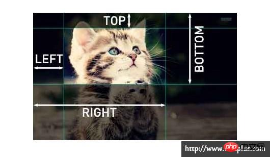
It should be noted that: The clip attribute can only work when the element is set with the "position:absolute" or "position:fixed" attribute. clip does not work on settings "position:relative" and "position:static".
About clip,
(2) Another property of CSS:
transform: rotate(deg);
Rotate a certain angle clockwise.
Warm-up exercise: Let’s draw a right semicircle
//html
<p class="pie-right">
    <p class="right"></p>
    <p class="mask"><span>0</span>%</p>
</p>
//css
.pie-right {
    position: absolute;
    top: 0;
    left: 0;
    height: 200px;
    width: 200px;
    border-radius: 50%;
    background: red;//注意这是表示当前进度的颜色
}
.right {
    position: absolute;
    top: 0;
    left: 0;
    height: 200px;
    width: 200px;
    border-radius: 50%;
    background: blue;//注意这个才不是当前进度的颜色
}
.pie-right, .right {
    clip: rect(0, auto, auto, 100px);
}
.mask {//我是遮罩
    position: absolute;
    top: 25px;
    left: 25px;
    height: 150px;
    width: 150px;
    background: #fff;
    border-radius: 50%;
    text-align: center;
}The effect is as follows:
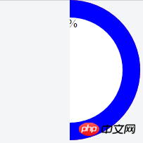
At this time, the element pie-right is completely obscured by the element right.
Then, let’s rotate it:
.right {
    transform: rotate(30deg);
}The effect after rotation is as follows:
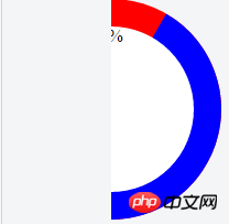
Now we can see When it is rotated 30 degrees, the red part exposed is the progress we want. This is the color of the pie-right element. The color of the right element in the blue part is the progress we have not yet reached.
Official start
Realizing the circular progress bar means that we need two semicircles on the left and right, so the html structure needs to be changed:
//html

<p class="circle">
    <p class="pie-right">
        <p class="right"></p>
    </p>
    <p class="pie-left">
        <p class="left"></p>
    </p>
    <p class="mask"><span>0</span>%</p>
</p>

//css
.circle {//这个元素可以提供进度条的颜色
    position: absolute;
    height: 200px;
    width: 200px;
    border-radius: 50%;
    background: red;//注意这是表示当前进度的颜色
}
.pie-right, .pie-left { //这俩元素主要是为了分别生成两个半圆的,所以起作用的地方在于clip裁掉另一半
    position: absolute;
    top: 0;
    left: 0;
    height: 200px;
    width: 200px;
    border-radius: 50%;
}
.right, .left {
    position: absolute;
    top: 0;
    left: 0;
    height: 200px;
    width: 200px;
    border-radius: 50%;
    background: blue;//注意这个才不是当前进度的颜色
}
.pie-right, .right { //裁掉左边一半
    clip: rect(0, auto, auto, 100px);
}
.pie-left, .left { //裁掉右边一半
    clip: rect(0, 100px, auto, 0);
}
.mask {//我是遮罩 mask不用改 好欣慰
    position: absolute;
    top: 25px;
    left: 25px;
    height: 150px;
    width: 150px;
    background: #fff;
    border-radius: 50%;
    text-align: center;
}The effect is similar:
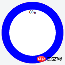
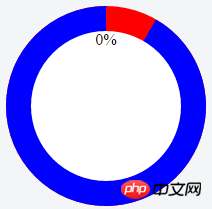
The progress is 0 at this time, let’s rotate it, first rotate 30 degrees
.right{
    transform: rotate(30deg);
}So it becomes like this:【 Always remember that the red part is the current progress. 】
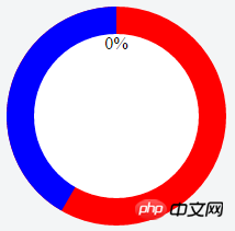
Then rotate 210 degrees to see the effect [210 degrees means the right side is completely rotated, and the left side is rotated 30 degrees]:
.right{
    transform: rotate(180deg);
}
.left{
    transform: rotate(30deg);
}looks like this:
Finally, when the progress value increases dynamically, the progress bar dynamics can be realized by changing the rotation angle through js Changed.
Every time the progress value increases by 1, the angle increases by 3.6 degrees. It should also be noted that when the progress is less than 50%, the left progress bar does not change. When it is greater than 50%, the left progress bar starts to change.
We can write a function:
function changeProcess(value) {
var num = value * 3.6;
if(num < 180) {
$('.right').css('transform', 'rotate(' + num + 'deg)');
} else {
$('.right').css('transform', 'rotate(180deg)');
$('.left').css('transform', 'rotate(' + (num-180) + 'deg)');
}
}When the progress value changes, just call this function.
The above is the detailed content of Detailed explanation of CSS3+jQuery to implement circular progress bar. For more information, please follow other related articles on the PHP Chinese website!

Hot AI Tools

Undresser.AI Undress
AI-powered app for creating realistic nude photos

AI Clothes Remover
Online AI tool for removing clothes from photos.

Undress AI Tool
Undress images for free

Clothoff.io
AI clothes remover

Video Face Swap
Swap faces in any video effortlessly with our completely free AI face swap tool!

Hot Article

Hot Tools

Notepad++7.3.1
Easy-to-use and free code editor

SublimeText3 Chinese version
Chinese version, very easy to use

Zend Studio 13.0.1
Powerful PHP integrated development environment

Dreamweaver CS6
Visual web development tools

SublimeText3 Mac version
God-level code editing software (SublimeText3)

Hot Topics
 1653
1653
 14
14
 1413
1413
 52
52
 1306
1306
 25
25
 1251
1251
 29
29
 1224
1224
 24
24
 Detailed explanation of jQuery reference methods: Quick start guide
Feb 27, 2024 pm 06:45 PM
Detailed explanation of jQuery reference method: Quick start guide jQuery is a popular JavaScript library that is widely used in website development. It simplifies JavaScript programming and provides developers with rich functions and features. This article will introduce jQuery's reference method in detail and provide specific code examples to help readers get started quickly. Introducing jQuery First, we need to introduce the jQuery library into the HTML file. It can be introduced through a CDN link or downloaded
 How to use PUT request method in jQuery?
Feb 28, 2024 pm 03:12 PM
How to use PUT request method in jQuery? In jQuery, the method of sending a PUT request is similar to sending other types of requests, but you need to pay attention to some details and parameter settings. PUT requests are typically used to update resources, such as updating data in a database or updating files on the server. The following is a specific code example using the PUT request method in jQuery. First, make sure you include the jQuery library file, then you can send a PUT request via: $.ajax({u
 In-depth analysis: jQuery's advantages and disadvantages
Feb 27, 2024 pm 05:18 PM
jQuery is a fast, small, feature-rich JavaScript library widely used in front-end development. Since its release in 2006, jQuery has become one of the tools of choice for many developers, but in practical applications, it also has some advantages and disadvantages. This article will deeply analyze the advantages and disadvantages of jQuery and illustrate it with specific code examples. Advantages: 1. Concise syntax jQuery's syntax design is concise and clear, which can greatly improve the readability and writing efficiency of the code. for example,
 jQuery Tips: Quickly modify the text of all a tags on the page
Feb 28, 2024 pm 09:06 PM
Title: jQuery Tips: Quickly modify the text of all a tags on the page In web development, we often need to modify and operate elements on the page. When using jQuery, sometimes you need to modify the text content of all a tags in the page at once, which can save time and energy. The following will introduce how to use jQuery to quickly modify the text of all a tags on the page, and give specific code examples. First, we need to introduce the jQuery library file and ensure that the following code is introduced into the page: <
 How to remove the height attribute of an element with jQuery?
Feb 28, 2024 am 08:39 AM
How to remove the height attribute of an element with jQuery? In front-end development, we often encounter the need to manipulate the height attributes of elements. Sometimes, we may need to dynamically change the height of an element, and sometimes we need to remove the height attribute of an element. This article will introduce how to use jQuery to remove the height attribute of an element and provide specific code examples. Before using jQuery to operate the height attribute, we first need to understand the height attribute in CSS. The height attribute is used to set the height of an element
 Use jQuery to modify the text content of all a tags
Feb 28, 2024 pm 05:42 PM
Title: Use jQuery to modify the text content of all a tags. jQuery is a popular JavaScript library that is widely used to handle DOM operations. In web development, we often encounter the need to modify the text content of the link tag (a tag) on the page. This article will explain how to use jQuery to achieve this goal, and provide specific code examples. First, we need to introduce the jQuery library into the page. Add the following code in the HTML file:
 Understand the role and application scenarios of eq in jQuery
Feb 28, 2024 pm 01:15 PM
jQuery is a popular JavaScript library that is widely used to handle DOM manipulation and event handling in web pages. In jQuery, the eq() method is used to select elements at a specified index position. The specific usage and application scenarios are as follows. In jQuery, the eq() method selects the element at a specified index position. Index positions start counting from 0, i.e. the index of the first element is 0, the index of the second element is 1, and so on. The syntax of the eq() method is as follows: $("s
 How to tell if a jQuery element has a specific attribute?
Feb 29, 2024 am 09:03 AM
How to tell if a jQuery element has a specific attribute? When using jQuery to operate DOM elements, you often encounter situations where you need to determine whether an element has a specific attribute. In this case, we can easily implement this function with the help of the methods provided by jQuery. The following will introduce two commonly used methods to determine whether a jQuery element has specific attributes, and attach specific code examples. Method 1: Use the attr() method and typeof operator // to determine whether the element has a specific attribute


