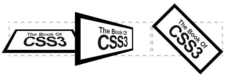
Rounded corners: border-radius Shadow: box-shadow Border image: border-image Box subtraction: box-sizing: border-box; Rounded corners: border-radius: pixels/percent One value sets the four corners of the box The horizontal and vertical radius of each corner can be set independently. The value order is upper left, upper right, upper right, lower right, lower left. Clockwise setting can be abbreviated. The logic is the same as padding and margin. The units support pixels and percentages (refer to width and height). ) You can use the horizontal radius/vertical radius to control the radius individually, and each radius can be controlled individually p:nth-child(5){ Border-radius: 0px 200px; } p:nth-child(7){ width: 400px; &
1. Detailed explanation of rounded corners and shadows, border images and box subtraction in CSS3

##Introduction: One value sets the horizontal and vertical radii of the four corners of the box. Each corner can be set independently. The order of values is upper left, upper right, lower right, lower left, and clockwise. Abbreviation, the logic is the same as padding and margin. The units support pixels and percentages (referring to width and height)
2. CSS3 rounded corners, box shadows and border images details Detailed explanation

Introduction: Today I started to organize the knowledge of CSS3. In fact, I should have written it last night, but it seems that it was I have acute gastroenteritis. I couldn't sleep all night because of the pain. Fortunately, I took an intravenous drip and slept well today. It seems I'd better be careful about what I eat. My stomach and intestines took revenge. CSS is not difficult, but While watching, you should try it on your browser. After trying it once, you will remember that CSS3 has compatibility issues in various browsers. Different browsers have private attributes with different prefixes, indicating that the attributes or rules have not yet been developed. Becoming a standard In other words, before the official announcement of the standard, each
3. ritinaThe problem of pixel virtual edges of CSS3 border images in retina screens_html/css_WEB-ITnose
Introduction: The problem of virtual pixels in CSS3 border images on ritina retina screens
4. Chapter 23 CSS3 Border Image Effect - Mizuhara

[Related Q&A Recommendations]:
Front-end - What’s the pain when using css3’s border-image? css - About border-image
The above is the detailed content of Detailed introduction to border pictures. For more information, please follow other related articles on the PHP Chinese website!


