

When dealing with mobile pages, we sometimes need to make the banner image into a square with the same width as the screen to obtain the best experience, such as Flipbord’s mobile page: So how should we use pure CSS to make an adaptive banner? What about the size of the square? Solution 1: CSS3 vw unit CSS3 adds a new set of length units vw, vh, vmin, vmax relative to the percentage of the visible area. where vw is the unit relative to the percentage of the viewport width, 1vw = 1% viewport width, vh is the unit relative to the percentage of the viewport height, 1vh = 1% viewport height; vmin is the smaller one relative to the current viewport width and height. Percentage unit, similarly vmax is the percentage unit that is larger than the current viewport width and height. The browser compatibility of this unit is as follows: Using the vw unit, we can easily make adaptive squares:
&a##1. Detailed introduction about mobile pages

2.
Recommended 10 articles about vw units
Introduction: When dealing with mobile pages, we sometimes need to make the banner image into a square with the same width as the screen to obtain the best experience, such as Flipbord’s mobile page: Then How to use pure CSS to create a square that can adapt to its size? Solution 1: CSS3 vw unit CSS3 adds a new set of length units vw, vh, vmin, vmax relative to the percentage of the visible area. where vw is the unit relative to the percentage of the viewport width, 1vw = 1% viewport width...3.
Detailed introduction to the height attribute
4.
Summary of how to use the height attribute height in css

5.
Summary of how to use the width attribute width in css

6.
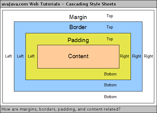
Summary of the three common length units in css (px em rem) #Introduction: The following is a summary of the common html units in web pages, and an introduction to length units in css+div layout. Personally, I think that the disadvantage of using px as the font unit and not being able to use the browser font scaling function under IE is no longer that important. Because the new versions of IE7 and IE8 already support the zoom function of the entire web page, including Firefox, which zooms the entire web page by default instead of scaling CSS fonts. Is there any significance in not simply scaling the font size? 7. css margin margin properties and usage summary ##Introduction: The white space surrounding the border of an element is the margin. Setting margins creates additional "white space" outside the element. The simplest way to set margins is to use the margin property. The margin property accepts any length unit, which can be pixels, inches, millimeters or ems, percentage values or even negative values. This article will talk about the margin property and how to use it in detail. 8. Detailed explanation of the use of CSS margin attributes 9. Details of length units in CSS 10. php uses mb_substr() to solve the problem of Chinese string interception and garbled characters 


The above is the detailed content of 10 recommended articles about length units. For more information, please follow other related articles on the PHP Chinese website!
 How to close the window opened by window.open
 what does usb interface mean
 How to shut down your computer quickly
 Main class not found or unable to load
 Data analysis methods
 Vue parent component calls the method of child component
 What is the cmd command to clean up C drive junk?
 How to create a new folder in webstorm


![[Web front-end] Node.js quick start](https://img.php.cn/upload/course/000/000/067/662b5d34ba7c0227.png)


