
This article mainly introduces the use of CSS3 to create tilted navigation bars and frosted glass effects. Friends in need can refer to it
Navigation bars are no stranger to every Web front-end siege lion, but frosted glass may It will be relatively unfamiliar. To put it simply, frosted glass actually allows pictures or backgrounds to be blurred using corresponding methods. This effect is very visually impactful for users.
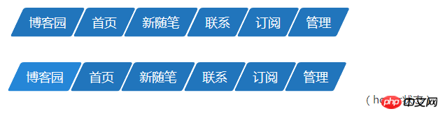
The theme of this sharing: Use CSS3 to create a navigation bar and frosted glass effect similar to the one below.
The navigation bar is trapezoidal in shape.
Frosted glass effect in the background area.
There is actually a reason why I share the navigation bar and frosted glass effect in one article. Because the realization of these two effects cannot be separated from an important idea.
To describe it in language: the parent element sets position:relative, its pseudo-element (after or before) sets position:absolute, and makes top, bottom, left, and right all 0, and the pseudo-element occupies the parent the entire space of the element, and finally set the z-index to place the background behind the parent element.
The specific code is as follows.
1 2 3 4 5 6 7 8 9 10 11 12 13 |
|
What does it mean? Don't worry, I will explain the meaning of this code in the next two practical examples.
Article structure:
1. Navigation bar
1.1: Parallelogram navigation bar
1.2 : Trapezoid navigation bar
2. Frosted glass effect
3. Conclusion
4. Reference article
1. Navigation bar
1.1: Parallelogram navigation bar
The idea of making parallelogram: The production of parallelogram uses the skew() tilt attribute in CSS3 2D deformation, because we are just It is tilted in the horizontal direction, so when using skew(), you need to specify the second parameter as 0, otherwise the x and y axis directions will be tilted, which is not the effect we want. Or use skewX(). The specific code implementation is as follows.
Parallelogram navigation bar HTML
1 2 3 4 5 6 7 8 9 10 11 12 13 14 15 16 17 18 19 20 |
|
In the above code, only some important parts are displayed. When setting up a parallelogram, you need to pay attention to the following points:
1. Set relative to the li element, and then set the positioning of the absolute and LRBT four directions of the pseudo element after. The reason is that we need to position the pseudo element relative to the li element, and let the pseudo element fill the space of the entire li element, so that the background set for the pseudo element will cover the entire li element. The most important thing is that setting skewX() on a pseudo element will only skew the pseudo element and will not skew the text on the parent element.
2.Set z-index:-1. If you do not set the z-index value to a negative value here, you will not be able to see the text in the li element. Because absolute will increase the level of its own element, so the z-index of the pseudo element should be -1, so that its level Places after the li element.
3. Use the skewX() function to rotate the pseudo element (not the li element) by 25 degrees. Be careful to write the attribute prefix to prevent browser compatibility issues.
4. When using pseudo-elements and pseudo-classes together, you must pay attention to the pseudo-class first and then the pseudo-element. If li::after:hover is set like this, it will have no effect. The correct way to write it is: li:hover::after.
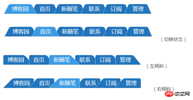
The sample effect is as follows.
1.2: Trapezoid Navigation Bar
The ladder navigation bar is the implementation idea: the ladder navigation bar uses three attributes in CSS3 3D deformation: perspective( ), rotateX() and transform-origin.
perspective() is used to set the distance between the user and the Z plane of the element's 3D space. The smaller the value, the closer the user is to the Z plane of the 3D space, and the visual effect will be obvious; conversely, the larger the value, The farther away the user is from the Z plane of the 3D space, the smaller the visual effect will be.
ratateX() is used for rotation of the x-axis in 3D space. You can imagine that the space rectangular coordinate system learned in high school is the same as the rotation of the x-axis.
transform-origin is used to specify the rotation center point position of the element.
You can check the relevant documents for how to use specific attributes, so I won’t go into details here. The specific code implementation is as follows:
Ladder navigation bar HTML
JS code
1 2 3 4 5 6 7 8 9 10 11 12 13 14 15 16 17 18 19 20 21 22 23 |
|
In the above code, only Show important parts. Pay attention to the following questions:
1. The first four questions are basically the same as the production ideas of the parallelogram navigation bar. Among them, setting perspective() and rotateX() on the pseudo element will only perform 3D processing on the pseudo element and rotate the X-axis in space, and will not perform any processing on the text on the parent element. The text will still be displayed according to the default effect. If perspective() and rotateX() are set on a parent element, it will affect all subsequent child elements. That is, all child elements (including text) will be rotated. The text is rotated, making it difficult to read. This logic should not be difficult to understand.
2. The attribute used to control whether the trapezoid is tilted left or right is transform-origin. The trapezoid is not tilted: bottom. Tilt left: bottom left; tilt right: bottom right.
The sample effect is as follows:
2.毛玻璃效果
毛玻璃的实现思想:毛玻璃使用了CSS3中的backgroung-size,fiter滤镜的原理。
background-size属性用于指定背景图片的尺寸,其中的一个参数cover是将背景图片放大,以适合铺满整个容器。但是这个属性使用的前提是需要设定一张足够大尺寸的图片,否则会导致背景图片失真。
fiter滤镜中的blur()用于将图片进行高斯模糊处理,只接受单位值,值越大,模糊效果越明显。
在张鑫旭老师的一篇关于毛玻璃实现的文章中(会在参考文章中给出链接),给出了毛玻璃实现的效果,可是有一些小问题:如果在背景图片上加上文字,blur()会将文字一起模糊掉,这样的话会用户体验不太好。当然,在不需要文字的背景图片下,张鑫旭老师的方案还是很棒的。
以下给出具体代码:
毛玻璃HTML
1 2 3 4 5 6 7 8 9 10 11 12 13 14 15 16 17 18 19 20 21 22 23 24 25 26 27 28 29 |
|
上面代码中,需要注意几个问题:
1.同样这里也是使用父元素relative,伪元素absolute的方法,并且设置了TBLR和z-index。使用这种方法的关键之处在于我们是对伪元素进行了blur()处理,这样并不会影响到父元素中的文字效果。
2.需要给背景图片添加background-size属性,这个是为了让图片自适应整个屏幕的宽度。另外,这个属性需要添加两次。一是在body元素上,一是在伪元素上。在伪元素上添加的原因是我们要让blur()处理模糊的图片与背景图片相同。如果在伪元素中给background设置inherit的话,只会继承父容器rascal的背景,而rascal容器是一个白色背景的容器,这样就与我们的效果不相同了。下图是在伪元素中使用background:inherit;的毛玻璃效果。
这并不是我们想要的毛玻璃效果。所以伪元素上background的设置应该与背景图片是相同的。
3.在为伪元素设置正确的background之后,我们要使用margin负值模糊边缘消退的问题。
可以看到,毛玻璃中的blur()效果有点过犹不及了,一圈模糊效果超出了容器,给父元素设置overflow:hidden,可以将超出的部分剪切掉。最终的示例效果如下。
最终效果看起来就很自然了。
3.结束语
三个实例中,有一个共同的思想:将CSS3的倾斜,透视,旋转和滤镜效果都放在伪元素中,并且给父元素设置relative,伪元素设置absolute,让伪元素的宽度和高度撑满父元素的整个区域,最后设置伪元素的z-index为负值。这样做的好处就是不会影响父容器中的文字。
具体的代码如下:
1 2 3 4 5 6 7 8 9 10 11 12 |
|
The above is the detailed content of CSS3 tutorial to create tilted navigation bar and frosted glass effect. For more information, please follow other related articles on the PHP Chinese website!


![[Web front-end] Node.js quick start](https://img.php.cn/upload/course/000/000/067/662b5d34ba7c0227.png)


