This article mainly introduces the use of CSS3 instead of JS to achieve interaction. From the perspective of comparing CSS3 animation and JS animation, it will be clearer; and with the use of front-end frameworks, page animation will be used more and more CSS3. Please refer to this article for specific sample code. I hope it can help you.
[CSS3 and JS]
Students who know CSS all know that the implementation of CSS is the lowest level, neither in terms of implementation nor performance. JS The scripts that provide interfaces are comparable; from the perspective of comparing CSS3 animation and JS animation, it will be clearer; and with the use of front-end frameworks, page animations will increasingly use CSS3
[Other uses of CSS3]
In addition to the replacement of animations, there is also the implementation of various interactions, which also reflects the power of CSS, and more options are provided by using CSS3 Tool;
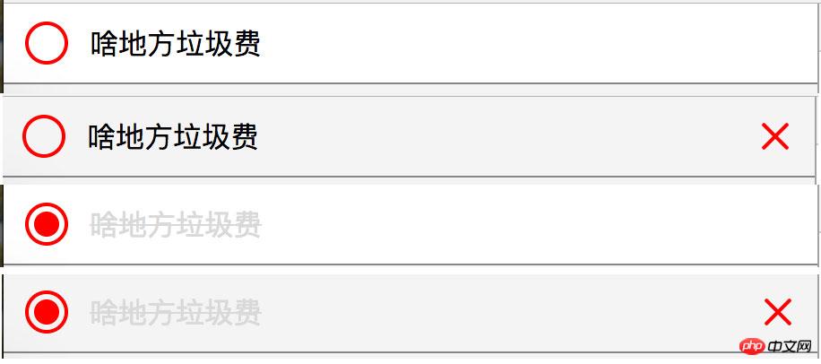
Let’s take a look at an example first: it can better reflect my deep understanding of CSS this time
<style>
body{background:#f4f4f4;margin:0;}
/*list*/
.list__con{}
.list__con .box{background:#fff;position:relative;border-bottom:solid 1px #858585;overflow:hidden;}
.list__con .box:hover{background:#f4f4f4;-webkit-transition:all .6s;transition:all .6s;}
.list__con .box:hover .delete{-webkit-transition:all .6s;transition:all .6s;opacity:1;}
.list__con .input{-webkit-appearance:none;appearance:none;position:absolute;top:10px;left:12px;padding:0;border:none;margin:0;width:24px;height:24px;border:solid 2px red;border-radius:50%;box-sizing:border-box;outline:none;cursor:pointer;}
.list__con .input:checked::after{content:'';width:14px;height:14px;background:red;position:absolute;top:3px;left:3px;border-radius:50%;}
.list__con label{line-height:24px;padding:10px 0 10px 48px;display:block;-webkit-transition:all .4s;transition:all .4s;}
.list__con .input:checked+label{color:#d9d9d9;text-decoration:line-through;}
.list__con .delete{width:44px;height:44px;float:right;position:relative;cursor:pointer;opacity:0;}
.list__con .delete:hover::after{-webkit-transform:rotate(225deg);transform:rotate(225deg);}
.list__con .delete:hover::before{-webkit-transform:rotate(225deg);transform:rotate(225deg);}
.list__con .delete::after{content:'';position:absolute;width:2px;height:20px;background:red;top:12px;left:50%;margin-left:-1px;-webkit-transform:rotate(45deg);transform:rotate(45deg);border-radius:4px;-webkit-transition:all .6s;transition:all .6s;}
.list__con .delete::before{content:'';position:absolute;width:20px;height:2px;background:red;top:50%;left:12px;margin-top:-1px;-webkit-transform:rotate(45deg);transform:rotate(45deg);border-radius:4px;-webkit-transition:all .6s;transition:all .6s;}
</style>
<p class="list__con">
<p class="box">
<p class="delete"></p>
<input class="input" type="checkbox" />
<label>啥地方垃圾费</label>
</p>
</p>
[Explanation]
The above includes many interactions, hover interaction, checked interaction;
I believe that many people have already implemented the above method. Achieved; here I will mainly talk about my understanding of this time and my vision for technology. I have been working for nearly four years now. During these years, I know how fast I have grown, but the same thing is that I can use a lot of knowledge, and I can also use it. I know how to use it; but this time I really understand what it means to only know its meaning but not its true meaning, and why!
I have previously implemented the above interactive effects using a combination of css and js. During this period, I also tried to use all css to achieve interactive effects. However, I was stuck in my ways when exploring, and it has not been truly realized until now. Original idea;
The benefits of using CSS to fully realize it improve the reusability and maintainability, provide a better way to implement the corresponding components, and also improve the performance;
.list__con .input:checked+label
Like the above usage, we can use various powerful selectors added by CSS3 to achieve more and better interactive effects; from now on, we will leave the use of JS to change the DOM. Tragedy, more inclined to CSS
Related recommendations:
An example of dynamic web technology PHP and JS realizing interaction
Ajax Asynchronous transmission and interaction with PHP
The above is the detailed content of CSS3 replaces JS to achieve interaction. For more information, please follow other related articles on the PHP Chinese website!


