
Recently I discovered a very powerful CSS3 attribute, which is the filter attribute. Friends who like p-pictures should know what kind of artifact this is by looking at the name. Of course, the effect of this attribute cannot be compared with that of PS, but if used well, one picture can be made into the effect of two pictures while saving a lot of space. This article mainly introduces relevant information about the powerful filter attribute in CSS3. Friends who need it can refer to it. I hope it can help everyone.
1. Definition
Filter literally means filter. The official filter attribute defines the visual effect of an element (usually ) (for example: blur and Saturation); give a chestnut:
<style>
    img{
      /*灰度100%*/
        -webkit-filter:grayscale(100%);
    }
</style>
<img src="img/boke.png" alt="">

Seeing this effect, are bloggers starting to be interested in filters?
2. Syntax
filter: none | blur() | brightness() | contrast() | drop-shadow() | grayscale() | hue-rotate() | invert() | opacity() | saturate() | sepia() | url();
As you can see, the attribute has many optional values. What do they mean?
grayscale grayscale
sepia brown (a retro old photo feel)
saturate saturation
hue-rotatehue rotation
invert reverse color
opacitytransparency
brightness
contrast
blur
drop-shadow
For example:
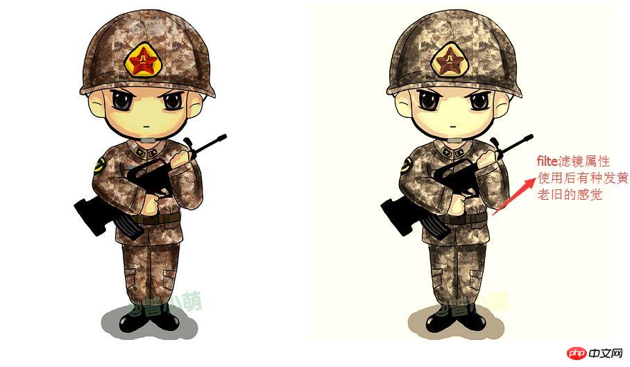
Use sepia to adjust here
 <head>
     <meta charset="UTF-8">
      <title>Title</title>
      <style>
          .img{

             -webkit-filter:sepia(70%);
          }
      </style>
  </head>
 <body>
 <img src="img/boke.png" alt="">
 <img class="img" src="img/boke.png" alt="">
</body>Sample picture:
3. Example
Below, I will give an example of several values of the filter attribute. Other interesting things need to be discovered by fellow bloggers. If you have any interesting things, you can join me. Share
(1)hue-rotate(color rotation)
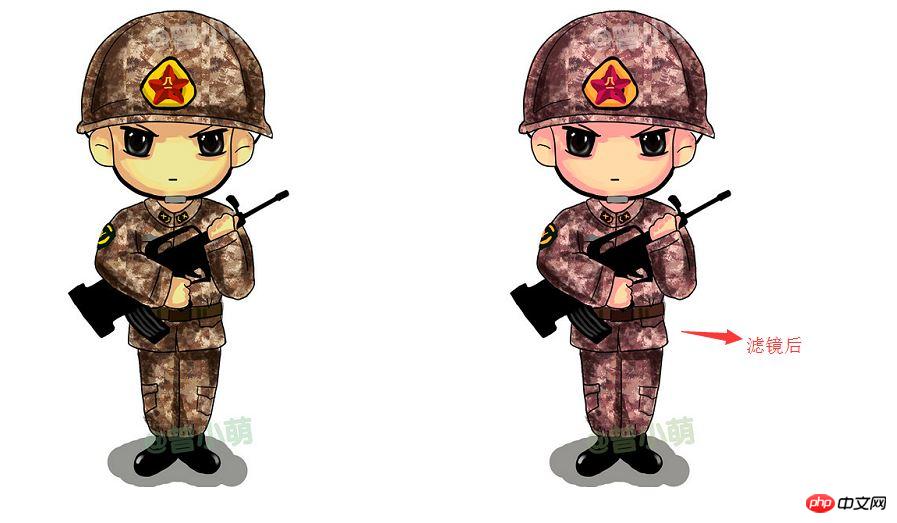
Let’s see the effect in the picture. The specific effect depends on everyone’s discovery:
     <style>
          .img{
              -webkit-filter:hue-rotate(330deg);
          }
      </style>
  </head>
  <body>
  <img src="img/boke.png" alt="">
  <img class="img" src="img/boke.png" alt="">
</body>Effect picture:
(2)blur(blur)
blur (blur effect, unit px)
     <style>
          .img{
            -webkit-filter:blur(1px);
          }
      </style>
  <body>
  <img src="img/boke.png" alt="">
  <img class="img" src="img/boke.png" alt="">
</body>Sample picture:

(3)invert reverse color
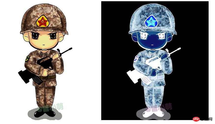
invert reverse color will turn the picture into a negative. It is useless to say more, look at the code:
 <style>
        .img{
            -webkit-filter:invert(100%);
        }
    </style>
<body>
<img src="img/boke.png" alt="">
<img class="img" src="img/boke.png" alt="">
</body>Example Picture:
Do you think it’s fun? Hurry up and give it a try.
Related recommendations:
Example explanation of css filter filter_html/css_WEB-ITnose
About filter filter Two creative ideas applied to pictures_Experience exchange
Detailed introduction to the filter attribute of CSS3
The above is the detailed content of Detailed explanation of CSS3 filter attribute. For more information, please follow other related articles on the PHP Chinese website!


