
 Web Front-end
CSS Tutorial
A detailed discussion of the animation sequence of CSS3 animation special effects
Web Front-end
CSS Tutorial
A detailed discussion of the animation sequence of CSS3 animation special effects
A detailed discussion of the animation sequence of CSS3 animation special effects

Everyone knows that animation is a property of CSS. This article mainly introduces the relevant information of animation sequence (animation) of CSS3 animation special effects. The editor thinks it is quite good. Now I will share it with you and give it as a reference. Let’s follow the editor to take a look, I hope it can help everyone.
First review the various parameters added to the animation animation:
(1) infinite parameter, indicating that the animation will loop infinitely. A time parameter can also be inserted between the speed curve and the number of playbacks to set the animation delay time. If you want the icon to start rotating after 1 second and rotate twice, the code is as follows
.close:hover::before{
    -webkit-animation: spin 1s linear 1s 2;
    animation: spin 1s linear 1s 2;
}(2) alternate parameter. Add the reverse playback parameter alternate to the animation animation. After adding this parameter, the animation will play in reverse at an even number of times.
.close:hover::before{
    -webkit-animation: spin 1s linear 1s 2 alternate;
    animation: spin 1s linear 1s 2 alternate;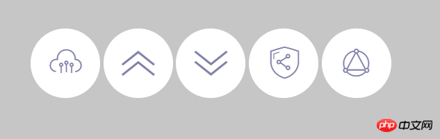
}Among the animation attribute parameters, the delay parameter is one of our more commonly used parameters. When there are multiple animated objects, we often use delay parameters to form animation sequences. For example, the following code defines 5 different icons:
<span class="close icon-suningliujinyun">Close</span>
<span class="close icon-shousuo">Close</span>
<span class="close icon-zhankai">Close</span>
<span class="close icon-diaoyonglian">Close</span>
<span class="close icon-lingshouyun">Close</span>
The basic style of the icon is the same as the previous Close icon, the difference is that the icons here are all set to inline -block to enable them to be arranged horizontally. The code is as follows:
.close{
    font-size:0px;/*使span中的文字不显示*/
    cursor:pointer;/*使鼠标指针显示为手型*/
    display:inline-block;
    width:100px;
    height:100px;
    line-height:100px;
    border-radius:50%;/*使背景形状显示为圆形*/
    background:#FFF;
    color:#8b8ab3;
    text-align:center;
}
.close::before{
    font-family: 'suningcloud';
    speak:none; /*使文本内容不能通过屏幕阅读器等辅助设备读取*/
    font-size:48px;
    display:block;
}is displayed during initialization, as shown in the figure below;
Next, add the icon animation animation, the initial position of the icon is shifted downward by -100%, and then moved upwards back to the initial position. In the process, the icon is changed from completely transparent to completely opaque
.close{
	font-size:0px;/*使span中的文字不显示*/
	cursor:pointer;/*使鼠标指针显示为手型*/
	display:inline-block;
	width:100px;
	height:100px;
	line-height:100px;
	border-radius:50%;/*使背景形状显示为圆形*/
	background:#FFF;
	color:#8b8ab3;
	text-align:center;
	/**/
	-webkit-animation: moving 1s linear;
	animation: moving 1s linear;
}

@-webkit-keyframes moving {
    from {
        opacity: 0;
        -webkit-transform: translateY(100%);
    }
    to {
        opacity: 1;
        -webkit-transform: translateY(0%);
    }
}
@keyframes moving {
    from {
        opacity: 0;
        transform: translateY(100%);
    }
    to {
        opacity: 1;
        transform: translateY(0%);
    }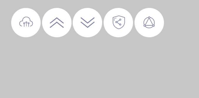
}The animation effects of the above five icons are all performed at the same time. In order to make the icon movement sequential, we will add a delay to each animation. Different from the previous method, we can set the animation delay directly through the animation-delay attribute. The code is as follows:
.icon-suningliujinyun{
	-webkit-animation-delay:0s;
	animation-delay: 0s;
}
.icon-shousuo{
	-webkit-animation-delay:.1s;
	animation-delay: .1s;
}
.icon-zhankai{
	-webkit-animation-delay:.2s;
	animation-delay: .2s;
}
.icon-diaoyonglian{
	-webkit-animation-delay:.3s;
	animation-delay: .3s;
}
.icon-lingshouyun{
	-webkit-animation-delay:.4s;
	animation-delay: .4s;
}In the above code, we set 5 The delay times of each icon are 0, 0.1, 0.2, 0.3 and 0.4s respectively. In fact, a delay of 0 seconds is the default, so the first icon doesn't actually need to set a delay code either. Test page, the animation effect is as shown in the figure.
I refreshed it twice and found that at the very beginning, several icons would flash across the top. This is a bug
The reason for this bug is that except for the first icon, the rest of the icons have a certain animation delay. When the animation does not start, the icon is not offset and is completely opaque. Only when the animation starts does the icon switch to the fully transparent and offset animation start state.
Solution: You need to use the animation-fill-mode attribute of animation animation. This property specifies the state of the element outside of animation time. If the value is forwards, it means that the attribute value in the last key frame is retained after the animation is completed. When the value is backwards, it is just the opposite, which means that the attribute value in the first key frame is applied to the element before the animation is delayed, and When the value is both, it means that both forwards and backwards settings are included. In this example, we can use backward or both.
.close{
    font-size:0px;/*使span中的文字不显示*/
    cursor:pointer;/*使鼠标指针显示为手型*/
    display:inline-block;
    width:100px;
    height:100px;
    line-height:100px;
    border-radius:50%;/*使背景形状显示为圆形*/
    background:#FFF;
    color:#8b8ab3;
    text-align:center;
    /**/
    -webkit-animation: moving 1s linear;
    animation: moving 1s linear;
    /*清除抖动*/
    -webkit-animation-fill-mode: both;
    animation-fill-mode: both;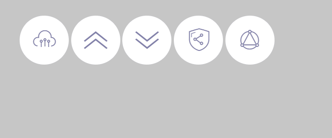
}The effect is as shown below:

PS: In animation, you can also set the speed curve like the transition animation
For example: in this example, we hope that the movement of the icon has a little elastic effect, that is, when the icon moves upward, it does not slow down and stop at the end point. , but continues to move upward after reaching the end point, and then moves in the opposite direction back to the end point after exceeding a certain distance, forming a reciprocating effect.
Of course we can use frame animation to achieve such an effect, but it will be easier to use a speed curve. To use custom curves, we often need some tools, because CSS3 animation uses the Cubic Bezier mathematical function to generate the speed curve, and the parameters of this function are not intuitive. We can use sites like cubic-bezier.com to visually adjust the speed curve.
Next, we can write the speed curve into the parameters of the animation attribute. The code is as follows:
##
.close{
    font-size:0px;/*使span中的文字不显示*/
    cursor:pointer;/*使鼠标指针显示为手型*/
    display:inline-block;
    width:100px;
    height:100px;
    line-height:100px;
    border-radius:50%;/*使背景形状显示为圆形*/
    background:#FFF;
    color:#8b8ab3;
    text-align:center;
    /**/
    /*-webkit-animation: moving 1s linear;
    animation: moving 1s linear;*/
    /*cubic-bezier*/
    -webkit-animation:moving 1s cubic-bezier(.62,-0.91,.45,1.97);
      animation:moving 1s cubic-bezier(.62,-0.91,.45,1.97);
    /*清除抖动*/
    -webkit-animation-fill-mode: both;
    animation-fill-mode: both;
}
How to implement radio button animation special effects in CSS3
Pure css3 implementation 3D picture cube rotation animation special effects
Introduction to the clever use of css3 animation animation special effects plug-in
The above is the detailed content of A detailed discussion of the animation sequence of CSS3 animation special effects. For more information, please follow other related articles on the PHP Chinese website!

Hot AI Tools

Undresser.AI Undress
AI-powered app for creating realistic nude photos

AI Clothes Remover
Online AI tool for removing clothes from photos.

Undress AI Tool
Undress images for free

Clothoff.io
AI clothes remover

Video Face Swap
Swap faces in any video effortlessly with our completely free AI face swap tool!

Hot Article
Hot Tools

Notepad++7.3.1
Easy-to-use and free code editor

SublimeText3 Chinese version
Chinese version, very easy to use

Zend Studio 13.0.1
Powerful PHP integrated development environment

Dreamweaver CS6
Visual web development tools

SublimeText3 Mac version
God-level code editing software (SublimeText3)
Hot Topics
 1657
1657
 14
1415
52
1309
25
1257
29
1230
24
14
1415
52
1309
25
1257
29
1230
24

 How to use bootstrap in vue
Apr 07, 2025 pm 11:33 PM
How to use bootstrap in vue
Apr 07, 2025 pm 11:33 PM
Using Bootstrap in Vue.js is divided into five steps: Install Bootstrap. Import Bootstrap in main.js. Use the Bootstrap component directly in the template. Optional: Custom style. Optional: Use plug-ins.
 Understanding HTML, CSS, and JavaScript: A Beginner's Guide
Apr 12, 2025 am 12:02 AM
Understanding HTML, CSS, and JavaScript: A Beginner's Guide
Apr 12, 2025 am 12:02 AM
WebdevelopmentreliesonHTML,CSS,andJavaScript:1)HTMLstructurescontent,2)CSSstylesit,and3)JavaScriptaddsinteractivity,formingthebasisofmodernwebexperiences.
 The Roles of HTML, CSS, and JavaScript: Core Responsibilities
Apr 08, 2025 pm 07:05 PM
The Roles of HTML, CSS, and JavaScript: Core Responsibilities
Apr 08, 2025 pm 07:05 PM
HTML defines the web structure, CSS is responsible for style and layout, and JavaScript gives dynamic interaction. The three perform their duties in web development and jointly build a colorful website.
 How to write split lines on bootstrap
Apr 07, 2025 pm 03:12 PM
How to write split lines on bootstrap
Apr 07, 2025 pm 03:12 PM
There are two ways to create a Bootstrap split line: using the tag, which creates a horizontal split line. Use the CSS border property to create custom style split lines.
 How to insert pictures on bootstrap
Apr 07, 2025 pm 03:30 PM
How to insert pictures on bootstrap
Apr 07, 2025 pm 03:30 PM
There are several ways to insert images in Bootstrap: insert images directly, using the HTML img tag. With the Bootstrap image component, you can provide responsive images and more styles. Set the image size, use the img-fluid class to make the image adaptable. Set the border, using the img-bordered class. Set the rounded corners and use the img-rounded class. Set the shadow, use the shadow class. Resize and position the image, using CSS style. Using the background image, use the background-image CSS property.
 How to set up the framework for bootstrap
Apr 07, 2025 pm 03:27 PM
How to set up the framework for bootstrap
Apr 07, 2025 pm 03:27 PM
To set up the Bootstrap framework, you need to follow these steps: 1. Reference the Bootstrap file via CDN; 2. Download and host the file on your own server; 3. Include the Bootstrap file in HTML; 4. Compile Sass/Less as needed; 5. Import a custom file (optional). Once setup is complete, you can use Bootstrap's grid systems, components, and styles to create responsive websites and applications.
 How to use bootstrap button
Apr 07, 2025 pm 03:09 PM
How to use bootstrap button
Apr 07, 2025 pm 03:09 PM
How to use the Bootstrap button? Introduce Bootstrap CSS to create button elements and add Bootstrap button class to add button text
 How to resize bootstrap
Apr 07, 2025 pm 03:18 PM
How to resize bootstrap
Apr 07, 2025 pm 03:18 PM
To adjust the size of elements in Bootstrap, you can use the dimension class, which includes: adjusting width: .col-, .w-, .mw-adjust height: .h-, .min-h-, .max-h-
