 Web Front-end
 CSS Tutorial
 Detailed explanation of the use of pseudo-elements::before and ::after
Detailed explanation of the use of pseudo-elements::before and ::after
This time I will bring you a detailed explanation of the use of pseudo elements::before and ::after. What are the precautions for using pseudo elements::before and ::after. The following is a practical case. Let’s take a look. take a look.
Preface
It is well known that the two pseudo-elements::before and ::after are actually the content in CSS3, but in fact in CSS2 There are already these two, but in CSS2 they are represented by a colon in front (:before and :after). Today I will mainly talk about how to use these two pseudo elements.1. You can add styles to ordinary elements just like ordinary elements.
For example, if I want to add an icon in front of the text, if I use ordinary When writing elements, I can write like this:/*CSS*/
.del{ font-size: 20px;}
.del i{ display: inline-block; width: 20px; height: 25px; margin-right: 2px; vertical-align: middle;
background: url("imgs/delete.png") no-repeat center; background-size: 100%;}
.del span{ vertical-align: middle;}/*HTML*/ <p class="del"><i></i><span>删除</span></p>
/*CSS*/
.del{ font-size: 20px;}
.del::before{ content: ""; display: inline-block; width: 20px; height: 25px; margin-right: 2px; vertical-align: middle;
        background: url("imgs/delete.png") no-repeat center; background-size: 100%;}
.del span{ vertical-align: middle;}/*HTML*/ <p class="del"><span>删除</span></p>

clear float problem:
.clearfix::after{ display:block; clear:both; content:""; overflow:hidden; height: 0; }Of course, if your website still needs to be compatible with IE8, then use :after, ::after is not compatible.
2. Insert text into elements
Sometimes I may need to add the same text to many elements at the same time, then you can consider using These two pseudo elements. For example:/*CSS*/
.up:after{ content: '↑'; color: #f00;}
.down:after{ content: '↓'; color: #0f0;}/*HTML*/ <p class="up">上升</p> <p class="down">下降</p>

##3. Insert the image into the element To achieve a picture plus text effect similar to the first example in this article, you can also use pseudo elements to directly insert pictures without using a background image, like this:
/*CSS*/
.del{ font-size: 20px;}
.del::before{ content: url("imgs/delete.png"); display: inline-block; margin-right: 2px; vertical-align: middle; }
.del span{ vertical-align: middle;}But you need to be very careful, Images inserted in this way cannot change the size of the image by controlling the size of the pseudo-element. They can only introduce images of a fixed size (this is a bit confusing...), so I personally think it is best to compare the background image honestly and practically. good.
4. Insert consecutive project numbersMaybe you will say, isn’t it easy to add consecutive project numbers? Just use an ordered list directly!
Yes, it is indeed possible, just like this:
<p>我的爱好:</p>
<ol>
    <li>吃饭</li>
    <li>睡觉</li>
    <li>打豆豆</li>
</ol>
This is the effect under Chrome:
 Looks pretty good , no problem, what if I want to bold the previous serial number? I'm confused...
Now you say, can't I just manually add labels and numbers before each text, and then add styles to the labels?
/*CSS*/
ul li{ list-style: none;}
ul li span{ font-weight: bold;}/*HTML*/ <p>我的爱好:</p> <ul> <li><span>1.</span>吃饭</li> <li><span>2.</span>睡觉</li> <li><span>3.</span>打豆豆</li> </ul>
Yes, there are three items now. What if there are thirty items or three hundred items? Add them one by one? (Very silly and naive...)
If you use pure CSS at this time, you have to use pseudo elements:
/*CSS*/
ul li{ list-style: none; counter-increment: number;}   //number相当于是个变量,随便取名就好,在伪元素中调用
ul li::before{ content: counter(number)"."; font-weight: bold;} //注意这里不同于JS,counter(number)与"."之间不需要加任何东西,直接连接就好/*HTML*/ <p>我的爱好:</p> <ul> <li>吃饭</li> <li>睡觉</li> <li>打豆豆</li> </ul>
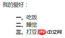
The effect is as follows:
 So if I don’t want Arabic numerals, can I just use Chinese numerals?
Can! Pseudo elements are nice and powerful!
ul li{ list-style: none; counter-increment: number;}
ul li::before{ content: counter(number,cjk-ideographic)"、"; font-weight: bold;}The effect is as follows:
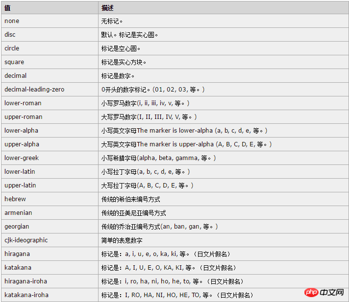
##In addition to this cjk-ideographic, you can also use more CSS  list-style-type
I believe you have mastered the method after reading the case in this article. For more exciting information, please pay attention to other related articles on the PHP Chinese website! 
CSS3 makes a large striped background
CSS3 dynamic prompt effect when the mouse moves into the picture
How to use sticker-footer layout in css
The above is the detailed content of Detailed explanation of the use of pseudo-elements::before and ::after. For more information, please follow other related articles on the PHP Chinese website!

Hot AI Tools

Undresser.AI Undress
AI-powered app for creating realistic nude photos

AI Clothes Remover
Online AI tool for removing clothes from photos.

Undress AI Tool
Undress images for free

Clothoff.io
AI clothes remover

Video Face Swap
Swap faces in any video effortlessly with our completely free AI face swap tool!

Hot Article

Hot Tools

Notepad++7.3.1
Easy-to-use and free code editor

SublimeText3 Chinese version
Chinese version, very easy to use

Zend Studio 13.0.1
Powerful PHP integrated development environment

Dreamweaver CS6
Visual web development tools

SublimeText3 Mac version
God-level code editing software (SublimeText3)

Hot Topics
 1659
1659
 14
14
 1415
1415
 52
52
 1310
1310
 25
25
 1258
1258
 29
29
 1232
1232
 24
24
 Detailed explanation of the mode function in C++
Nov 18, 2023 pm 03:08 PM
Detailed explanation of the mode function in C++ In statistics, the mode refers to the value that appears most frequently in a set of data. In C++ language, we can find the mode in any set of data by writing a mode function. The mode function can be implemented in many different ways, two of the commonly used methods will be introduced in detail below. The first method is to use a hash table to count the number of occurrences of each number. First, we need to define a hash table with each number as the key and the number of occurrences as the value. Then, for a given data set, we run
 Detailed explanation of obtaining administrator rights in Win11
Mar 08, 2024 pm 03:06 PM
Windows operating system is one of the most popular operating systems in the world, and its new version Win11 has attracted much attention. In the Win11 system, obtaining administrator rights is an important operation. Administrator rights allow users to perform more operations and settings on the system. This article will introduce in detail how to obtain administrator permissions in Win11 system and how to effectively manage permissions. In the Win11 system, administrator rights are divided into two types: local administrator and domain administrator. A local administrator has full administrative rights to the local computer
 Detailed explanation of division operation in Oracle SQL
Mar 10, 2024 am 09:51 AM
Detailed explanation of division operation in OracleSQL In OracleSQL, division operation is a common and important mathematical operation, used to calculate the result of dividing two numbers. Division is often used in database queries, so understanding the division operation and its usage in OracleSQL is one of the essential skills for database developers. This article will discuss the relevant knowledge of division operations in OracleSQL in detail and provide specific code examples for readers' reference. 1. Division operation in OracleSQL
 Detailed explanation of the usage of Vue.nextTick function and its application in asynchronous updates
Jul 26, 2023 am 08:57 AM
Detailed explanation of the usage of Vue.nextTick function and its application in asynchronous updates. In Vue development, we often encounter situations where data needs to be updated asynchronously. For example, data needs to be updated immediately after modifying the DOM or related operations need to be performed immediately after the data is updated. The .nextTick function provided by Vue emerged to solve this type of problem. This article will introduce the usage of the Vue.nextTick function in detail, and combine it with code examples to illustrate its application in asynchronous updates. 1. Vue.nex
 Detailed explanation of remainder function in C++
Nov 18, 2023 pm 02:41 PM
Detailed explanation of the remainder function in C++ In C++, the remainder operator (%) is used to calculate the remainder of the division of two numbers. It is a binary operator whose operands can be any integer type (including char, short, int, long, etc.) or a floating-point number type (such as float, double). The remainder operator returns a result with the same sign as the dividend. For example, for the remainder operation of integers, we can use the following code to implement: inta=10;intb=3;
 Detailed explanation of the linux system call system() function
Feb 22, 2024 pm 08:21 PM
Detailed explanation of Linux system call system() function System call is a very important part of the Linux operating system. It provides a way to interact with the system kernel. Among them, the system() function is one of the commonly used system call functions. This article will introduce the use of the system() function in detail and provide corresponding code examples. Basic Concepts of System Calls System calls are a way for user programs to interact with the operating system kernel. User programs request the operating system by calling system call functions
 Detailed explanation of php-fpm tuning method
Jul 08, 2023 pm 04:31 PM
PHP-FPM is a commonly used PHP process manager used to provide better PHP performance and stability. However, in a high-load environment, the default configuration of PHP-FPM may not meet the needs, so we need to tune it. This article will introduce the tuning method of PHP-FPM in detail and give some code examples. 1. Increase the number of processes. By default, PHP-FPM only starts a small number of processes to handle requests. In a high-load environment, we can improve the concurrency of PHP-FPM by increasing the number of processes
 Detailed explanation of the role and usage of PHP modulo operator
Mar 19, 2024 pm 04:33 PM
The modulo operator (%) in PHP is used to obtain the remainder of the division of two numbers. In this article, we will discuss the role and usage of the modulo operator in detail, and provide specific code examples to help readers better understand. 1. The role of the modulo operator In mathematics, when we divide an integer by another integer, we get a quotient and a remainder. For example, when we divide 10 by 3, the quotient is 3 and the remainder is 1. The modulo operator is used to obtain this remainder. 2. Usage of the modulo operator In PHP, use the % symbol to represent the modulus


