This time I will bring you the method of horizontal and vertical centering. What are the precautions for horizontal and vertical centering? The following is a practical case, let’s take a look.
1. Centering elements out of document flow
##Method 1: margin:auto methodCSS code:
p{
      width: 400px;
      height: 400px;
      position: relative;
      border: 1px solid #465468;
 }
 img{
      position: absolute;
      margin: auto;
      top: 0;
      left: 0;
      right: 0;
      bottom: 0;
}HTML code:
<p>
   <img src="mm.jpg">
</p>
Rendering:
##When an element Absolute positioning
CSS code:
.container{
      width: 500px;
      height: 400px;
      border: 2px solid #379;
      position: relative;
 }
 .inner{
      width: 480px;
      height: 380px;
      background-color: #746;
      position: absolute;
      top: 50%;
      left: 50%;
      margin-top: -190px; /*height的一半*/
      margin-left: -240px; /*width的一半*/
}<p class="container"> <p class="inner"></p> </p>
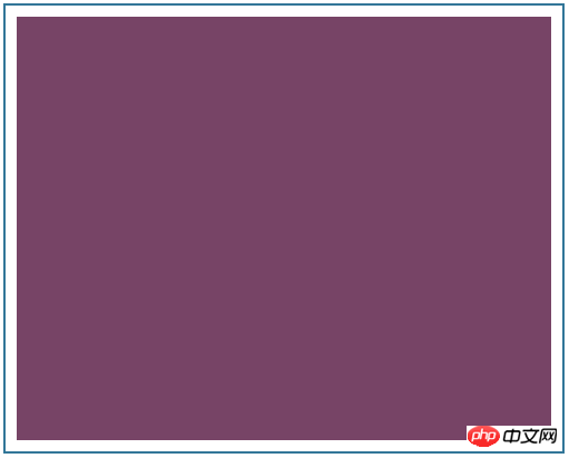
Here, we first use top:50% and left:50% to move the inner coordinate origin (upper left corner) to the center of the container, and then use Negative margin makes it offset half its width to the left, and half its height upwards, so that the center point of the inner is aligned with the center point of the container. 
Method 1: table-cell method
CSS code:
p{
    width: 300px;
    height: 300px;
    border: 3px solid #555;
    display: table-cell;
    vertical-align: middle;
    text-align: center;
}
img{
    vertical-align: middle;
}<p> <img src="mm.jpg"> </p>
pThe above vertical -align: middle controls the vertical centering, while text-align: center controls the horizontal direction. An interesting fact is that when we remove the vertical-align: middle of img, it looks like this: 
It’s still centered! Is it really centered? 
p{
    border: 3px solid #555;
    width: 300px;
    height: 200px;
    display: table-cell;
    vertical-align: middle;
    text-align: center;
}
span{
    vertical-align: middle;
}<p> <span>这是放在span中的文字,通过外层p设置display: table-cell以及vertical-align: middle实现垂直居中。</span> </p>
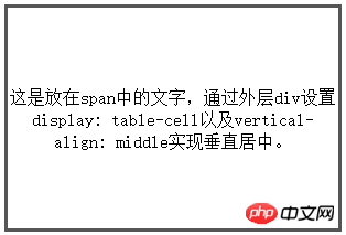
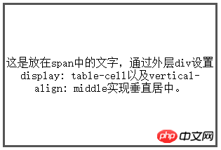
When we remove the vertical-align: middle of span, it looks like this: 
Do you see the difference? Line spacing of text is smaller. If you run the code on your computer, you will find that these lines of text are moved to the middle and have not moved up like the picture. I'm also trying to figure out what's going on. If you know the reason, please tell me. 
CSS code:
.container{
      width: 300px;
      height: 200px;
      border: 3px solid #546461;
      display: -webkit-flex;
      display: flex;
      -webkit-align-items: center;
      align-items: center;
      -webkit-justify-content: center;
      justify-content: center;
 }
 .inner{
      border: 3px solid #458761;
      padding: 20px;
}<p class="container"> <p class="inner"> 我在容器中水平垂直居中 </p> </p>
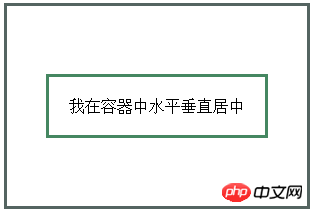
align-items controls the vertical centering, and justify-content controls the horizontal centering. This is a new method of CSS3. The browser support status is as follows: 
# I believe you have mastered the method after reading the case in this article. For more exciting information, please pay attention to other related articles on the PHP Chinese website ! 
Use transparent to make a triangle
The above is the detailed content of Horizontal and vertical centering method. For more information, please follow other related articles on the PHP Chinese website!


