

Detailed explanation of the use of CSS3 shadow box-shadow function
This time I will bring you a detailed explanation of the use of the CSS3shadow box-shadow function, what are the precautions when using CSS3 shadow box-shadow, the following is a practical case, let's go together take a look.
text-shadow is to add a shadow effect to the text, and box-shadow is to add a surrounding shadow effect to the element block. With the popularity of HTML5 and CSS3, the use of this special effect is becoming more and more common.
The basic syntax is {box-shadow:[inset] x-offset y-offset blur-radius spread-radiuscolor}
Object selector {box-shadow:[projection method] X axis Offset Y-axis offset Shadow blur radius Shadow expansion radius Shadow color}
Parameter setting value of box-shadow attribute:
Shadow type: this parameter Optional. If no value is set, the default projection method is outer shadow; if the unique value "inset" is taken, the projection is inner shadow;
X-offset: shadow horizontal offset, its value can be positive or negative . If the value is positive, the shadow is on the right side of the object. If the value is negative, the shadow is on the left side of the object;
Y-offset: the vertical offset of the shadow, its value can also be positive or negative. . If it is a positive value, the shadow is at the bottom of the object. When its value is negative, the shadow is at the top of the object;
Shadow blur radius: This parameter is optional, but its value can only be positive. If its value is 0, it means that the shadow has no blurring effect. The larger the value, the blurr the edge of the shadow;
Shadow expansion radius: This parameter is optional, and its value can be positive or negative. If the value If it is positive, the entire shadow will be extended and expanded, otherwise if the value is negative, it will be reduced;
Shadow color: This parameter is optional. If the color is not set, the browser will use the default color, but the default color of each browser is inconsistent, especially the transparent color under the Safari and Chrome browsers under the webkit kernel, and the black color under Firefox/Opera (has been verification), it is recommended not to omit this parameter.
Browser compatibility:
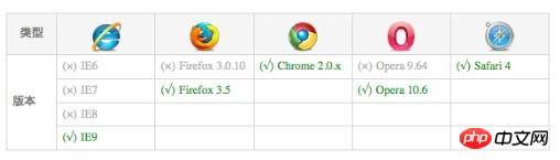
In order to be compatible with various mainstream browsers and support lower versions of these mainstream browsers, in Chrome and Safari based on Webkit When using the box-shadow attribute on the browser, we need to write the name of the attribute in the form -webkit-box-shadow. Firefox browser needs to be written in the form of -moz-box-shadow.
box-shadow{
         //Firefox0-
         -moz-box-shadow:投影方式 X轴偏移量 Y轴偏移量阴影模糊半径 阴影扩展半径 阴影颜色;
         //Safariand Google chrome0-
         -webkit-box-shadow:投影方式 X轴偏移量 Y轴偏移量阴影模糊半径 阴影扩展半径 阴影颜色;
         //Firefox0+、 Google chrome 0+ 、 Oprea5+ and IE9
         box-shadow:  投影方式 X轴偏移量 Y轴偏移量 阴影模糊半径 阴影扩展半径 阴影颜色;
}Note: For convenience, in some parts of the following CSS attributes, only the box-shadow attribute is written, and the -moz- and -webkit- prefixes are not written. Don’t forget to add them when using them.
In order to understand the characteristics of box-shadow more clearly, do a few small tests to see the effect:
Related code:
<!DOCTYPE html>
<html>

<head>
<meta content="text/html; charset=utf-8" http-equiv="Content-Type">
<title>CSS3属性:box-shadow测试</title>
<script type="text/javascript" src="js/jqueryminjs"></script>
<script type="text/javascript" src="js/jqueryboxshadowjs"></script>
<style type="text/css">
box-shadow-1{
  -webkit-box-shadow: 3px 3px 3px;
  -moz-box-shadow: 3px 3px 3px;
  box-shadow: 3px 3px 3px;
}
box-shadow-2{
  -webkit-box-shadow:0 0 10px #0CC;
  -moz-box-shadow:0 0 10px #0CC;
  box-shadow:0 0 10px #0CC;
}
box-shadow-3{
  -webkit-box-shadow:0 0 10px rgba(0, 204, 204, 5);
  -moz-box-shadow:0 0 10px rgba(0, 204, 204, 5);
  box-shadow:0 0 10px rgba(0, 204, 204, 5);
}
box-shadow-4{
  -webkit-box-shadow:0 0 10px 15px #0CC;
  -moz-box-shadow:0 0 10px 15px #0CC;
  box-shadow:0 0 10px 15px #0CC;
}
box-shadow-5{
  -webkit-box-shadow:inset 0 0 10px #0CC;
  -moz-box-shadow:inset 0 0 10px #0CC;
  box-shadow:inset 0 0 10px #0CC;
}
box-shadow-6{
    box-shadow:-10px 0 10px red, /*左边阴影*/
    10px 0 10px yellow, /*右边阴影*/
    0 -10px 10px blue, /*顶部阴影*/
    0 10px 10px green; /*底边阴影*/
}
box-shadow-7{
    box-shadow:0 0 10px 5px black,
    0 0 10px 20px red;
}
box-shadow-8{
    box-shadow:0 0 10px 20px red,
    0 0 10px 5px black;
}
box-shadow-9{
    box-shadow: 0 0 0 1px red;
}


obj{
    width:100px;
    height:100px;
    margin:50px auto;
    background:#eee;
}
outer{
    width: 100px;
    height: 100px;
    border: 1px solid red;
}
inner{
    width: 60px;
    height: 60px;
    background-color: red;
    -webkit-box-shadow: 50px 50px blue;
    -moz-box-shadow: 50px 50px blue;
    box-shadow: 50px 50px blue;
  }
</style>
</head>

<body>
    <p class="obj box-shadow-1"></p>
    <p class="outer">
        <p class="inner"></p>
    </p>
    <p class="obj  box-shadow-2" ></p>
    <p class="obj  box-shadow-3" ></p>
    <p class="obj  box-shadow-4" ></p>
    <p class="obj  box-shadow-5" ></p>
    <p class="obj  box-shadow-6" ></p>
    <p class="obj  box-shadow-7" ></p>
    <p class="obj  box-shadow-8" ></p>
    <p class="obj  box-shadow-9" ></p>
    <script type="text/javascript">
        $(document)ready(function(){
        if($browsermsie) {
          $('obj')boxShadow(-10,-10,5,"#0cc"); //obj元素使用了box-shadow
        }
      });
    </script>

</body>
</html>Conclusion:
1) From the effect of .box-shadow-1, it can be concluded that when the attribute shadow color is not specified, the shadow appears as a transparent color under the Safari and Chrome browsers under the webkit kernel, and appears as black under Firefox/Opera.
2) From the comparison of the inner and outer p blocks, all mainstream browsers that support box-shadow behave as follows: the inner shadow breaks through the outer The layer container brings out the entire shadow effect. The W3C standard explains the principle and performance of box-shadow with diagrams:
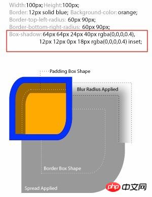
From the picture we can understand: rounded border-radius, shadow expansion How radius, shadow blur radius and padding affect the object shadow: a non-zero value of border-radius will affect the shape of the shadow in the same way, but border-image will not affect any shape of the object shadow; the object shadow is the same as the box model The levels are the same, the outer shadow will be below the background of the object, and the inner shadow will be below the border and above the background. We know that by default the background image is on top of the background color. So the entire hierarchy is: border>inner shadow>background image>background color>outer shadow.
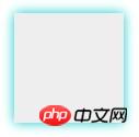
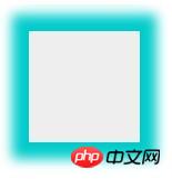
3) From the effect of .box-shadow-2 to .box-shadow-5, we can understand the role of box-shadow value.
. box-shadow-2 has no offset in xy, shadow size is 10px, no expansion radius, color #0CC is rgba(0, 204,204, 1), here we use the color HEX value ;Effect
而. box-shadow-3是在. box-shadow-2效果的基础上,应用了rgba颜色值,好处是给box-shadow阴影添加了alpha透明效果。效果:

. box-shadow-4在. box-shadow-2效果的基础上添加了阴影扩展半径15px。
. box-shadow-5在. box-shadow-2效果的基础上,将外阴影设为内阴影。

4). box-shadow-6一个元素使用了多个阴影,多个阴影之间用逗号分隔。给对象四边设置阴影效果,我们是通过改变x-offset和y-offset的正负值来实现,其中x-offset为负值时,生成左边阴影,为正值时生成右边阴影,y-offset为正值是生成底部阴影,为负值时生成顶部阴影。并且把模糊半径设置为0,如果不设置为0的话那么其他三边也将会有阴影。这点需要注意!
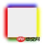
注意这样的写法是错误的:{box-shadow:-10px 0 10px red, box-shadow:10px 0 10px blue,box-shadow:0 -10px 10px yellow,box-shadow:0 10px 10px green}
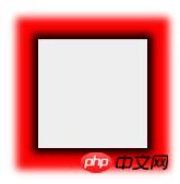
并且此处还涉及到一个多阴影的顺序问题。当给同一个元素使用多个阴影属性时,需要注意它的顺序,最先写的阴影将显示在最顶层,如. box-shadow-7设为不同的模糊值:
.box-shadow-7{
         box-shadow:0 0 10px 5px black,
         0 0 10px 20px red;
}将能看出层叠的顺序效果:
如果将两个阴影效果调一下,改为如下:
.box-shadow-8{
         box-shadow:0 0 10px 20px red,
         0 0 10px 5px black;
}将只显示红色的阴影效果,因为红色阴影层在上面,模糊半径大,将后面的黑色阴影完全遮挡。
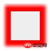
得出的结论是:如果前面的阴影模糊值小于后面的阴影模糊值,那么前面的显示在后面之上,如果前面阴影的模糊值大于后面的阴影模糊值,那么前面的阴影将遮住后面的阴影效果。
4) 类border边框效果(只设置阴影扩展半径和阴影颜色)
.box-shadow-9呈现的效果,同boder:1px solid red相似,但box-shadow的效果与border效果在对象高度上有区别,正好要比border高度大一个扩展半径。而且阴影不影响页面的任何布局,这一点可以通过查看firebug下的layout图得以证实。
5) 在ie下模拟css3中的box-shadow阴影效果
方法一:可以使用IE的Shadow滤镜
基本语法:filter:progid:DXImageTransform.Microsoft.Shadow(color=’颜色值’, Direction=阴影角度(数值),Strength=阴影半径(数值));
注意:该滤镜必须配合background属性一起使用,否则该滤镜失效。
IE下模拟css3中的box-shadow(阴影)代码:
box-shadow{
    filter: progid:DXImageTransformMicrosoftShadow(color='#969696',Direction=135, Strength=5);/*for ie6,7,8*/
    background-color: #ccc;
    -moz-box-shadow:2px 2px 5px #969696;/*firefox*/
    -webkit-box-shadow:2px 2px 5px #969696;/*webkit*/
    box-shadow:2px 2px 5px #969696;/*opera或ie9*/
}在六一儿童节的专题中,我是这么处理的:
liblk-item{
         width:423px;
         height:229px;
         float:left;
         padding:8px;
         margin:2px 18px 13px 21px;
         display:inline;
         border:1px solid #d3c998;
         border-radius:2px;
         filter:progid:DXImageTransformMicrosoftShadow(color='#d3c998', Direction=135,Strength=5);/*for ie6,7,8*/
         background-color: #fff;
         -moz-box-shadow:2px 2px 5px#d3c998;/*firefox*/
         -webkit-box-shadow:2px 2px 5px#d3c998;/*webkit*/
         box-shadow:2px 2px 5px #d3c998;/*opera或ie9*/

}方法二:有些js和.htc的hack文件可以实现IE中的阴影效果。
ie-css3.htc是一个可以让IE浏览器支持部份CSS3属性的htc文件,不只是box-shadow,它还可以让你的IE浏览器支持圆角属性border-radius和文字阴影属性text-shadow。
它的使用方法是:下载它并放到你的服务器目录
在你的
里面写入下面的代码:这个脚本的缺点是IE只支持一部分的box-shadow值。需要注意:
当你使用了这个htc文件后,你的CSS里面,只要写有box-shadow, -moz-box-shadow或-webkit-box-shadow的任何一种,IE就会渲染。
当使用了这个htc文件后,你不能这样写box-shadow: 0 0 10px red; 而应该是box-shadow: 0px 0px 10px red; 否则IE中会失效。
不支持RGBA值中的alpha透明度。
不支持inset内阴影。
不支持阴影扩展。
阴影在IE中只会显示为黑色,不管你设置成其它什么颜色。
方法三:使用jQuery的插件jquery.boxshadow.js,插件的下载地址是http://www.hintzmann.dk/testcenter/js/jquery/boxshadow/jquery.boxshadow.js
使用方法很简单,将该文件和jquery版本库引入head标签,插入以下js效果代码:
<script type="text/javascript">
          $(document)ready(function(){
   if($browsermsie) {
     $('obj')boxShadow(-10,-10,5,"#0cc"); //obj元素使用了box-shadow
   }
 });
</script>注意:js中可以使用:obj.style.webkitBoxShadow=值(字符串);obj.style.MozBoxShadow=值(字符串);obj.style.boxShadow=值(字符串);
补充知识:CSS3的属性
border-top-left-radius:[
默认值:0
取值:
用长度值设置对象的左上角(top-left)圆角半径长度。不允许负值
用百分比设置对象的左上角(top-left)圆角半径长度。不允许负值
说明:
设置或检索对象的左上角圆角边框。提供2个参数,2个参数以空格分隔,每个参数允许设置1个参数值,第1个参数表示水平半径,第2个参数表示垂直半径,如第2个参数省略,则默认等于第1个参数。 如设置border-top-left-radius:5px10px;表示top-left这个角的水平圆角半径为5px,垂直圆角半径为10px。对应的脚本特性为borderTopLeftRadius。
相信看了本文案例你已经掌握了方法,更多精彩请关注php中文网其它相关文章!
推荐阅读:
The above is the detailed content of Detailed explanation of the use of CSS3 shadow box-shadow function. For more information, please follow other related articles on the PHP Chinese website!

Hot AI Tools

Undresser.AI Undress
AI-powered app for creating realistic nude photos

AI Clothes Remover
Online AI tool for removing clothes from photos.

Undress AI Tool
Undress images for free

Clothoff.io
AI clothes remover

Video Face Swap
Swap faces in any video effortlessly with our completely free AI face swap tool!

Hot Article
Hot Tools

Notepad++7.3.1
Easy-to-use and free code editor

SublimeText3 Chinese version
Chinese version, very easy to use

Zend Studio 13.0.1
Powerful PHP integrated development environment

Dreamweaver CS6
Visual web development tools

SublimeText3 Mac version
God-level code editing software (SublimeText3)
Hot Topics
 1653
1653
 14
1413
52
1306
25
1251
29
1224
24
14
1413
52
1306
25
1251
29
1224
24

 How to achieve wave effect with pure CSS3? (code example)
Jun 28, 2022 pm 01:39 PM
How to achieve wave effect with pure CSS3? (code example)
Jun 28, 2022 pm 01:39 PM
How to achieve wave effect with pure CSS3? This article will introduce to you how to use SVG and CSS animation to create wave effects. I hope it will be helpful to you!
 Use CSS skillfully to realize various strange-shaped buttons (with code)
Jul 19, 2022 am 11:28 AM
Use CSS skillfully to realize various strange-shaped buttons (with code)
Jul 19, 2022 am 11:28 AM
This article will show you how to use CSS to easily realize various weird-shaped buttons that appear frequently. I hope it will be helpful to you!
 How to hide elements in css without taking up space
Jun 01, 2022 pm 07:15 PM
How to hide elements in css without taking up space
Jun 01, 2022 pm 07:15 PM
Two methods: 1. Using the display attribute, just add the "display:none;" style to the element. 2. Use the position and top attributes to set the absolute positioning of the element to hide the element. Just add the "position:absolute;top:-9999px;" style to the element.
 How to implement lace borders in css3
Sep 16, 2022 pm 07:11 PM
How to implement lace borders in css3
Sep 16, 2022 pm 07:11 PM
In CSS, you can use the border-image attribute to achieve a lace border. The border-image attribute can use images to create borders, that is, add a background image to the border. You only need to specify the background image as a lace style; the syntax "border-image: url (image path) offsets the image border width inward. Whether outset is repeated;".
 How to enlarge the image by clicking the mouse in css3
Apr 25, 2022 pm 04:52 PM
How to enlarge the image by clicking the mouse in css3
Apr 25, 2022 pm 04:52 PM
Implementation method: 1. Use the ":active" selector to select the state of the mouse click on the picture; 2. Use the transform attribute and scale() function to achieve the picture magnification effect, the syntax "img:active {transform: scale(x-axis magnification, y Axis magnification);}".
 It turns out that text carousel and image carousel can also be realized using pure CSS!
Jun 10, 2022 pm 01:00 PM
It turns out that text carousel and image carousel can also be realized using pure CSS!
Jun 10, 2022 pm 01:00 PM
How to create text carousel and image carousel? The first thing everyone thinks of is whether to use js. In fact, text carousel and image carousel can also be realized using pure CSS. Let’s take a look at the implementation method. I hope it will be helpful to everyone!
 How to set animation rotation speed in css3
Apr 28, 2022 pm 04:32 PM
How to set animation rotation speed in css3
Apr 28, 2022 pm 04:32 PM
In CSS3, you can use the "animation-timing-function" attribute to set the animation rotation speed. This attribute is used to specify how the animation will complete a cycle and set the speed curve of the animation. The syntax is "element {animation-timing-function: speed attribute value;}".
 Does css3 animation effect have deformation?
Apr 28, 2022 pm 02:20 PM
Does css3 animation effect have deformation?
Apr 28, 2022 pm 02:20 PM
The animation effect in css3 has deformation; you can use "animation: animation attribute @keyframes ..{..{transform: transformation attribute}}" to achieve deformation animation effect. The animation attribute is used to set the animation style, and the transform attribute is used to set the deformation style. .
