padding to create adaptive image layout (CSS percentage)
margin and padding attributes The percentage values in the vertical direction are calculated relative to the width, which is different from the percentage values of attributes such as top and bottom.
<p>The reasons for this design will be explained in my new book (which should be published in a few months), so I won’t go into it here.
<p>For the padding attribute, the percentage in any direction padding is calculated for the width, allowing us to easily implement a fixed-proportion block-level container. For example, Suppose there is now a <p> element: p { padding: 50%; }p { padding: 100% 0 0; }p { padding-bottom: 100%; }<p> The element size is a square with a width and height of 1:1. No matter what the width of its parent container is, this <p> element can always maintain the same proportion. <p>What is the function of this feature that can fix the proportion? <p>For most layouts, we do not require a fixed proportion, but there is one exception, and that is the picture, because the original size of the picture is fixed. In the traditional fixed-width layout, we will set specific width and height values for the image to ensure that our image occupies a stable area; but on the mobile terminal or in the case of responsive development, the final width of the image is very small It may be uncertain. For example, for a banner advertisement on the mobile phone, the width under iPhone 7 is 375, under iPhone 7 Plus it is 414, and there are other sizes such as 360. What is needed at this time is not a fixed size setting for the image, but a proportion setting. <p>Usually have the following implementations: <p>1. Fix a height, and then use the background-size attribute control, as follows: .banner {
height: 40px;
background-size: cover;
}vw, as follows: .banner {
height: 15.15vw;
background-size: cover;
}vw The approach is at least a little easier to understand. <p>However, if our image is not a banner, but needs to be 1rem distance from the left and right sides, at this time, our CSS code will be a little more verbose, and if we want to maintain perfect proportions, Just use CSS3 calc() to calculate: .banner {
height: calc(0.1515 * (100vw - 2rem));
background-size: cover;
}calc() also It's very stretched, but it's just the padding attribute that is ordinary and inconspicuous, and its compatibility and adaptability are excellent. <p>3. Use percentage padding, as follows: .banner {
padding: 15.15% 0 0;
background-size: cover;
}<img> , percentagepadding can also be easily dealt with. The search routine is relatively fixed. A fixed-proportion container element is required outside the picture element, such as the following HTML structure: <p class="banner"> <img src=""banner.jpg> </p>
element is also responsible for controlling the proportion, and then the image is filled with the .banner element. The CSS code is as follows: .banner {
padding: 15.15% 0 0;
position: relative;
}
.banner > img {
position: absolute;
width: 100%; height: 100%;
left: 0; top: 0;
} You can see that no matter how wide the screen width is, the ratio of our advertising images is fixed, there will be no clipping, no missing areas, and the layout will look very neat. Flexible and more robust. <p>————-<p>In fact, I have always underestimated the practical application value of percentage <p>padding
, because of the existence of vw units, after all Understanding vw seems to be simpler, so I haven’t introduced related techniques. However, as more and more image-related layouts are processed, I found that the practical value of percentage padding is greater than imagined, and it is applicable to more scenes than vw units, and is more compatible. Better (percentage feature is supported by IE6, 100% coverage of pictures is supported by IE8). For complex layouts, if the width of the picture is not fixed and adaptive, we usually think of a trick, which is to only set the width of the picture, for example: <p>img { width: 100%; }0到计算高度的图片变化,视觉上会有明显的元素跳动,代码层面会有布局重计算。<p>所以对图片高宽进行同时约定还是有必要的,但是同时要保证宽度自适应,似乎有点难度。记住,如果遇到这种需求场景,没有比百分比padding布局更好的做法!<p>缩小浏览器宽度可以看到不同宽度下的布局效果,Gif效果截图如下:<p>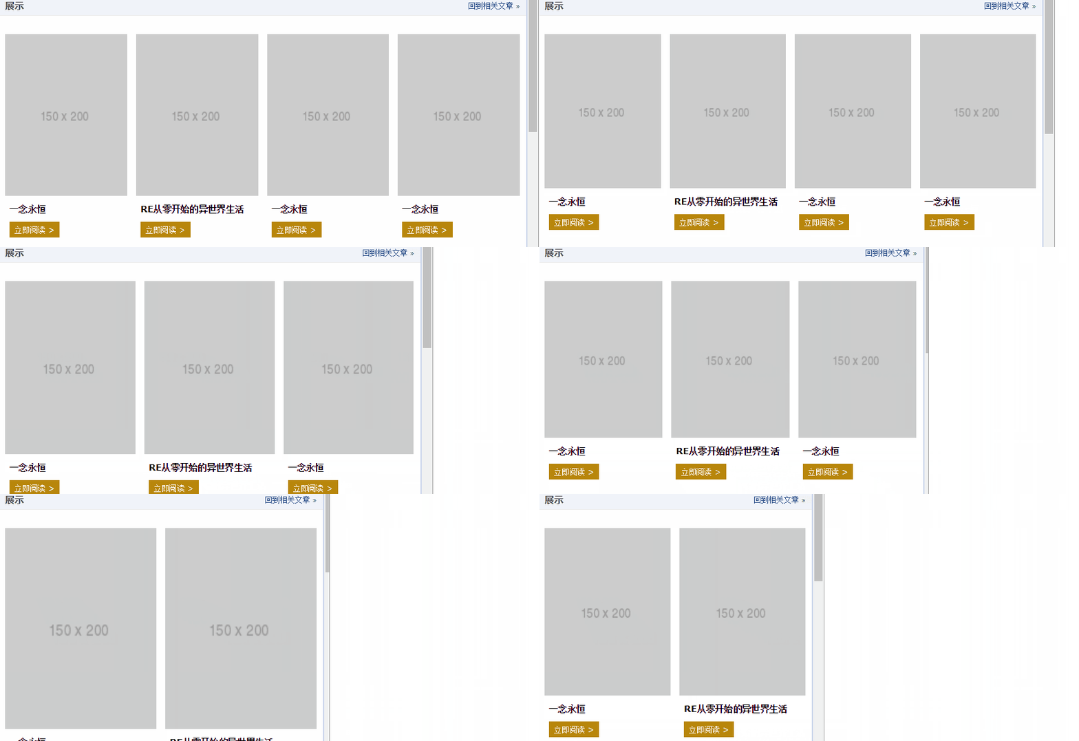 <p>此demo难点就是图片自适应同时保持比例,以及页面刷新的时候没有布局稳固不晃动,其核心HTML和CSS代码如下:
<p class="works-item-t">
  <img src="./150x200.png">
</p>
.works-item-t {
 padding-bottom: 133%;
 position: relative;
}
.works-item-t > img {
 position: absolute;
 width: 100%; height: 100%;
}padding值只使用padding-bottom表示的时候,如果没有text-align属性干扰,<img>元素的left:0;top:0是可以省略的。<p>对于这种图片宽度100%容器,高度按比例的场景,padding-bottom的百分比值大小就是图片元素的高宽比,就这么简单。<p>但,有时候,图片宽度并不是100%容器的,例如,图片宽度50%容器宽度,图片高宽比4:3,此时,CSS垂直方向百分比就666了,如下:.img-box {
padding: 0 50% 66.66% 0;
}css登录界面美化
<p>css如何实现鼠标滑过缩略图时放大图片 <p>css实现鼠标触发效果The above is the detailed content of padding to create adaptive image layout (CSS percentage). For more information, please follow other related articles on the PHP Chinese website!

Hot AI Tools

Undresser.AI Undress
AI-powered app for creating realistic nude photos

AI Clothes Remover
Online AI tool for removing clothes from photos.

Undress AI Tool
Undress images for free

Clothoff.io
AI clothes remover

Video Face Swap
Swap faces in any video effortlessly with our completely free AI face swap tool!

Hot Article

Hot Tools

Notepad++7.3.1
Easy-to-use and free code editor

SublimeText3 Chinese version
Chinese version, very easy to use

Zend Studio 13.0.1
Powerful PHP integrated development environment

Dreamweaver CS6
Visual web development tools

SublimeText3 Mac version
God-level code editing software (SublimeText3)

Hot Topics
 1653
1653
 14
14
 1413
1413
 52
52
 1304
1304
 25
25
 1251
1251
 29
29
 1224
1224
 24
24
 How to use bootstrap in vue
Apr 07, 2025 pm 11:33 PM
Using Bootstrap in Vue.js is divided into five steps: Install Bootstrap. Import Bootstrap in main.js. Use the Bootstrap component directly in the template. Optional: Custom style. Optional: Use plug-ins.
 The Roles of HTML, CSS, and JavaScript: Core Responsibilities
Apr 08, 2025 pm 07:05 PM
HTML defines the web structure, CSS is responsible for style and layout, and JavaScript gives dynamic interaction. The three perform their duties in web development and jointly build a colorful website.
 Understanding HTML, CSS, and JavaScript: A Beginner's Guide
Apr 12, 2025 am 12:02 AM
WebdevelopmentreliesonHTML,CSS,andJavaScript:1)HTMLstructurescontent,2)CSSstylesit,and3)JavaScriptaddsinteractivity,formingthebasisofmodernwebexperiences.
 How to insert pictures on bootstrap
Apr 07, 2025 pm 03:30 PM
There are several ways to insert images in Bootstrap: insert images directly, using the HTML img tag. With the Bootstrap image component, you can provide responsive images and more styles. Set the image size, use the img-fluid class to make the image adaptable. Set the border, using the img-bordered class. Set the rounded corners and use the img-rounded class. Set the shadow, use the shadow class. Resize and position the image, using CSS style. Using the background image, use the background-image CSS property.
 How to write split lines on bootstrap
Apr 07, 2025 pm 03:12 PM
There are two ways to create a Bootstrap split line: using the tag, which creates a horizontal split line. Use the CSS border property to create custom style split lines.
 How to set up the framework for bootstrap
Apr 07, 2025 pm 03:27 PM
To set up the Bootstrap framework, you need to follow these steps: 1. Reference the Bootstrap file via CDN; 2. Download and host the file on your own server; 3. Include the Bootstrap file in HTML; 4. Compile Sass/Less as needed; 5. Import a custom file (optional). Once setup is complete, you can use Bootstrap's grid systems, components, and styles to create responsive websites and applications.
 How to use bootstrap button
Apr 07, 2025 pm 03:09 PM
How to use the Bootstrap button? Introduce Bootstrap CSS to create button elements and add Bootstrap button class to add button text
 How to resize bootstrap
Apr 07, 2025 pm 03:18 PM
To adjust the size of elements in Bootstrap, you can use the dimension class, which includes: adjusting width: .col-, .w-, .mw-adjust height: .h-, .min-h-, .max-h-


