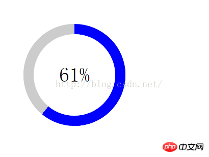
This time I will show you how to use Yuanshengcss3 to realize ring loading Progress bar, and use Yuanshengcss3 to realize ring loading progress bar What are the precautions, as follows This is a practical case, let’s take a look at it.
Rendering:

The requirement at that time was to make the progress bar gradient in a fan shape Effects loading. I thought about it for a long time, and it seems that the only way to make a gradient image is to use border-img. Another super stupid method is to write 50 rectangles distributed on the progress bar. The gradients provided by css3 include linear gradients, radial gradients and repeating gradients. I can't figure out how to achieve a fan-shaped gradient. No more talking, let’s get to the code:
<!DOCTYPE html>
<html lang="cn">
<head>
	<meta charset="UTF-8">
	<title>Document</title>
	<style>
	*{
		margin: 0;
		padding: 0;
	}
	.wrap,.circle,.percent{
		position: absolute;
		width: 200px;
		height: 200px;
		border-radius: 50%;
	}
	.wrap{
		top:50px;
		left:50px;
		background-color: #ccc;
	}
	.circle{
		box-sizing: border-box;
		border:20px solid #ccc;
		clip:rect(0,200px,200px,100px);
	}
	.clip-auto{
		clip:rect(auto, auto, auto, auto);
	}
	.percent{
		box-sizing: border-box;
		top:-20px;
		left:-20px;
	}
	.left{
		transition:transform ease;
		border:20px solid blue;
		clip: rect(0,100px,200px,0);
	}
	.right{
		border:20px solid blue;
		clip: rect(0,200px,200px,100px);
	}
	.wth0{
		width:0;
	}
	.num{
		position: absolute;
		box-sizing: border-box;
		width: 160px;
		height: 160px;
		line-height: 160px;
		text-align: center;
		font-size: 40px;
		left: 20px;
		top: 20px;
		border-radius: 50%;
		background-color: #fff;
		z-index: 1;
	}
	</style>
	<script src="http://apps.bdimg.com/libs/zepto/1.1.4/zepto.min.js"></script>
</head>
<body>
<p class="wrap">
	<p class="circle">
		<p class="percent left"></p>
		<p class="percent right wth0"></p>
	</p>
	<p class="num"><span>0</span>%</p>
</p>
</body>
<script>
	var percent=0;
	var loading=setInterval(function(){
		if(percent>100){
			percent=0;
			$('.circle').removeClass('clip-auto');
			$('.right').addClass('wth0');
		}else if(percent>50){
			$('.circle').addClass('clip-auto');
			$('.right').removeClass('wth0');
		}
		$('.left').css("-webkit-transform","rotate("+(18/5)*percent+"deg)");
		$('.num>span').text(percent);
		percent++;
	},200);
</script>
</html>I believe you have mastered the method after reading the case in this article. For more exciting information, please pay attention to other related articles on the PHP Chinese website!
Recommended reading:
Summary of the basic use of js
##How to avoid features and browser inference in JS
The above is the detailed content of How to use source css3 to implement a ring loading progress bar. For more information, please follow other related articles on the PHP Chinese website!


