
 Web Front-end
CSS Tutorial
Use CSS3 to write code similar to check boxes and buttons with switches in iOS
Web Front-end
CSS Tutorial
Use CSS3 to write code similar to check boxes and buttons with switches in iOS
Use CSS3 to write code similar to check boxes and buttons with switches in iOS

This article mainly introduces the use of CSS3 to write check boxes and buttons with switches similar to those in iOS. Friends in need can refer to
checkbox multiple selection
Recently I wrote a checkbox suitable for mobile terminals, as shown in the picture: 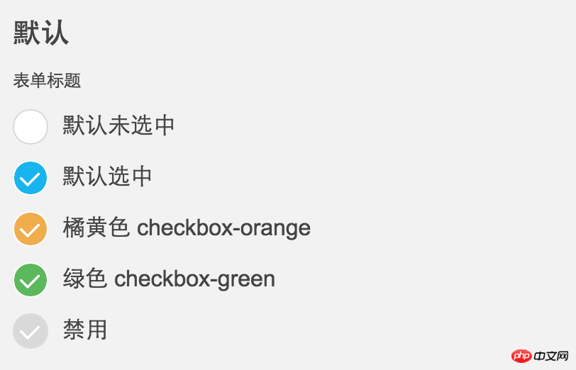
ps: The checkbox in the middle is iconfont, iOS style.
Specific HTML:
<p class="mui-checkbox-con">
    <label>
        <input class="mui-checkbox" type="checkbox">默认未选中</label>
</p>
<p class="mui-checkbox-con">
    <label>
        <input class="mui-checkbox" type="checkbox" checked>默认选中</label>
</p>
<p class="mui-checkbox-con">
    <label>
        <input class="mui-checkbox checkbox-orange" type="checkbox" checked>橘黄色 checkbox-orange</label>
</p>
<p class="mui-checkbox-con">
    <label>
        <input class="mui-checkbox checkbox-green" type="checkbox" checked>绿色 checkbox-green</label>
</p>
<p class="mui-checkbox-con">
    <label>
        <input class="mui-checkbox" type="checkbox" disabled>禁用</label>
</p>CSS code (exported by SCSS, the layout is a bit strange):
.mui-checkbox {
  -webkit-appearance: none;
  position: relative;
  width: 25px;
  height: 25px;
  margin-right: 10px;
  background-color: #FFFFFF;
  border: solid 1px #d9d9d9;
  border-top-left-radius: 20px;
  border-top-rightright-radius: 20px;
  border-bottom-left-radius: 20px;
  border-bottom-rightright-radius: 20px;
  background-clip: padding-box;
  display: inline-block; }
  .mui-checkbox:focus {
    outline: 0 none;
    outline-offset: -2px; }
  .mui-checkbox:checked {
    background-color: #18b4ed;
    border: solid 1px #FFFFFF; }
    .mui-checkbox:checked:before {
      display: inline-block;
      margin-top: 1px;
      margin-left: 2px;
      font-family: iconfont;
      content: "\e667";
      color: #FFFFFF;
      font-size: 18px; }
  .mui-checkbox:disabled {
    background-color: #d9d9d9;
    border: solid 1px #d9d9d9; }
    .mui-checkbox:disabled:before {
      display: inline-block;
      margin-top: 1px;
      margin-left: 2px;
      font-family: iconfont;
      content: "\e667";
      color: #FFFFFF;
      font-size: 18px; }
  .mui-checkbox.checkbox-green:checked {
    background-color: #5cb85c; }
  .mui-checkbox.checkbox-orange:checked {
    background-color: #f0ad4e; }
  .mui-checkbox.checkbox-s {
    width: 19px;
    height: 19px; }
    .mui-checkbox.checkbox-s:before {
      display: inline-block;
      margin-top: 1px;
      margin-left: 2px;
      font-family: iconfont;
      content: "\e667";
      color: #FFFFFF;
      font-size: 13px; }
.mui-checkbox-anim {
  -webkit-transition: background-color ease 0.2s;
transition: background-color ease 0.2s; }SCSS code:
@mixin checkedCon($fs:18px) {
  &:before {
    display: inline-block;
    margin-top: 1px;
    margin-left: 2px;
    font-family: iconfont;
    content: "\e667";
    color: #FFFFFF;
    font-size: $fs;
  }
}
$duration: .4s;
.mui-checkbox {
  -webkit-appearance: none;
  position: relative;
  width: 25px;
  height: 25px;
  margin-right: 10px;
  background-color: #FFFFFF;
  border: solid 1px #d9d9d9;
  border-top-left-radius: 20px;
  border-top-rightright-radius: 20px;
  border-bottom-left-radius: 20px;
  border-bottom-rightright-radius: 20px;
  background-clip: padding-box;
  display: inline-block;
  &:focus {
    outline: 0 none;
    outline-offset: -2px
  }
  &:checked {
    background-color: #18b4ed;
    border: solid 1px #FFFFFF;
    @include checkedCon();
  }
  &:disabled {
    background-color: #d9d9d9;
    border: solid 1px #d9d9d9;
    @include checkedCon();
  }
  &.checkbox-green:checked {
    background-color: #5cb85c;
  }
  &.checkbox-orange:checked {
    background-color: #f0ad4e;
  }
  &.checkbox-s {
    width: 19px;
    height: 19px;
    @include checkedCon(13px);
  }
}
.mui-checkbox-anim{
  //border等其他元素不做过渡效果,增加视觉差,更有动画效果
  transition: background-color ease $duration/2;
}With switch switch
itself. The purpose of making this UI is to support mobile pages, and webkit also supports single-tagged input elements using pseudo-classes (:before or:after), so I didn’t make any changes. Much support and optimization, I just want to keep the html as clean as possible, so I don’t use other elements for simulation. If you want to use it on a desktop application or support other browsers, you can modify it slightly yourself. I haven't tested it anyway.
Today I continue to share an iOS-style switch button, which looks very common, as shown in the picture: 
<label><input class="mui-switch" type="checkbox"> 默认未选中</label>
<label><input class="mui-switch" type="checkbox" checked> 默认选中</label>
<label><input class="mui-switch mui-switch-animbg" type="checkbox"> 默认未选中,简单的背景过渡效果,加mui-switch-animbg类即可</label>
<label><input class="mui-switch mui-switch-animbg" type="checkbox" checked> 默认选中</label>
<label><input class="mui-switch mui-switch-anim" type="checkbox"> 默认未选中,过渡效果,加 mui-switch-anim
类即可</label>
<label><input class="mui-switch mui-switch-anim" type="checkbox" checked> 默认选中</label>
.mui-switch {
  width: 52px;
  height: 31px;
  position: relative;
  border: 1px solid #dfdfdf;
  background-color: #fdfdfd;
  box-shadow: #dfdfdf 0 0 0 0 inset;
  border-radius: 20px;
  border-top-left-radius: 20px;
  border-top-rightright-radius: 20px;
  border-bottom-left-radius: 20px;
  border-bottom-rightright-radius: 20px;
  background-clip: content-box;
  display: inline-block;
  -webkit-appearance: none;
  user-select: none;
  outline: none; }
  .mui-switch:before {
    content: '';
    width: 29px;
    height: 29px;
    position: absolute;
    top: 0px;
    left: 0;
    border-radius: 20px;
    border-top-left-radius: 20px;
    border-top-rightright-radius: 20px;
    border-bottom-left-radius: 20px;
    border-bottom-rightright-radius: 20px;
    background-color: #fff;
    box-shadow: 0 1px 3px rgba(0, 0, 0, 0.4); }
  .mui-switch:checked {
    border-color: #64bd63;
    box-shadow: #64bd63 0 0 0 16px inset;
    background-color: #64bd63; }
    .mui-switch:checked:before {
      left: 21px; }
  .mui-switch.mui-switch-animbg {
    transition: background-color ease 0.4s; }
    .mui-switch.mui-switch-animbg:before {
      transition: left 0.3s; }
    .mui-switch.mui-switch-animbg:checked {
      box-shadow: #dfdfdf 0 0 0 0 inset;
      background-color: #64bd63;
      transition: border-color 0.4s, background-color ease 0.4s; }
      .mui-switch.mui-switch-animbg:checked:before {
        transition: left 0.3s; }
  .mui-switch.mui-switch-anim {
    transition: border cubic-bezier(0, 0, 0, 1) 0.4s, box-shadow cubic-bezier(0, 0, 0, 1) 0.4s; }
    .mui-switch.mui-switch-anim:before {
      transition: left 0.3s; }
    .mui-switch.mui-switch-anim:checked {
      box-shadow: #64bd63 0 0 0 16px inset;
      background-color: #64bd63;
      transition: border ease 0.4s, box-shadow ease 0.4s, background-color ease 1.2s; }
      .mui-switch.mui-switch-anim:checked:before {
        transition: left 0.3s; }
/*# sourceMappingURL=mui-switch.css.map */@mixin borderRadius($radius:20px) {
border-radius: $radius;
border-top-left-radius: $radius;
border-top-rightright-radius: $radius;
border-bottom-left-radius: $radius;
border-bottom-rightright-radius: $radius;
}
$duration: .4s;
$checkedColor: #64bd63;
.mui-switch {
width: 52px;
height: 31px;
position: relative;
border: 1px solid #dfdfdf;
background-color: #fdfdfd;
box-shadow: #dfdfdf 0 0 0 0 inset;
@include borderRadius();
background-clip: content-box;
display: inline-block;
-webkit-appearance: none;
user-select: none;
outline: none;
&:before {
content: '';
width: 29px;
height: 29px;
position: absolute;
top: 0px;
left: 0;
@include borderRadius();
background-color: #fff;
box-shadow: 0 1px 3px rgba(0, 0, 0, 0.4);
}
&:checked {
border-color: $checkedColor;
box-shadow: $checkedColor 0 0 0 16px inset;
background-color: $checkedColor;
&:before {
left: 21px;
}
}
&.mui-switch-animbg {
transition: background-color ease $duration;
&:before {
transition: left 0.3s;
}
&:checked {
box-shadow: #dfdfdf 0 0 0 0 inset;
background-color: $checkedColor;
transition: border-color $duration, background-color ease $duration;
&:before {
transition: left 0.3s;
}
}
}
&.mui-switch-anim {
transition: border cubic-bezier(0, 0, 0, 1) $duration, box-shadow cubic-bezier(0, 0, 0, 1) $duration;
&:before {
transition: left 0.3s;
}
&:checked {
box-shadow: $checkedColor 0 0 0 16px inset;
background-color: $checkedColor;
transition: border ease $duration, box-shadow ease $duration, background-color ease $duration*3;
&:before {
transition: left 0.3s;
}
}
}
}Analysis of scale scaling in transform of css3
About list-style modifying list attributes in CSS Problems with controlling the style of the li tag
About the code that uses ellipses to replace CSS text when it exceeds the div or span
The above is the detailed content of Use CSS3 to write code similar to check boxes and buttons with switches in iOS. For more information, please follow other related articles on the PHP Chinese website!

Hot AI Tools

Undresser.AI Undress
AI-powered app for creating realistic nude photos

AI Clothes Remover
Online AI tool for removing clothes from photos.

Undress AI Tool
Undress images for free

Clothoff.io
AI clothes remover

Video Face Swap
Swap faces in any video effortlessly with our completely free AI face swap tool!

Hot Article
Hot Tools

Notepad++7.3.1
Easy-to-use and free code editor

SublimeText3 Chinese version
Chinese version, very easy to use

Zend Studio 13.0.1
Powerful PHP integrated development environment

Dreamweaver CS6
Visual web development tools

SublimeText3 Mac version
God-level code editing software (SublimeText3)
Hot Topics
 1653
1653
 14
1413
52
1306
25
1251
29
1224
24
14
1413
52
1306
25
1251
29
1224
24

![Change the power button action on Windows 11 [5 Tips]](https://img.php.cn/upload/article/000/887/227/169600135086895.png?x-oss-process=image/resize,m_fill,h_207,w_330) Change the power button action on Windows 11 [5 Tips]
Sep 29, 2023 pm 11:29 PM
Change the power button action on Windows 11 [5 Tips]
Sep 29, 2023 pm 11:29 PM
The power button can do more than shut down your PC, although this is the default action for desktop users. If you want to change the power button action in Windows 11, it's easier than you think! Keep in mind that the physical power button is different from the button in the Start menu, and the changes below won't affect the operation of the latter. Additionally, you'll find slightly different power options depending on whether it's a desktop or laptop. Why should you change the power button action in Windows 11? If you put your computer to sleep more often than you shut it down, changing the way your hardware power button (that is, the physical power button on your PC) behaves will do the trick. The same idea applies to sleep mode or simply turning off the display. Change Windows 11
 iOS 17: How to organize iMessage apps in Messages
Sep 18, 2023 pm 05:25 PM
iOS 17: How to organize iMessage apps in Messages
Sep 18, 2023 pm 05:25 PM
In iOS 17, Apple not only added several new messaging features, but also tweaked the design of the Messages app to give it a cleaner look. All iMessage apps and tools, such as the camera and photo options, can now be accessed by tapping the "+" button above the keyboard and to the left of the text input field. Clicking the "+" button brings up a menu column with a default order of options. Starting from the top, there's camera, photos, stickers, cash (if available), audio, and location. At the very bottom is a "More" button, which when tapped will reveal any other installed messaging apps (you can also swipe up to reveal this hidden list). How to reorganize your iMessage app You can do this below
 How to use Vue to implement button countdown effects
Sep 21, 2023 pm 02:03 PM
How to use Vue to implement button countdown effects
Sep 21, 2023 pm 02:03 PM
How to use Vue to implement button countdown effects With the increasing popularity of web applications, we often need to use some dynamic effects to improve user experience when users interact with the page. Among them, the countdown effect of the button is a very common and practical effect. This article will introduce how to use the Vue framework to implement button countdown effects and give specific code examples. First, we need to create a Vue component that contains a button and countdown function. In Vue, a component is a reusable Vue instance, and a view will
 Can Elden's Ring be played on switch?
Mar 11, 2024 am 11:31 AM
Can Elden's Ring be played on switch?
Mar 11, 2024 am 11:31 AM
Can Elden's Ring be played on the switch? As a very charming action RPG game, many friends may not know whether it can be played smoothly on the switch platform. The answer is that it cannot be played at the moment. accomplish. Can Ring of Elden be played on switch? Answer: It cannot be played on switch. This highly anticipated Souls series role-playing action game has been officially released. Players can purchase it on PC, PS4/5 and Xbox Series eX|S/XboxOne and experience it immediately. Many friends who own a switch may still be eager to enjoy this game on the NS, but unfortunately, there is no switch version of the game. According to the official website configuration requirements, the game configuration is relatively high, and sw
 Why won't my laptop start up after pressing the power button?
Mar 10, 2024 am 09:31 AM
Why won't my laptop start up after pressing the power button?
Mar 10, 2024 am 09:31 AM
There could be several reasons why your Windows laptop won't boot. Memory failure, dead battery, faulty power button, or hardware issues are all common causes. Here are some solutions to help you resolve this issue. Laptop won't turn on after pressing the power button If your Windows laptop still won't turn on after pressing the power button, here are some steps you can take to resolve the issue: Is your laptop fully charged? Perform a hard reset to clean your laptop Reseat the memory Transparent CMOS type battery Take your laptop for repair. 1] Is your laptop fully charged? The first thing to do is to check if your laptop is fully charged. Laptop won't start if battery is drained
 What does iPhone 16 look like? What changes are there in iPhone 16?
Apr 07, 2024 pm 05:10 PM
What does iPhone 16 look like? What changes are there in iPhone 16?
Apr 07, 2024 pm 05:10 PM
After the release of the iPhone 15 series, there have been constant revelations about the appearance and configuration of Apple’s new iPhone 16. What does iPhone 16 look like? Is there any improvement in iPhone 16? Recently, an overseas blogger showed off the design of the iPhone 16 series. The overall design is basically the same as the iPhone 15 series. As you can see from the picture, the entire iPhone 16 series is equipped with a new "shoot" button as standard, allowing users to take photos more conveniently. In addition, other design details are still unknown. The message shows that this new button will be used to shoot videos and is located below the power button. Previous news has mentioned that it may be a capacitive solid-state button, but recent reports indicate that it should still be a
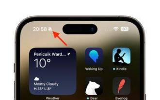 iPhone 15 Pro: How to get rid of the silent mode symbol in the status bar
Sep 24, 2023 pm 10:01 PM
iPhone 15 Pro: How to get rid of the silent mode symbol in the status bar
Sep 24, 2023 pm 10:01 PM
On iPhone 15 Pro and iPhone 15 Pro Max models, Apple introduced a physically programmable action button that replaces the traditional ring/silent switch above the volume buttons. The action button can be programmed to perform several different functions, but the ability to switch between silent and ring modes isn't gone. By default, a long press on the action button will silence the device and the button's tactile feedback will pulse three times. Both iPhone 15 Pro models will display a crossed-out bell symbol next to the time in the status bar to indicate that silent/silent mode is activated, and it will remain so until you long-press the Action button again to unmute the device. If you prefer to put your iPhone in silent mode
 How to solve the problem of unresponsive buttons in IE browser
Jan 30, 2024 am 10:48 AM
How to solve the problem of unresponsive buttons in IE browser
Jan 30, 2024 am 10:48 AM
What should I do if there is no response when clicking the web button in IE browser? If there is no response when we click the web button, we can set it in the compatibility view! When some friends are using the IE browser, they find that the browser will not respond when clicking the button on the web page. In this way, we cannot use the functions of the web page. How can we set it up? The editor has compiled the IE browser below. How to solve the problem of the browser not responding when clicking the web button? If not, follow me and read on! IE browser does not respond when clicking the web button. Solution: 1. Open IE browser, click the [Tools] button on the operation bar, and click [Compatibility View] settings, as shown in the figure. 2. In the [Compatibility View] setting page, click the [Add] button on the right and fill in the website.
