

About the application of CSS pseudo elements

Use CSS pseudo-elements: before and: after to insert content before and after the document without changing the original structure of the document. There is a good example below, you can refer to it
Use CSS pseudo-elements: before and :after can insert content before and after the document without changing the original structure of the document. Combined with box-shadow, it can achieve very cool effects.
Here are three examples:
1. Use :before and :after to add Background, such as putting quotation marks before and after a piece of text;
2. Use: before, :after, box-shadow to achieve 3D shadow effect;
3. Use: before, :after, box-shadow to achieve photo overlay effect.
<!DOCTYPE html>
<html>
<head>
<title>Pseudo Demo</title>
<style>
body{background-color:#ccd3d7;padding:40px;}
h2{display:block;border-bottom:1px solid #ddd;padding:15px;}
p.myquote{padding:1em;font-size:16px;margin:8px 1em;position:relative;color:blue;line-height:1.7em;}
p.myquote:before,p.myquote:after{font-size:40px;position:absolute;padding:0;margin:0;color:green;}
p.myquote:hover:before,p.myquote:hover:after{color:red;font-size:50px;}
p.myquote:before{content:"“";left:0;left:-10px;}
p.myquote:after{content:"”";padding-left:15px;bottom:4px;}
.shbox{
background:#fff;
padding:10px;
width:90%;
margin:40px auto;
height:auto;
margin:40px auto;
}
.sh-down-lr{position:relative;}
.sh-down-lr:before,.sh-down-lr:after{
z-index: -1;
position: absolute;
content: "";
bottom: 15px;
left: 10px;
width: 50%;
top: 80%;
max-width:300px;
background: #777;
-webkit-box-shadow: 0 15px 10px #777;
-moz-box-shadow: 0 15px 10px #777;
box-shadow: 0 15px 10px #777;
-webkit-transform: rotate(-3deg);
-moz-transform: rotate(-3deg);
-o-transform: rotate(-3deg);
-ms-transform: rotate(-3deg);
transform: rotate(-3deg);
}
.sh-down-lr:after{
-webkit-transform: rotate(3deg);
-moz-transform: rotate(3deg);
-o-transform: rotate(3deg);
-ms-transform: rotate(3deg);
transform: rotate(3deg);
right:10px;
left:auto;
}
.stackone {
border: 6px solid #fff;
width: 400px;
height:225px;
margin: 50px;
position: relative;
-webkit-box-shadow: 2px 2px 5px rgba(0,0,0,0.3);
-moz-box-shadow: 2px 2px 5px rgba(0,0,0,0.3);
box-shadow: 2px 2px 5px rgba(0,0,0,0.3);
}
.stackone img{width:100%;heigth:100%;}
.stackone:before,.stackone:after {
content: "";
width: 400px;
height:225px;
background: #aaa;
border: 6px solid #fff;
position:absolute;
z-index:-1;
top:0;
left:-10px;
-webkit-box-shadow: 2px 2px 5px rgba(0,0,0,0.3);
-moz-box-shadow: 2px 2px 5px rgba(0,0,0,0.3);
box-shadow: 2px 2px 5px rgba(0,0,0,0.3);
-webkit-transform: rotate(-5deg);
-moz-transform: rotate(-5deg);
-o-transform: rotate(-5deg);
-ms-transform: rotate(-5deg);
transform: rotate(-5deg);
}
.stackone:after {
top:5px;
left:0;
-webkit-transform: rotate(3deg);
-moz-transform: rotate(3deg);
-o-transform: rotate(3deg);
-ms-transform: rotate(3deg);
transform: rotate(3deg);
}
</style>
</head>
<body>
<p class="shbox sh-down-lr">
<h2>CSS Demo :before, :after, box-shadow</h2>
<p>人最宝贵的是生命。生命属于人只有一次。人的一生应当这样度过:当回忆往事的时候,他不会因为虚度年华而悔恨,也不会因为碌碌无为而羞愧.</p>
<p>钢是在烈火里燃烧、高度冷却中炼成的,因此它很坚固。我们这一代人也是在斗争中和艰苦考验中锻炼出来的,并且学会了在生活中从不灰心丧气。</p>
</p>
<p style="background:none;">
<p>
<img src="http://photos.tuchong.com/392707/f/6512410.jpg" />
<p>
</p>
</body>
</html>Achievement effect: 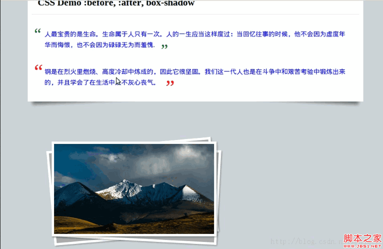
The above is the entire content of this article. I hope it will be helpful to everyone’s learning. For more related content, please pay attention to the PHP Chinese website !
Related recommendations:
About the grid system principle of bootstrap3.0
Sharing about how to control the background with css
How to use CSS to control front-end image HTTP requests
The above is the detailed content of About the application of CSS pseudo elements. For more information, please follow other related articles on the PHP Chinese website!

Hot AI Tools

Undresser.AI Undress
AI-powered app for creating realistic nude photos

AI Clothes Remover
Online AI tool for removing clothes from photos.

Undress AI Tool
Undress images for free

Clothoff.io
AI clothes remover

Video Face Swap
Swap faces in any video effortlessly with our completely free AI face swap tool!

Hot Article
Hot Tools

Notepad++7.3.1
Easy-to-use and free code editor

SublimeText3 Chinese version
Chinese version, very easy to use

Zend Studio 13.0.1
Powerful PHP integrated development environment

Dreamweaver CS6
Visual web development tools

SublimeText3 Mac version
God-level code editing software (SublimeText3)
Hot Topics
 1653
1653
 14
1413
52
1304
25
1251
29
1224
24
14
1413
52
1304
25
1251
29
1224
24

 Stacked Cards with Sticky Positioning and a Dash of Sass
Apr 03, 2025 am 10:30 AM
Stacked Cards with Sticky Positioning and a Dash of Sass
Apr 03, 2025 am 10:30 AM
The other day, I spotted this particularly lovely bit from Corey Ginnivan’s website where a collection of cards stack on top of one another as you scroll.
 Google Fonts Variable Fonts
Apr 09, 2025 am 10:42 AM
Google Fonts Variable Fonts
Apr 09, 2025 am 10:42 AM
I see Google Fonts rolled out a new design (Tweet). Compared to the last big redesign, this feels much more iterative. I can barely tell the difference
 How to Create an Animated Countdown Timer With HTML, CSS and JavaScript
Apr 11, 2025 am 11:29 AM
How to Create an Animated Countdown Timer With HTML, CSS and JavaScript
Apr 11, 2025 am 11:29 AM
Have you ever needed a countdown timer on a project? For something like that, it might be natural to reach for a plugin, but it’s actually a lot more
 HTML Data Attributes Guide
Apr 11, 2025 am 11:50 AM
HTML Data Attributes Guide
Apr 11, 2025 am 11:50 AM
Everything you ever wanted to know about data attributes in HTML, CSS, and JavaScript.
 Why are the purple slashed areas in the Flex layout mistakenly considered 'overflow space'?
Apr 05, 2025 pm 05:51 PM
Why are the purple slashed areas in the Flex layout mistakenly considered 'overflow space'?
Apr 05, 2025 pm 05:51 PM
Questions about purple slash areas in Flex layouts When using Flex layouts, you may encounter some confusing phenomena, such as in the developer tools (d...
 How to select a child element with the first class name item through CSS?
Apr 05, 2025 pm 11:24 PM
How to select a child element with the first class name item through CSS?
Apr 05, 2025 pm 11:24 PM
When the number of elements is not fixed, how to select the first child element of the specified class name through CSS. When processing HTML structure, you often encounter different elements...
 A Proof of Concept for Making Sass Faster
Apr 16, 2025 am 10:38 AM
A Proof of Concept for Making Sass Faster
Apr 16, 2025 am 10:38 AM
At the start of a new project, Sass compilation happens in the blink of an eye. This feels great, especially when it’s paired with Browsersync, which reloads
 In front-end development, how to use CSS and JavaScript to achieve searchlight effects similar to Windows 10 settings interface?
Apr 05, 2025 pm 10:21 PM
In front-end development, how to use CSS and JavaScript to achieve searchlight effects similar to Windows 10 settings interface?
Apr 05, 2025 pm 10:21 PM
How to implement Windows-like in front-end development...
