This article mainly shares CSS3 flexible box model development notes for everyone. Friends who want to learn the CSS3 flexible box model should not miss this article. You can refer to it.
This article will continue to share CSS3 flexible box with everyone. The second part of the model development notes. The previous one also introduced the CSS3 flexible box model for everyone. Click to view: CSS3 flexible box model development notes (1)
box-flex attribute
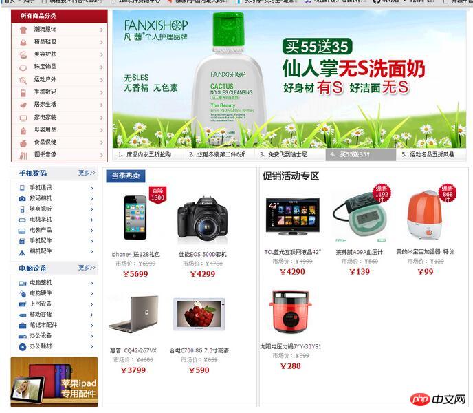
The box-flex attribute can flexibly control the display space of child elements in the box. Note that the display space includes the width and height of the child element, not just the width of the column where the child element is located. It can also be said to be the area occupied by the child element in the box. This attribute is very important in elastic layout. It solves the disadvantages of using percentages to define elastic layout in traditional design. Basic syntax of the box-flex attribute:
box-flex:
Value description:
Practical experience: Adaptive column width design
In traditional web design, if you want to divide a column into three columns, the simpler way is to divide the three sub-sections into three sub-sections. The width of the elements is set to 33.3%. This approach cannot completely fill the width of the parent element. When the width of the parent element is large enough, the user will see unfilled blank space. However, flex layout becomes more complicated if you set a fixed width value for the child elements. If you use the box-flex attribute, this problem will be solved.
html code:
<body>
<h1><img src="images/web3_13.gif" /></h1>
<p id="box">
    <!--左侧栏目-->
    <p id="box1"><img src="images/web3_01.gif" /></p>
    <!--中间栏目-->
    <p id="box2">
        <h2><img src="images/web3_02.gif" /></h2>
        <p><img src="images/web3_04.gif" /></p>
        <p><img src="images/web3_05.gif" /></p>
        <p><img src="images/web3_06.gif" /></p>
        <p><img src="images/web3_07.gif" /></p>
    </p>
    <!--右侧栏目-->
    <p id="box3">
        <h2><img src="images/web3_12.gif" /></h2>
        <p><img src="images/web3_08.gif" /></p>
        <p><img src="images/web3_09.gif" /></p>
        <p><img src="images/web3_10.gif" /></p>
        <p><img src="images/web3_11.gif" /></p>
    </p>
</p>
</body>CSS3 code:
/*这是一个三栏布局的页面,其中左侧栏目的宽度是固定的,而中间和右侧栏目的宽度是弹性的*/
<style>
body{
    margin:0;
    padding:0;
    text-align:center;
}
h1,h2{margin:2px;}
#box{
    margin:auto;
    text-align:left;
    width:1002px;
    overflow:hidden;
}
/*定义box元素盒形显示,并设置子元素水平布置*/
#box{
    display:box;
    display:-moz-box;
    display:-webkit-box;
    box-orient:horizontal;
    -moz-box-orient:horizontal;
    -webkit-box-orient:horizontal;
}
/*定义盒子左侧栏目的宽度为固定显示*/
#box1{width:201px;}
#box2,#box3{
    border:1px solid #CCC;
    margin:2px;
}
/*定义盒子内中间栏目的宽度为盒子剩余空间的2/3*/
#box2{
    box-flex: 4;
    -moz-box-flex: 4;
    -webkit-box-flex: 4;
}
/*定义盒子内中间栏目的宽度为盒子剩余空间的1/3*/
#box3{
    box-flex:2;
    -moz-box-flex:2;
    -webkit-box-flex:2;
}
#box2 p,#box3 p{
    display:inline;
}
</style>Demo effect:

Implementation and allocation of elastic space
By default, the child element is not elastic, it will be as wide as possible in order to make it Contained content is visible and there is no overflow. If you want to change its size, you can use the width and height attributes to achieve it. Of course, you can also use min-height, min-width, max-height, max-width and other attributes to limit the size.
When the box-flex property is at least greater than 0, it becomes elastic. When a child element is elastic, its size can be changed in the following ways:
1. Use width, height, min-height, min-width, max-height, max-width and other attributes to define size.
2. Use the size of the box to limit the flexible size of child elements.
3. Use the box to allow all the space to limit the elastic size of the element.
If the child element has no declared size, then its size will be completely determined by the size of the box, that is, the size of the child element is equal to the size of the box multiplied by its box-flex property value in the box-flex of all child elements. Percentage of the total attribute value. The formula is expressed as follows:
The size of the child element = the size of the box * the box-flex attribute value of the child element/the sum of the box-flex attribute values of all child elements
If one or more child elements declare specific sizes, their size will be taken into account, and the remaining flex boxes will share the remaining available space according to the above principles.
Due to the support of the internal image size, the space of the child element is always larger than the spare space of the box, and a parsing exception will occur.
The impact of the box-flex attribute on the layout of child elements
HTML code:
<body>
<h1><img src="images/web3_13.gif" /></h1>
<p id="box">
    <!--左侧栏目-->
    <p id="box1"><img src="images/web3_01.gif" /></p>
    <!--中间栏目-->
    <p id="box2"></p>
    <!--右侧栏目-->
    <p id="box3"></p>
</p>
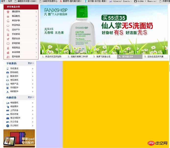
</body>The middle and right sides respectively occupy Half of the remaining space
CSS3 code:
#box2{
    box-flex: 2;
    -moz-box-flex: 2;
    -webkit-box-flex: 2;
    background:#CCF;
}
#box3{
    box-flex: 2;
    -moz-box-flex: 2;
    -webkit-box-flex: 2;
    background:#FC0;
}Demo effect:

The middle column occupies 1/5 of the free space, and the right column occupies 4/5 of the free space
CSS3 code:
#box2{
    box-flex: 0.5;
    -moz-box-flex: 0.5;
    -webkit-box-flex: 0.5;
    background:#CCF;
}
#box3{
    box-flex: 2;
    -moz-box-flex: 2;
    -webkit-box-flex: 2;
    background:#FC0;
}Demo effect:

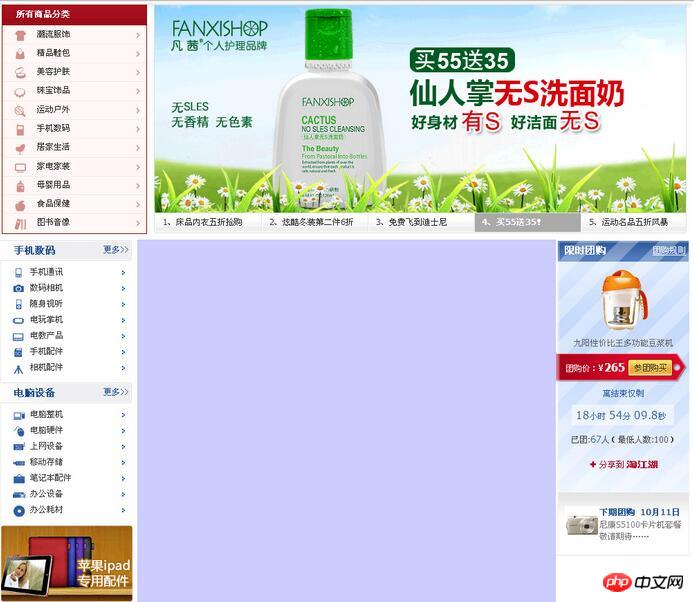
The middle is elastically displayed, occupying all free space, and the right column is fixedly large
CSS3 code:
#box2{
    box-flex: 0.5;
    -moz-box-flex: 0.5;
    -webkit-box-flex: 0.5;
    background:#CCF;
}
#box3{
    width:196px;
    background:url(images/web3_03.gif) no-repeat;
}Demonstration effect:

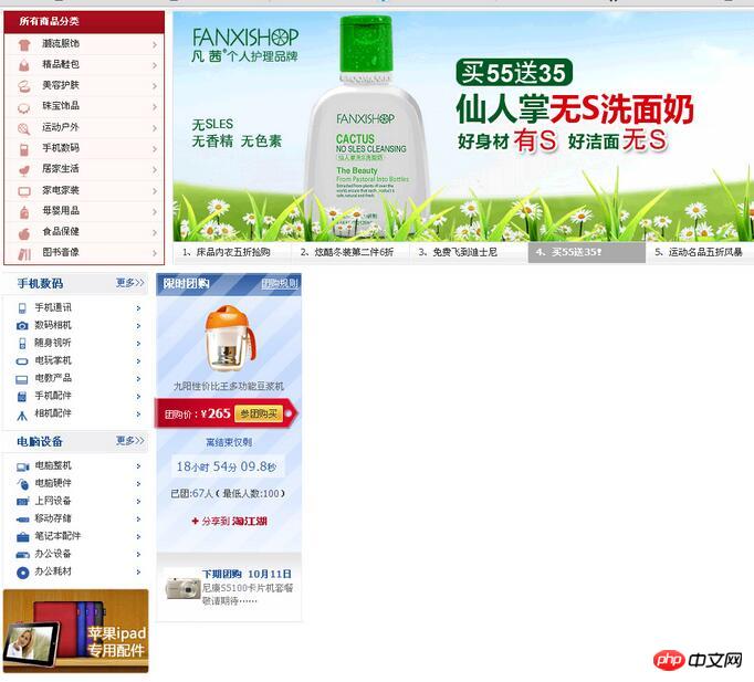
The middle column loses elasticity (when set to 0 or copied), shrinks and displays as a line, and the right column automatically moves to the left
CSS Code:
#box2{
    box-flex: 0;
    -moz-box-flex: 0;
    -webkit-box-flex: 0;
    background:#CCF;
}
#box3{
    width:196px;
    background:url(images/web3_03.gif) no-repeat;
} Demonstration effect:

The above is the entire content of this article. I hope it will be helpful to everyone's study. For more related content, please pay attention to the PHP Chinese website!
Related recommendations:
One of the methods of developing CSS3 flexible box model
##
The above is the detailed content of About the second method of developing CSS3 flexible box model. For more information, please follow other related articles on the PHP Chinese website!


