
 Web Front-end
CSS Tutorial
How to use CSS to achieve the effect of icon rotation when the mouse moves up
Web Front-end
CSS Tutorial
How to use CSS to achieve the effect of icon rotation when the mouse moves up
How to use CSS to achieve the effect of icon rotation when the mouse moves up

This article mainly introduces CSS to realize the mouse-up icon rotation effect. Friends who need it can refer to it
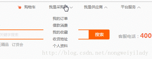
The mouse-up icon rotation effect is often used in corporate projects, especially the top navigation Column, for example:
#The next step is to use css to achieve the icon rotation effect when the mouse moves up.
<!DOCTYPE html>
<html>
<head lang="en">
    <meta charset="UTF-8">
    <title></title>
    <style>
        p,img,body{
            margin: 0;
            padding: 0;
        }
        .box{
            height: 150px;
            width:300px;
            background: #1b7b80;
            margin: 0 auto;
            padding: 20px;
        }
        .box:hover img{
            transform: rotate(180deg);
            -webkit-transform: rotate(180deg);
            -moz-transform: rotate(180deg);
            -o-transform: rotate(180deg);
            -ms-transform: rotate(180deg);
        }
        img{
            margin: 0 auto;
            display: block;
            transition: all 0.2s ease-in-out;
            -webkit-transition: all 0.2s ease-in-out;
            -moz-transition: all 0.2s ease-in-out;
            -o-transition: all 0.2s ease-in-out;
        }
    </style>
</head>
<body>
    <p class="box">
        <img src="img/down.png" alt=""/>
    </p>
</body>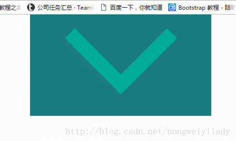
</html>A box is placed here, and a picture is placed in the box. In order to see it more clearly, a larger picture is placed here. The effect to be achieved now is that when the mouse moves over the .box box, the icon img will rotate 180 degrees. In
style, the key is the setting of img and .box:hover img. First, we need to set the transition attribute for img. The attribute here specifies the animation method and duration. Then set the .box to rotate the img 180 degrees when the mouse moves up: hover:
transform: rotate(180deg);
The settings below such as -webkit- are mainly for Set up to be compatible with browsers from various manufacturers.
The effect obtained is shown in the figure below:
The above is the entire content of this article, I hope it will be helpful to everyone's study , please pay attention to the PHP Chinese website for more related content!
Related recommendations:
Use css3 and jQuery to realize text shaking up and down following the mouse
##Use css3 and jQuery to realize text Follow the up and down shaking of the mouse
The above is the detailed content of How to use CSS to achieve the effect of icon rotation when the mouse moves up. For more information, please follow other related articles on the PHP Chinese website!

Hot AI Tools

Undresser.AI Undress
AI-powered app for creating realistic nude photos

AI Clothes Remover
Online AI tool for removing clothes from photos.

Undress AI Tool
Undress images for free

Clothoff.io
AI clothes remover

Video Face Swap
Swap faces in any video effortlessly with our completely free AI face swap tool!

Hot Article
Hot Tools

Notepad++7.3.1
Easy-to-use and free code editor

SublimeText3 Chinese version
Chinese version, very easy to use

Zend Studio 13.0.1
Powerful PHP integrated development environment

Dreamweaver CS6
Visual web development tools

SublimeText3 Mac version
God-level code editing software (SublimeText3)
Hot Topics
 1657
1657
 14
1415
52
1309
25
1257
29
1229
24
14
1415
52
1309
25
1257
29
1229
24

 Google Fonts Variable Fonts
Apr 09, 2025 am 10:42 AM
Google Fonts Variable Fonts
Apr 09, 2025 am 10:42 AM
I see Google Fonts rolled out a new design (Tweet). Compared to the last big redesign, this feels much more iterative. I can barely tell the difference
 How to Create an Animated Countdown Timer With HTML, CSS and JavaScript
Apr 11, 2025 am 11:29 AM
How to Create an Animated Countdown Timer With HTML, CSS and JavaScript
Apr 11, 2025 am 11:29 AM
Have you ever needed a countdown timer on a project? For something like that, it might be natural to reach for a plugin, but it’s actually a lot more
 HTML Data Attributes Guide
Apr 11, 2025 am 11:50 AM
HTML Data Attributes Guide
Apr 11, 2025 am 11:50 AM
Everything you ever wanted to know about data attributes in HTML, CSS, and JavaScript.
 How to select a child element with the first class name item through CSS?
Apr 05, 2025 pm 11:24 PM
How to select a child element with the first class name item through CSS?
Apr 05, 2025 pm 11:24 PM
When the number of elements is not fixed, how to select the first child element of the specified class name through CSS. When processing HTML structure, you often encounter different elements...
 Why are the purple slashed areas in the Flex layout mistakenly considered 'overflow space'?
Apr 05, 2025 pm 05:51 PM
Why are the purple slashed areas in the Flex layout mistakenly considered 'overflow space'?
Apr 05, 2025 pm 05:51 PM
Questions about purple slash areas in Flex layouts When using Flex layouts, you may encounter some confusing phenomena, such as in the developer tools (d...
 How We Created a Static Site That Generates Tartan Patterns in SVG
Apr 09, 2025 am 11:29 AM
How We Created a Static Site That Generates Tartan Patterns in SVG
Apr 09, 2025 am 11:29 AM
Tartan is a patterned cloth that’s typically associated with Scotland, particularly their fashionable kilts. On tartanify.com, we gathered over 5,000 tartan
 A Proof of Concept for Making Sass Faster
Apr 16, 2025 am 10:38 AM
A Proof of Concept for Making Sass Faster
Apr 16, 2025 am 10:38 AM
At the start of a new project, Sass compilation happens in the blink of an eye. This feels great, especially when it’s paired with Browsersync, which reloads
 In front-end development, how to use CSS and JavaScript to achieve searchlight effects similar to Windows 10 settings interface?
Apr 05, 2025 pm 10:21 PM
In front-end development, how to use CSS and JavaScript to achieve searchlight effects similar to Windows 10 settings interface?
Apr 05, 2025 pm 10:21 PM
How to implement Windows-like in front-end development...
