This article mainly introduces the relevant information on the detailed use of css3 matrix. The editor thinks it is quite good. Now I will share it with you and give it as a reference. Let’s follow the editor to take a look at
css3 matrix changes. The application format is:
transform: matrix(a,b,c,d,e,f);
, which corresponds to:

The conversion in practical application is:

where:
ax cy e = abscissa
bx dy f = vertical coordinate
Why is there an extra 0 0 1? Because, in order to make up the parameters.
translate matrix
The basic format is:
transform: matrix(1, 0, 0, 1, X, Y); // X 横向平移, Y 纵向平移
scale matrix
The scale matrix is also quite simple.
// 将 X 轴缩放 A 倍
// 将 Y 轴缩放 B 倍
matrix(A, 0, 0, B, 0,0);
Of course, if you are in the last two Write numbers, which represent, first zoom and then translate.
// 得到: X 轴 = 0.3*x + 100
// 得到: Y 轴 = 0.2*x + 200
matrix(0.3,0,0,0.2,100,200);
rotate matrix
rotate is actually the same as the triangle The function has a lot to do with it. First, determine your rotation angle (clockwise rotation). Then, calculate sinθ and cosθ. The final matrix formula is:
matrix(cosθ,sinθ,-sinθ,cosθ,0,0) // 就是 cs-sc
skew matrix
skew (stretch) matrix is also a trigonometric function, but tanθ is used. The format is:
// 将 Y 轴向 X 轴倾斜 A°
// 将 X 轴向 Y 轴倾斜 B°
matrix(1,tan(A),tan(B),1,0,0)
3D transformation matrix
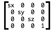
3D transformation is a 4*4 matrix. It is similar to 2D, except that there is one more Z. // This is the scaled 3D matrix
 The corresponding css of
is written as:
transform: matrix3d(sx, 0, 0, 0, 0, sy, 0, 0, 0, 0, sz, 0, 0, 0, 0, 1)
The above is The entire content of this article is hoped to be helpful to everyone's study. For more related content, please pay attention to the PHP Chinese website!
Related recommendations:
About the method of drawing triangle icons in Html and CSS
About CSS3 Analysis of rem (set font size)
The above is the detailed content of About how to use matrices in css3. For more information, please follow other related articles on the PHP Chinese website!


