Use css3 to imitate the start menu of window7
Quite realistic, css3 is really powerful. What points should be paid attention to are still the same. The difficulty lies in fine-tuning the details, especially the production of gradient background. CSS3 is very flexible. Next time I have the opportunity, I will post a detailed tutorial on CSS3 gradient background.
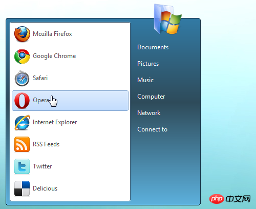
Quite realistic, css3 is really powerful.
Friendly reminder: Please do not browse under IE.
Let’s take a look at the original author’s design sketch: 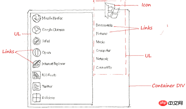
Concise creation process
Step one: Create the following menu structure
<p id="startmenu">
<ul id="programs">
<li><a href="#"><img src="firefox-32.png" alt="" />Mozilla Firefoxa></li>
<li><a href="#"><img src="chrome.png" alt="" />Google Chromea></li>
<li><a href="#"><img src="safari.png" alt="" />Safaria></li>
<li><a href="#"><img src="opera.png" alt="" />Operaa></li>
<li><a href="#"><img src="ie.png" alt="" />Internet Explorera></li>
<li><a href="#"><img src="rss_32.png" alt="" />RSS Feedsa></li>
<li><a href="#"><img src="twitter_32.png" alt="" />Twittera></li>
<li><a href="#"><img src="delicious_32.png" alt="" />Deliciousa></li>
<ul>
<ul id="links">
<li class="icon"><img src="folder.png" alt="" /></li>
<li><a href="#"><span>Documentsspan>a></li>
<li><a href="#"><span>Picturesspan>a></li>
<li><a href="#"><span>Musicspan>a></li>
<li><a href="#"><span>Computerspan>a></li>
<li><a href="#"><span>Networkspan>a></li>
<li><a href="#"><span>Connect tospan>a></li>
<ul>
p>
The start menu of win7 has two parts, the program menu on the left and the system menu on the right.
Step 2: Menu container css
#startmenu { border:solid 1px #102a3e; overflow:visible; display:inline-block; margin:60px 0 0 20px;
-moz-border-radius:5px;-webkit-border-radius:5px; position:relative;
box-shadow: inset 0 0 1px #fff; -moz-box-shadow: inset 0 0 1px #fff; -webkit-box-shadow: inset 0 0 1px #fff;
background-color:#619bb9;
background: -moz-linear-gradient(top, rgba(50, 123, 165, 0.75), rgba(46, 75, 90, 0.75) 50%, rgba(92, 176, 220, 0.75));
background: -webkit-gradient(linear, center top, center bottom, from(#327aa4),color-stop(45%, #2e4b5a), to(#5cb0dc)); }There are several points of concern, you can pay attention to:
-moz-border-radius:5px;-webkit-border-radius:5px;圆角效果,这是css3中应用最广的
box-shadow: inset 0 0 1px #fff; -moz-box-shadow: inset 0 0 1px #fff; -webkit-box-shadow: inset 0 0 1px #fff;阴影效果
background: -moz-linear-gradient(top, rgba(50, 123, 165, 0.75), rgba(46, 75, 90, 0.75) 50%, rgba(92, 176, 220, 0.75));渐变背景
Step 3: css on the left side of the menu
#programs { background:#fff; border:solid 1px #365167; margin:7px 0 7px 7px;
box-shadow: 0 0 1px #fff; -moz-box-shadow: 0 0 1px #fff; -webkit-box-shadow: 0 0 1px #fff;
-moz-border-radius:3px;-webkit-border-radius:3px;}
#programs a { border:solid 1px transparent; display:block; padding:3px; margin:3px;
color:#4b4b4b; text-decoration:none; min-width:220px;}
#programs a:hover {border:solid 1px #7da2ce;
-moz-border-radius:3px; -webkit-border-radius:3px;
box-shadow: inset 0 0 1px #fff; -moz-box-shadow: inset 0 0 1px #fff; -webkit-box-shadow: inset 0 0 1px #fff;
background-color:#cfe3fd;
background: -moz-linear-gradient(top, #dcebfd, #c2dcfd);
background: -webkit-gradient(linear, center top, center bottom, from(#dcebfd), to(#c2dcfd));}
#programs a img {border:0; vertical-align:middle; margin:0 5px 0 0;}What is worth noting here is the effect setting of the mouse passing through the menu item, which is the style in #programs a:hover, This is the difficulty, and it is also the power of CSS3, which is still rounded corners, shadows, and gradient backgrounds.
Step 4: The CSS part on the right side of the menu
#links {margin:7px; margin-top:-30px;}
#links li.icon {text-align:center;}
#links a {border:solid 1px transparent; display:block; margin:5px 0; position:relative;
color:#fff; text-decoration:none; min-width:120px;}
#links a:hover {border:solid 1px #000;
-moz-border-radius:3px; -webkit-border-radius:3px;
box-shadow: 0 0 1px #fff; -moz-box-shadow: inset 0 0 1px #fff; -webkit-box-shadow: inset 0 0 1px #fff;
background-color:#658da0;
background: -moz-linear-gradient(center left, rgba(81,115,132,0.55), rgba(121,163,184,0.55) 50%, rgba(81,115,132,0.55));
background: -webkit-gradient(linear, 0% 100%, 100% 100%, from(#517384), color-stop(50%, #79a3b8), to(#517384));
}
#links a span { padding:5px; display:block; }
#links a:hover span { background: -moz-linear-gradient(center top, transparent, transparent 49%, rgba(2,37,58,0.5) 50%, rgba(63,111,135,0.5));
background: -webkit-gradient(linear, center top, center bottom, from(transparent), color-stop(49%, transparent),
color-stop(50%, rgba(2,37,58,0.5)), to(rgba(63,111,135,0.5))); }What are the points to pay attention to? The difficulty lies in fine-tuning the details, especially The production of gradient background is very flexible in CSS3.
The above is the entire content of this article. I hope it will be helpful to everyone's study. For more related content, please pay attention to the PHP Chinese website!
Related recommendations:
How to use CSS to implement a large drop-down menu
CSS page layout with left, middle and right columns Implementation
The above is the detailed content of Use css3 to imitate the start menu of window7. For more information, please follow other related articles on the PHP Chinese website!

Hot AI Tools

Undresser.AI Undress
AI-powered app for creating realistic nude photos

AI Clothes Remover
Online AI tool for removing clothes from photos.

Undress AI Tool
Undress images for free

Clothoff.io
AI clothes remover

Video Face Swap
Swap faces in any video effortlessly with our completely free AI face swap tool!

Hot Article

Hot Tools

Notepad++7.3.1
Easy-to-use and free code editor

SublimeText3 Chinese version
Chinese version, very easy to use

Zend Studio 13.0.1
Powerful PHP integrated development environment

Dreamweaver CS6
Visual web development tools

SublimeText3 Mac version
God-level code editing software (SublimeText3)

Hot Topics
 1658
1658
 14
14
 1415
1415
 52
52
 1309
1309
 25
25
 1257
1257
 29
29
 1231
1231
 24
24
 When your USB C is not recognized by Windows 11, there are over 5 fixes to choose from.
May 08, 2023 pm 11:22 PM
USB-C connectors are now standard on most modern phones, laptops, and tablets. In other words, we have entered the USB-C era, and the traditional rectangular USB Type-A plugs we have become accustomed to are gradually disappearing. You can now charge your Windows 11 PC and communicate via USB-C connection with other USB Type-C gadgets that have USB-C ports (such as display adapters, docking stations, phones, etc.). Unfortunately, certain software and hardware combinations can cause problems. When this happens, you may see a message indicating that the USB-C connection has failed. In this article, we will show how to fix Win
 How to enable an administrator account on Windows 11
Apr 15, 2023 pm 07:46 PM
How to Enable or Disable an Administrator Account on Windows 11 Using PowerShell One of the quickest ways to enable an administrator account on Windows 11 is to use PowerShell. You can also use the newer Windows Terminal or, if you prefer, the older Command Prompt (cmd) tool. You need to make sure you run these commands from a user account that already has administrator rights. If you are using a standard user account, you will need to switch to another user account to run this tool. To enable an administrator account using PowerShell on Windows 11: Open by clicking the Start button or pressing the Windows key
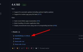 Here are the fixes for Open Shell Windows 11 not working issue
Apr 14, 2023 pm 02:07 PM
Open shell not running on Windows 11 is not a new problem and has been plaguing users since the advent of this new operating system. The cause of the Open-Shell Windows 11 not working issue is not specific. It can be caused by unexpected errors in programs, the presence of viruses or malware, or corrupted system files. For those who don’t know, Open-Shell is the replacement for Classic Shell, which was discontinued in 2017. You can check out our tutorial on how to install Classic Shell on Windows 11. How to replace Windows 11 Start menu
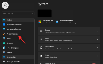 How to Remove Recommendations from the Start Menu in Windows 11
Apr 14, 2023 am 10:19 AM
How to remove suggestions from the Start menu in Windows 11 You can use native options in Windows 11 to remove suggestions from the Start menu. This will disable suggestions, but the section will still have its dedicated space in the Start menu. Alternatively, you can choose to disable individual recommendations from the Start menu to remove items you don't want recommended. Option 1: Disable recommendations You can use any of the following methods to disable recommendations in the Recommendations section of the Start menu. let's start. Method 1: Using the Settings app press Windows + i and click Personalize. Click Start. Turn off the toggle for the following items. Show recently added apps Show most commonly used apps in start and jump columns
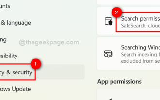 How to turn recent search history on or off in Windows 11
Apr 15, 2023 am 08:10 AM
Microsoft has added a recent search history feature that appears in the Start menu pane. The recent search history feature notifies users of what items have been recently accessed or searched for on their Windows system. Most users find it convenient because they don't have to remember or recall the files they were looking for recently. However, seeing it when opening the Start menu will irritate some of them. In this article, we will show you how to make it disappear from the Start Menu. If you are interested in learning more about how to disable it on your PC, read this article. How to turn on or off recent search history in Windows 11 Let us see how to disable recent search history on your system with the following simple steps. 1
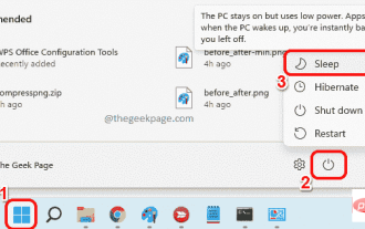 How to Put Your Windows 11 Computer to Sleep 8 Ways
May 09, 2023 am 10:31 AM
So you're dealing with something urgent and have all your windows open. Your laptop is running on battery power, you have to have lunch and it's late. Shutting down a system is a costly affair, consider closing any windows you have open. Leaving the system on until your lunch is gone will also drain your battery. Well, sleep mode is your answer. Sleep mode saves the machine's state to system RAM and then shuts down the machine. Even though the machine looks like it's completely shut down, it's still running, but in a very low-power mode. The moment you come back, your system will come back to life with all previously open windows and programs open. Yes, of course, this is one of the best things that windows has. In this article, we
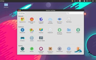 How to edit the start menu in Ubuntu? How to edit the start menu in Ubuntu
Jan 07, 2024 pm 03:26 PM
In the Windows system, users can easily edit the start menu and perform various operations. However, in the Ubuntu system, many users do not know much about it and are relatively unfamiliar with the method of editing the start menu. Therefore, the editor will introduce how to edit the start menu in Ubuntu. Let’s go and see it together! Method 1: Enter the command alacarte directly in the Ubuntu terminal. You can add, modify, hide, and display menus at will, but you cannot delete menus, even if you have root permissions. Method 2: Pay attention to several directories and files. desktop file/usr/share/applications/mime under /usr/share/applications/
 6 Best Apps to Customize Your Windows 11 PC
May 02, 2023 am 10:58 AM
There are many reasons to admire Windows 11. A redesigned taskbar, new Start menu, and revamped Settings app are just some of the improved elements to get you excited about. Like OliverTwist, you may want more and want to improve an already great product. In this article, we will explore some of the best Windows 11 apps to enhance your experience. We'll take a deep dive into the newly redesigned Microsoft Store and recommend some of our favorite apps for productivity, media playback, and more. We'll also explore some of the must-have Windows 11 apps on the internet. Can you customize Windows 11? LatestW


