

Analysis of CSS float and position

This article focuses on learning and understanding CSS floating float and positioning, and uses examples to help you master CSS floating float and positioning skills. Interested friends can refer to
1. Floating float
I. Definition and rules
float defaults to none, corresponding to the standard stream. When float: left;, the element will move closer to the left side of its parent element and break away from the standard flow. At the same time, the width will no longer stretch to fill the parent container, but will be determined based on its own content.
II. Demonstration rules
Preparation code
<html xmlns="http://www.w3.org/1999/xhtml">
<head>
<meta http-equiv="Content-Type" content="text/html; charset=utf-8" />
<title></title>
<style>
body
{
margin: 0;
padding: 0;
}
#father
{
background-color: cyan;
/*父级p 没有定位 造成子p的margin-top传递给父级*/
position: absolute;
}
#father *
{
margin: 10px;
padding: 10px;
border: 1px dashed red;
}
#son1
{
}
#son2
{
}
#son3
{
}
</style>
</head>
<body>
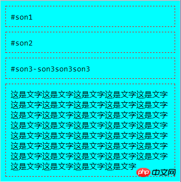
<p id="father">
<p id="son1">#son1</p>
<p id="son2">#son2</p>
<p id="son3">#son3-son3son3son3</p>
<p>
这是文字这是文字这是文字这是文字这是文字这是文字这是文字这是文字这是文字这是文字这是文字这是文字这是文字这是文字这是文字这是文字这是文字这是文字这是文字这是文字
</p>
</p>
</body>
</html>1. Add position:absolute to #father in the middle to eliminate the margin-top transfer problem of unpositioned parent p , the relevant content is as follows
Solution to the margin-top transfer problem in nested p
In these two browsers , there are two nested ps. If the padding value of the parent element of the outer p is 0, then the margin-top or margin-bottom value of the inner p will be "transferred" to the outer p.
<!DOCTYPE html PUBLIC "-//W3C//DTD XHTML 1.0 Transitional//EN" "http://www.w3.org/TR/xhtml1/DTD/xhtml1-transitional.dtd">
<html xmlns="http://www.w3.org/1999/xhtml">
<head>
<meta http-equiv="Content-Type" content="text/html; charset=utf-8" />
<title>无标题文档</title>
</head>

<body>
<p style="background-color:#FF0000;width:300px; height:100px">上部层</p>

<p style="background-color:#009900; width:300px; height:300px;overflow:hidden "> <!--父层-->
     <p style="margin:50px; background-color:#000000;width:200px; height:200px"">子层</p>
</p>

</body>
</html>Cause: The box does not obtain haslayout, causing margin-top to be invalid
Solution:
1. Add: overflow:hidden to the parent layer p;
2. Put margin -top outer margin is changed to padding-top inner margin;
3. The side where the parent element's margin overlaps has padding that is not 0 or a border whose width is not 0 and style is not none.
Add p to the parent layer: padding-top: 1px;
4. Let the parent element generate a block formatting context. The following attributes can be implemented
* float: left/right
* position: absolute
* display: inline-block/table-cell (or other table types)
* overflow: hidden/auto
Add parent layer p: position: absolute;
The display effect is
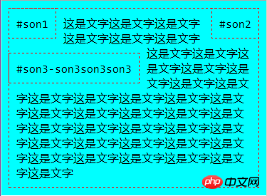
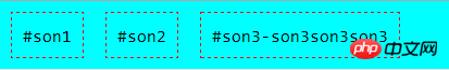
When the floats of 2, 1, and 2 are left and right respectively,
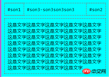
can be seen that 1 and 2 are out of standard stream, son3 in the standard stream is treated as if they do not exist, so son3 replaces the original position of son1, and the left border of son1, the right border of son2 coincide with the left and right borders of son3
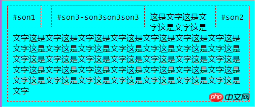
3. When 1,2,3 When all float left
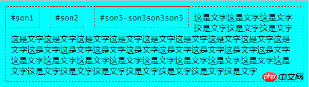
, the text surrounds the floated p
4, 1, 2 float left, 3 floats right, when the window width is reduced, 3 will be squeezed down
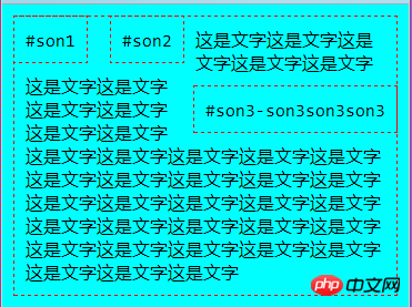
When 3 floats to the left and 2 floats to the right, it will be displayed as
when browsing When the width of the browser window is reduced, guess who will be squeezed out, son2?
The answer is still son3. The rule is: The last words written in the html file will be squeezed out. In the html file, son3 is after son2, so son3 is always squeezed first. Come down.
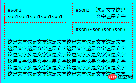
5. Increase the height of son1. When son3 is squeezed down, it will get stuck there
6. Delete the text in the box and float all three sub-p's to the left
Displayed as
The three child ps in the parent p are all out of the standard stream, and the parent p shrinks into a line. You can use clear to correct it
Add an empty p with margin-padding-border all 0 and clear both to support the parent p
III. clear clears the float
If the previous Elements with float:left will affect the following elements, such as p in the above example. Writing clear: left in the p element can eliminate the impact of the previous left floating element on this element. In the same way, clear:both clears both the left and right elements.
2. Position position
The position value is static absolute relative fixed
1. static
This is the default, that is, standard flow arrangement Next, it is the static positioning method.
2. fixed
It is fixed in the browser window. The [Back to Top] button in the forum is made of fixed
Practice making a return Play at the top
<p id="backToTop">
    回到顶部
</p>
#backToTop
{
    width: 100px;
    height: 50px;


    background-color: red;
    color: white;
    cursor: pointer;
    border-radius: 25px 0 0 25px;
    padding-left: 20px;


    text-align: center;
    line-height: 50px;

    position: fixed;
    bottombottom: 80px;
    rightright: 0;
}Display effect

3. Relative relative positioning
Relative to its own offset, and not deviating from the standard flow, use top/bottom left/right to specify the offset
4. Absolute positioning
Position based on other positioned elements, using absolute rules to break away from the standard flow
1), this other element:
The closest positioned ancestor element or browser Window, when the previous ancestor element cannot be found, the latter browser window will be used to position it.
2), Already positioned: means that the position has been set, and it is not static...that is, the position value is either static or already. If a positioned element is not set to position or is set to static, it is considered not to be positioned.
Trick
Only set position: absolute without setting the top/bottom/left/right value, then the element will remain in place , but it has been separated from the standard flow.
3. display
The display value has inline block none
Set it to none to hide it , such as inline-block and other newly added
. The above is the entire content of this article. I hope it will be helpful to everyone's learning. For more related content, please pay attention to the PHP Chinese website!
Related recommendations:
How to use css3 to set a list separation line without upper and lower edges
Text implemented using CSS3 Timing scroll up
About CSS to achieve beautiful drop-down navigation effect
##
The above is the detailed content of Analysis of CSS float and position. For more information, please follow other related articles on the PHP Chinese website!

Hot AI Tools

Undresser.AI Undress
AI-powered app for creating realistic nude photos

AI Clothes Remover
Online AI tool for removing clothes from photos.

Undress AI Tool
Undress images for free

Clothoff.io
AI clothes remover

Video Face Swap
Swap faces in any video effortlessly with our completely free AI face swap tool!

Hot Article
Hot Tools

Notepad++7.3.1
Easy-to-use and free code editor

SublimeText3 Chinese version
Chinese version, very easy to use

Zend Studio 13.0.1
Powerful PHP integrated development environment

Dreamweaver CS6
Visual web development tools

SublimeText3 Mac version
God-level code editing software (SublimeText3)
Hot Topics


 How to use bootstrap in vue
Apr 07, 2025 pm 11:33 PM
How to use bootstrap in vue
Apr 07, 2025 pm 11:33 PM
Using Bootstrap in Vue.js is divided into five steps: Install Bootstrap. Import Bootstrap in main.js. Use the Bootstrap component directly in the template. Optional: Custom style. Optional: Use plug-ins.
 The Roles of HTML, CSS, and JavaScript: Core Responsibilities
Apr 08, 2025 pm 07:05 PM
The Roles of HTML, CSS, and JavaScript: Core Responsibilities
Apr 08, 2025 pm 07:05 PM
HTML defines the web structure, CSS is responsible for style and layout, and JavaScript gives dynamic interaction. The three perform their duties in web development and jointly build a colorful website.
 Understanding HTML, CSS, and JavaScript: A Beginner's Guide
Apr 12, 2025 am 12:02 AM
Understanding HTML, CSS, and JavaScript: A Beginner's Guide
Apr 12, 2025 am 12:02 AM
WebdevelopmentreliesonHTML,CSS,andJavaScript:1)HTMLstructurescontent,2)CSSstylesit,and3)JavaScriptaddsinteractivity,formingthebasisofmodernwebexperiences.
 How to write split lines on bootstrap
Apr 07, 2025 pm 03:12 PM
How to write split lines on bootstrap
Apr 07, 2025 pm 03:12 PM
There are two ways to create a Bootstrap split line: using the tag, which creates a horizontal split line. Use the CSS border property to create custom style split lines.
 How to set up the framework for bootstrap
Apr 07, 2025 pm 03:27 PM
How to set up the framework for bootstrap
Apr 07, 2025 pm 03:27 PM
To set up the Bootstrap framework, you need to follow these steps: 1. Reference the Bootstrap file via CDN; 2. Download and host the file on your own server; 3. Include the Bootstrap file in HTML; 4. Compile Sass/Less as needed; 5. Import a custom file (optional). Once setup is complete, you can use Bootstrap's grid systems, components, and styles to create responsive websites and applications.
 How to insert pictures on bootstrap
Apr 07, 2025 pm 03:30 PM
How to insert pictures on bootstrap
Apr 07, 2025 pm 03:30 PM
There are several ways to insert images in Bootstrap: insert images directly, using the HTML img tag. With the Bootstrap image component, you can provide responsive images and more styles. Set the image size, use the img-fluid class to make the image adaptable. Set the border, using the img-bordered class. Set the rounded corners and use the img-rounded class. Set the shadow, use the shadow class. Resize and position the image, using CSS style. Using the background image, use the background-image CSS property.
 How to use bootstrap button
Apr 07, 2025 pm 03:09 PM
How to use bootstrap button
Apr 07, 2025 pm 03:09 PM
How to use the Bootstrap button? Introduce Bootstrap CSS to create button elements and add Bootstrap button class to add button text
 How to resize bootstrap
Apr 07, 2025 pm 03:18 PM
How to resize bootstrap
Apr 07, 2025 pm 03:18 PM
To adjust the size of elements in Bootstrap, you can use the dimension class, which includes: adjusting width: .col-, .w-, .mw-adjust height: .h-, .min-h-, .max-h-
