Two common functions of CSS3 rounded corners and gradients
This article mainly introduces relevant information on the detailed explanation of two commonly used functions of CSS3 rounded corners and gradients. Friends in need can refer to the following
Css3 rounded corners explanation: I believe everyone is familiar with pictures and background rounded corners. You are familiar with it,
Fillet syntax: border-radius: fillet value;
Advantages of CSS3 rounded corners
The traditional rounded corner generation scheme must use multiple pictures as background patterns. The emergence of CSS3 means that we no longer have to waste time creating these images, and there are many other advantages:
* Reduce the workload of maintenance. The work of generating, updating image files, and writing web page code is no longer necessary.
* Improve web page performance. Web pages will load faster because there are no more unnecessary HTTP requests.
* Increase visual reliability. Under certain circumstances (network congestion, server error, slow network speed, etc.), the background image may fail to download, resulting in poor visual effects. This doesn't happen with CSS3.
This value can be used: em, ex, pt, px, percentage;
Border-radius is similar to margin and padding
Border-radius: lefttop, righttop, rightbottom, leftbottom.
<p class="box1">
</p>
.box1{width:200px;height:100px;border-radius:30px 5px;background:#f66f17;margin-top:30px;}
<p class="box2"></p>
.box2{width:200px;height:100px;border-radius:30px 20px 10px 0px;background:#f66f17;margin-top:30px;}
##It should be very simple to understand the rounded corners.
For percentages: The safest approach at present is to set the style and width of each rounded border to the same value and avoid using percentage values.
IE9 and below do not support this attribute
Linear gradient: background: linear-gradient (set the gradient form, the first color starting point, the position of the middle color point, the end point color);
Linear: Type of gradient (linear gradient);
Form of gradient: There are two ways to select optional parameters - 1. Set the rotation angle, 0 degrees means horizontally from left to right, 90 degrees means from top to bottom, from 0 degrees Start transforming counterclockwise.
2. Use keywords, left means from left to right, top means from top to bottom, in the same way right means from right to left, lefttop means from sitting on top to bottom right, and in the same way leftbottom, righttop, rightbottom.
The middle color and middle color position are optional parameters.
But we need to consider browser compatibility, let’s write like this:
-webkit-gradient(linear,0 0,0 100%,from(start color,to(end color))); /*for Safari4, Chrome 2 */
-webkit-linear-gradient (start color, end color); /*for Safari 5.1, Chrome 10 */
-moz-linear-gradient (start color, end color); /*for firefox*/
-o-linear-gradient (start color, end color); /*Opera*/
linear-gradient (start color, end color); /*Standard properties*/
It’s a troublesome thing for IE, the old method
Filter:progid:DXImageTransform.Microsoft.gradient(startColorstr='Start Color',endColorstr=”End Color”); /*IE6,IE 7*/
-ms-linear-gradient (start color, end color); /*IE8*/
<p class="content1"></p>
.content1{width:500px;height:300px;border-radius:10%;background:#ade691;
background:-webkit-linear-gradient(left,#88cfc3,#329e8c 30%,#096e5d);background:-moz-linear-gradient(left,#88cfc3,#329e8c 30%,#096e5d);background:filter: progid:DXImageTransform.Microsoft.gradient(startColorstr='#88cfc3', endColorstr='#096e5d'); /* IE6,IE7 */-ms-filter: "progid:DXImageTransform.Microsoft.gradient(startColorstr='#88cfc3', endColorstr='#096e5d')";background:linear-gradient(lleft,#88cfc3,#329e8c 30%,#096e5d;float:left;}
.tit1{font-size:3em;font-weight: bold;color:#f00;}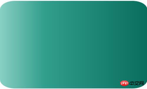
<p class="content2"></p>
.content2{width:500px;height:200px;
background-image: -webkit-repeating-linear-gradient(red,green 40px, orange 80px);
background-image: repeating-linear-gradient(red,green 40px, orange 80px);}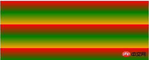
Radial gradient: radial-gradient (set the center of the gradient, gradient shape gradient size , starting color value, middle color value, middle color position, end color)
Gradient center, optional parameters, such as 30px 20px refers to 30px from the left and 20px from the top, which can be pixels, percentages, or Keyword, the default is the center position.
Gradient shape, optional parameter, can take the value circle or eclipse [default]
Gradient size, loopable parameter, can take the value
closest-side:
Specify the radius length of the radial gradient from the center of the circle to the side closest to the center
closest-corner:
Specify the radius length of the radial gradient from the center of the circle to the corner closest to the center
farthest-side:
Specify the radius length of the radial gradient from the center of the circle to the farthest corner from the center
farthest-corner:
Specify the radius length of the radial gradient from the center of the circle to the corner farthest from the center
contain :
Includes, specifying the radius length of the radial gradient from the center of the circle to the point closest to the center of the circle. Similar to closest-side
cover:
Cover, specifying the radius length of the radial gradient from the center of the circle to the point farthest from the center of the circle. Similar to farthest-corner
circle farthest-corner circular gradient, ellipse farthest-corner elliptical gradient
<p class="content3"></p>
.content3{width:500px;height:200px;
background-image: -webkit-radial-gradient(circle,hsla(120,70%,60%,.9),hsla(360,60%,60%,.9));
background-image: radial-gradient(circle,hsla(120,70%,60%,.9),hsla(360,60%,60%,.9));margin-top:20px;}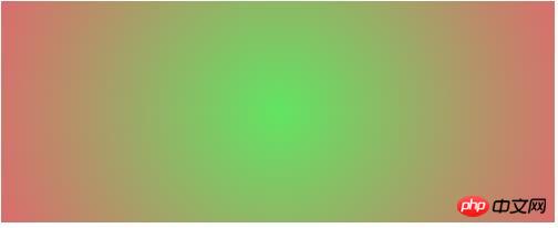
Using CSS3 to implement text scrolling upwards at regular intervals
Implementation of linear color gradient in CSS3
The above is the detailed content of Two common functions of CSS3 rounded corners and gradients. For more information, please follow other related articles on the PHP Chinese website!

Hot AI Tools

Undresser.AI Undress
AI-powered app for creating realistic nude photos

AI Clothes Remover
Online AI tool for removing clothes from photos.

Undress AI Tool
Undress images for free

Clothoff.io
AI clothes remover

Video Face Swap
Swap faces in any video effortlessly with our completely free AI face swap tool!

Hot Article

Hot Tools

Notepad++7.3.1
Easy-to-use and free code editor

SublimeText3 Chinese version
Chinese version, very easy to use

Zend Studio 13.0.1
Powerful PHP integrated development environment

Dreamweaver CS6
Visual web development tools

SublimeText3 Mac version
God-level code editing software (SublimeText3)

Hot Topics
 1653
1653
 14
14
 1413
1413
 52
52
 1305
1305
 25
25
 1251
1251
 29
29
 1224
1224
 24
24
 How to achieve wave effect with pure CSS3? (code example)
Jun 28, 2022 pm 01:39 PM
How to achieve wave effect with pure CSS3? This article will introduce to you how to use SVG and CSS animation to create wave effects. I hope it will be helpful to you!
 Use CSS skillfully to realize various strange-shaped buttons (with code)
Jul 19, 2022 am 11:28 AM
This article will show you how to use CSS to easily realize various weird-shaped buttons that appear frequently. I hope it will be helpful to you!
 Guide to modifying win11 window corners to rounded corners
Dec 31, 2023 pm 08:35 PM
After updating the win11 system, many friends found that the win11 interface window adopts a new rounded corner design. But some people don’t like this rounded corner design and want to modify it to the previous interface, but they don’t know how to modify it. Let’s take a look below. How to modify rounded corners in win11 1. The rounded corner design of win11 is a built-in system setting that cannot be modified at present. 2. So if you don’t like using the rounded corner design of win11, you can wait for Microsoft to provide a modification method. 3. If you are really not used to it, you can also choose to return to the previous win10 system. 4. If you don’t know how to roll back, you can check out the tutorials provided on this site. 5. If you cannot go back using the tutorial above, you can still
 How to hide elements in css without taking up space
Jun 01, 2022 pm 07:15 PM
Two methods: 1. Using the display attribute, just add the "display:none;" style to the element. 2. Use the position and top attributes to set the absolute positioning of the element to hide the element. Just add the "position:absolute;top:-9999px;" style to the element.
 How to implement lace borders in css3
Sep 16, 2022 pm 07:11 PM
In CSS, you can use the border-image attribute to achieve a lace border. The border-image attribute can use images to create borders, that is, add a background image to the border. You only need to specify the background image as a lace style; the syntax "border-image: url (image path) offsets the image border width inward. Whether outset is repeated;".
 How to enlarge the image by clicking the mouse in css3
Apr 25, 2022 pm 04:52 PM
Implementation method: 1. Use the ":active" selector to select the state of the mouse click on the picture; 2. Use the transform attribute and scale() function to achieve the picture magnification effect, the syntax "img:active {transform: scale(x-axis magnification, y Axis magnification);}".
 It turns out that text carousel and image carousel can also be realized using pure CSS!
Jun 10, 2022 pm 01:00 PM
How to create text carousel and image carousel? The first thing everyone thinks of is whether to use js. In fact, text carousel and image carousel can also be realized using pure CSS. Let’s take a look at the implementation method. I hope it will be helpful to everyone!
 How to set animation rotation speed in css3
Apr 28, 2022 pm 04:32 PM
In CSS3, you can use the "animation-timing-function" attribute to set the animation rotation speed. This attribute is used to specify how the animation will complete a cycle and set the speed curve of the animation. The syntax is "element {animation-timing-function: speed attribute value;}".


