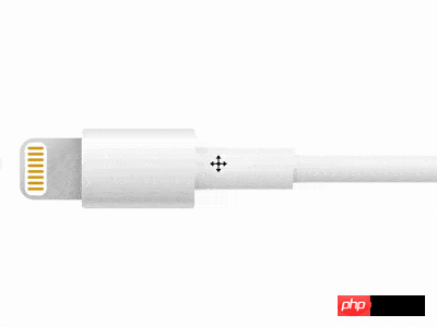

Press the "Click to Preview" button on the right to preview on the current page, and click on the link to preview in full screen.
https://codepen.io/comehope/pen/RBjdzZ
This video is interactive, you can pause the video at any time and edit the video code.
Please use chrome, safari, edge to open and watch.
https://scrimba.com/p/pEgDAM/cgkE6C6
Define dom, the container contains 2 elements, representing plugs and cables:
<p class="cable">
    <span class="head"></span>
    <span class="body"></span>
</p>Centered display:
body {
    margin: 0;
    height: 100vh;
    display: flex;
    align-items: center;
}Define container size:
.cable {
    display: flex;
    align-items: center;
    font-size: 10px;
    margin-left: 5em;
}Draw the outline of the plug:
.head {
    width: 8.5em;
    height: 8.5em;
    border-radius: 2em 0 0 2em;
}Draw the outline of the pins on the plug:
.head {
    position: relative;
}

.head::before {
    content: '';
    position: absolute;
    width: 3em;
    height: 7.3em;
    top: calc((8.5em - 7.3em) / 2);
    left: 0.7em;
    border-radius: 1em;
    box-sizing: border-box;
}Draw the outline of the hand-held part of the cable:
.body {
    width: 15.5em;
    height: 11em;
    border-radius: 0.5em;
}Draw the outline of the slightly thicker part of the cable:
.body {
    position: relative;
    display: flex;
    align-items: center;
}

.body::before {
    content: '';
    position: absolute;
    width: 13.5em;
    height: 6em;
    left: 15.5em;
}Draw the extension part of the cable:
.body::after {
    content: '';
    position: absolute;
    width: 100vh;
    height: 3.9em;
    left: calc(15.5em + 13.5em);
}Hide the parts outside the screen:
body {
    overflow: hidden;
}Next draw the details.
Paint the extension cord with gradient color:
.body::after {
    background:
        linear-gradient(
            white,
            hsl(0, 0%, 96%) 5%,
            hsl(0, 0%, 97%) 25%,
            hsl(0, 0%, 95%) 40%,
            hsl(0, 0%, 81%) 95%,
            white
        );
}Paint the thicker part of the cable with gradient color:
.body::before {
    background:
        linear-gradient(
            white,
            hsl(0, 0%, 96%) 5%,
            hsl(0, 0%, 98%) 20%,
            hsl(0, 0%, 95%) 50%,
            hsl(0, 0%, 81%) 95%,
            white
        );
}Paint the handheld part of the cable with gradient color:
.body {
    background:linear-gradient(
        hsl(0, 0%, 91%),
        white 15%,
        hsl(0, 0%, 93%) 50%,
        hsl(0, 0%, 87%) 70%,
        hsl(0, 0%, 79%) 90%,
        hsl(0, 0%, 84%),
        hsl(0, 0%, 86%)
    );
}Paint the plug with a gradient color:
.head {
    background:
        linear-gradient(
            -45deg,
            hsl(0, 0%, 75%),
            hsl(0, 0%, 79%),
            hsl(0, 0%, 78%),
            hsl(0, 0%, 87%) 80%
        );
}Draw the pins on the plug:
.head::before {
    background-color: white;
}

.head::after {
    content: '';
    position: absolute;
    box-sizing: border-box;
    width: 2.2em;
    height: 0.4em;
    color: goldenrod;
    background-color: currentColor;
    border-radius: 0.5em;
    left: 1.1em;
    top: 1.2em;
    box-shadow:
        0 0.8em 0,
        0 1.6em 0,
        0 2.4em 0,
        0 3.2em 0,
        0 4em 0,
        0 4.8em 0,
        0 5.6em 0;
} Next add a shadow to make the cable more three-dimensional.
Draw the shadow on the plug:
.head {
    background:
        linear-gradient(
            90deg,
            transparent 80%,
            rgba(0,0,0,12%)
        ),
        linear-gradient(
            -45deg,
            hsl(0, 0%, 75%),
            hsl(0, 0%, 79%),
            hsl(0, 0%, 78%),
            hsl(0, 0%, 87%) 80%
        );
}Draw the shadow on the handheld part of the cable:
.body::before {
    background:
        linear-gradient(
            45deg,
            rgba(0,0,0,4%) 10%,
            transparent 20%
        ),
        linear-gradient(
            90deg,
            rgba(0,0,0,4%),
            transparent 10%
        ),
        linear-gradient(
            white,
            hsl(0, 0%, 96%) 5%,
            hsl(0, 0%, 98%) 20%,
            hsl(0, 0%, 95%) 50%,
            hsl(0, 0%, 81%) 95%,
            white
        );
}Draw the shadow on the thicker part of the cable:
.body::after {
    background:
        linear-gradient(
            45deg,
            rgba(0,0,0,4%),
            transparent 4%
        ),
        linear-gradient(
            90deg,
            rgba(0,0,0,4%),
            transparent 2%
        ),
        linear-gradient(
            white,
            hsl(0, 0%, 96%) 5%,
            hsl(0, 0%, 97%) 25%,
            hsl(0, 0%, 95%) 40%,
            hsl(0, 0%, 81%) 95%,
            white
        );
}Finally, Add entrance animation to the screen
.cable {
    animation: show 5s linear infinite;
}

@keyframes show {
    0% {
        transform: translateX(100vw);
    }

    20%, 100% {
        transform: translateX(0);
    }
}You’re done!
Related articles:
Create a spindle divider using pure CSS3
How to create a simple five-pointed star graphic using pure CSS3
Related videos:
CSS animation practical skills video tutorial
The above is the detailed content of An example of how to create a lightning connection line using CSS language. For more information, please follow other related articles on the PHP Chinese website!


