This article introduces you to the flex layout to implement the layout of the NetEase Cloud player interface. It has certain reference value. Friends in need can refer to it. I hope it will be helpful to you.
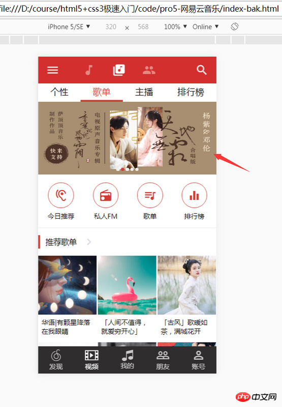
Today we will go into the details of the project and talk about the hurdles that every graphics cutter cannot get around. It is also a regular task that jser must face - "NetEase Cloud Music Highly Reusable Responsive Carousel Graphics" The realization of the carousel chart is as important as the preparation work for you to go to your girlfriend’s house for the first time and cannot be bypassed. Unfortunately, most people write carousel pictures as if they are meeting parents for the first time and have little experience. Many people want to write a set of carousels themselves, and then continue to improve them in their future work, and finally form their own plug-in library. Unfortunately, most people who have this idea only find out when they take action. To realize this is even harder than fulfilling the promise of "buying an apartment when you get married". In the end, I had no choice but to become a porter of plug-ins due to project pressure and my own skill level. But there are three problems with the plug-in porter. First of all, this thing is of no use to a person's technical growth. Secondly, and this is also the key point, the plug-in does not fully meet the project requirements, and I am not capable of secondary development. When encountering strange things The bug can only resign itself to its fate and continue on the slow journey of finding a more suitable plug-in. Finally, some plugins are heavy and bloated, but all you need is the most basic carousel functionality. Would you make dumplings just to have a plate of vinegar? I don't think so. Then why do you use hundreds of K or even M plug-ins in the project just to use a carousel? Many people may say that it’s because they don’t know how to write. Well, today we will implement one. You will find that the world of js is so simple and beautiful. With the effort of finding plug-ins, you can develop 8 A plug-in.
nbsp;html>
<meta>
<meta>
<meta>
<title>Document</title>
<style>
#p1 {
width: 100px;
height: 100px;
position: absolute;
left: 50px;
top: 50px;
background: red;
}
</style>
<script>
document.addEventListener("DOMContentLoaded", function () {
var op = document.getElementById('p1');
var disX = 0;
op.addEventListener("touchstart", function (e) {
var startPoint = e.changedTouches[0].pageX;
var startLeft = op.offsetLeft;
disX = startPoint - startLeft;
});
op.addEventListener("touchmove", doMove,false);
function doMove(e) {
 var currPoint = e.changedTouches[0].pageX;
 var newLeft  = currPoint - disX;
 op.style.left = newLeft +'px';
}
function doUp(e) {
var currPoint = e.changedTouches[0].pageX;
var newLeft = currPoint - disX;
op.style.left = newLeft +'px';
op.removeEventListener("touchmove", doUp,false);
op.removeEventListener("touchend", doUp,false);
}
op.addEventListener("touchend", doUp,false);
}, false);
</script>
<p></p>
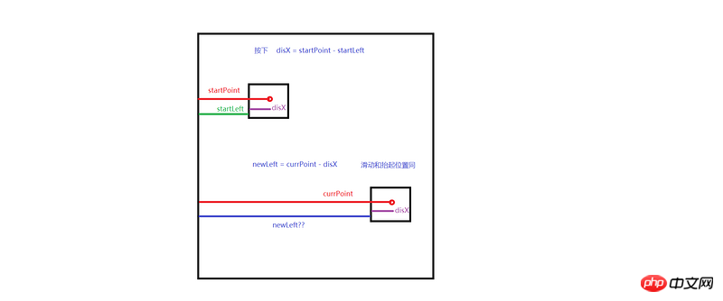
var currPoint = e.changedTouches[0].pageX; var newLeft = currPoint - disX; op.style.left = newLeft +'px';
What is this?
var currPoint = e.changedTouches[0].pageX;
var newLeft  = currPoint - disX;
op.style.left = newLeft +'px';
op.addEventListener("touchmove", doUp,false);
op.addEventListener("touchend", doUp,false);You can understand it at a glance.

nbsp;html>


    <meta>
    <meta>
    <style>
        * {
            margin: 0;
            padding: 0;
        }

        li {
            list-style: none;
        }

        .swiper-container {
            width: 320px;
            height: 130px;
            position: relative;
            margin: 20px auto;
            overflow: hidden;
        }

        .swiper-container .swiper-wrapper {
            width: 2240px;
            height: 130px;
            position: absolute;
            left: 0px;
        }

        .swiper-container .swiper-wrapper img {
            width: 320px;
            height: 130px;
            float: left;
            display: block;
        }

        .swiper-container ul {
            width: 35px;
            height: 4px;
            position: absolute;
            bottom: 10px;
            left: 50%;
            margin-left: -15px;
        }

        .swiper-container ul li {
            width: 4px;
            height: 4px;
            border-radius: 2px;
            border: 0.25px solid #fff;
            margin-left: 2.5px;
            background: #666;
            float: left;
            cursor: pointer;
        }

        .swiper-container ul .active {
            background: #fff;
        }

        .swiper-container ul li:hover {
            background: #fff;
        }
    </style>


    <p>
        </p><p>
            <img  src="/static/imghw/default1.png" data-src="images/4.jpg" class="lazy" alt="Flex layout implements the layout of NetEase Cloud player interface" >
            <img  src="/static/imghw/default1.png" data-src="images/0.jpg" class="lazy" alt="Flex layout implements the layout of NetEase Cloud player interface" >
            <img  src="/static/imghw/default1.png" data-src="images/1.jpg" class="lazy" alt="Flex layout implements the layout of NetEase Cloud player interface" >
            <img  src="/static/imghw/default1.png" data-src="images/2.jpg" class="lazy" alt="Flex layout implements the layout of NetEase Cloud player interface" >
            <img  src="/static/imghw/default1.png" data-src="images/3.jpg" class="lazy" alt="Flex layout implements the layout of NetEase Cloud player interface" >
            <img  src="/static/imghw/default1.png" data-src="images/4.jpg" class="lazy" alt="Flex layout implements the layout of NetEase Cloud player interface" >
            <img  src="/static/imghw/default1.png" data-src="images/0.jpg" class="lazy" alt="Flex layout implements the layout of NetEase Cloud player interface" >
        </p>

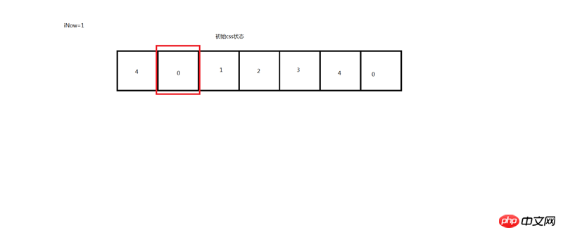
Don’t worry about anything else. The red box is the width of the mobile phone screen. It actually moves one grid each time. Then I only need to set an iNow value and record how many grids to move. As long as the iNow is correct, everything will be fine. I can just do it.
nbsp;html>


    <meta>
    <meta>
    <style>
        * {
            margin: 0;
            padding: 0;
        }

        li {
            list-style: none;
        }

        .swiper-container {
            width: 320px;
            height: 130px;
            position: relative;
            margin: 20px auto;
            overflow: hidden;
        }

        .swiper-container .swiper-wrapper {
            width: 2240px;
            height: 130px;
            position: absolute;
            left: 0px;
            transition: .3s all ease;

        }

        .swiper-container .swiper-wrapper img {
            width: 320px;
            height: 130px;
            float: left;
            display: block;
        }

        .swiper-container ul {
            width: 35px;
            height: 4px;
            position: absolute;
            bottom: 10px;
            left: 50%;
            margin-left: -15px;
        }

        .swiper-container ul li {
            width: 4px;
            height: 4px;
            border-radius: 2px;
            border: 0.25px solid #fff;
            margin-left: 2.5px;
            background: #666;
            float: left;
            cursor: pointer;
        }

        .swiper-container ul .active {
            background: #fff;
        }

        .swiper-container ul li:hover {
            background: #fff;
        }
    </style>


    <p>
        </p><p>
            <img  src="/static/imghw/default1.png" data-src="images/1.jpg" class="lazy" alt="Flex layout implements the layout of NetEase Cloud player interface" >
            <img  src="/static/imghw/default1.png" data-src="images/2.jpg" class="lazy" alt="Flex layout implements the layout of NetEase Cloud player interface" >
            <img  src="/static/imghw/default1.png" data-src="images/3.jpg" class="lazy" alt="Flex layout implements the layout of NetEase Cloud player interface" >
            <img  src="/static/imghw/default1.png" data-src="images/4.jpg" class="lazy" alt="Flex layout implements the layout of NetEase Cloud player interface" >
        </p>

) The so-called infinite carousel The principle of broadcasting is that when iNow is equal to the 0 on the far right, pull it back to the red box position. On the left is when iNow is equal to 4 on the far left, iNow is equal to 6.
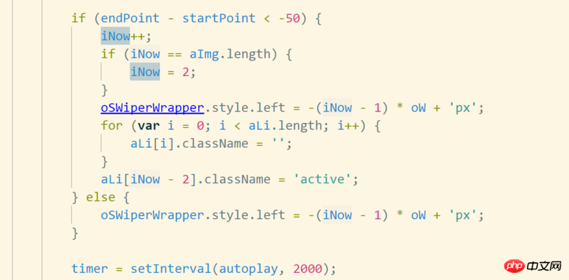
Many people have the source The code ignores the basic learning and is used directly. It is no different from directly looking for the plug-in, so just treat this as a small exercise. Four exercises:1. Implement corresponding adaptation to multiple screens2. Implement wireless carousel3. Implement if the sliding distance does not exceed 50px will not broadcast the next one4. Implement automatic rotation with timer!
Here I put the code on the left side of the above four practice solutions as a reminder, and everyone should try their best to learn to implement it.
Recommended related articles:
Detailed explanation of flex layout
##How to use flex layout to distribute columns
CSS3 flex layout application introduction_html/css_WEB-ITnose
The above is the detailed content of Flex layout implements the layout of NetEase Cloud player interface. For more information, please follow other related articles on the PHP Chinese website!


