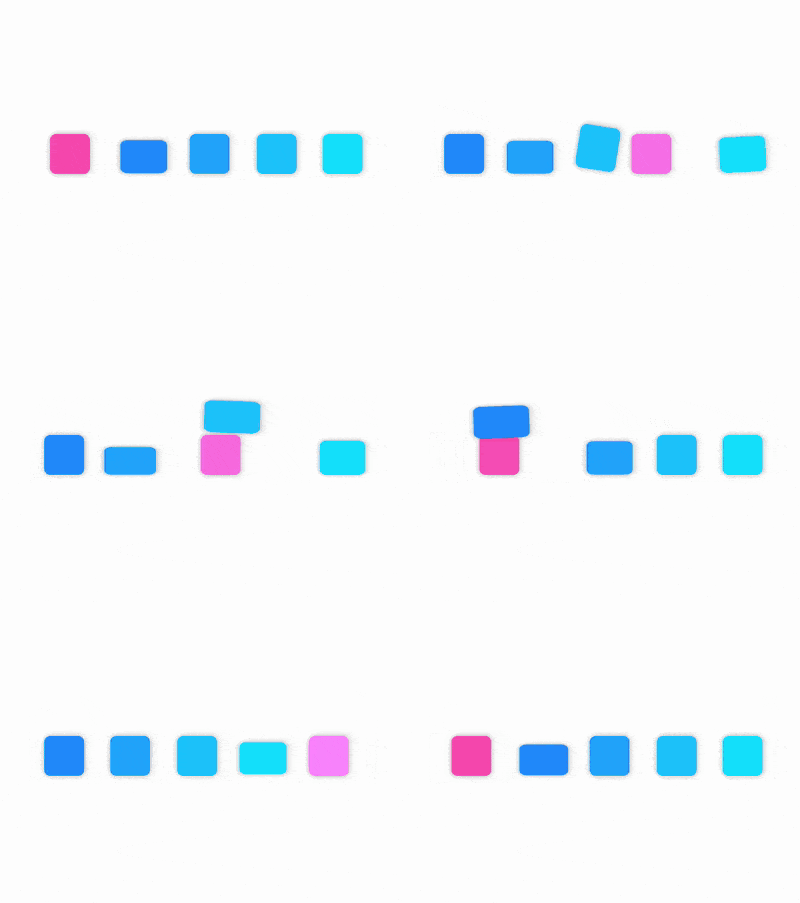
The content of this article is about how to use pure CSS to realize block jumping animation (source code attached). It has certain reference value. Friends in need can refer to it. I hope it will be helpful to you. help.

https://github.com/comehope/front- end-daily-challenges
Define dom, the container contains 2 sub-elements, representing 1 girl and a group of boys (4), eachspanElement represents 1 person (1 square):
<figure>
    <span></span>
    <p>
        <span></span>
        <span></span>
        <span></span>
        <span></span>
    </p>
</figure>
Centered display:
body {
    margin: 0;
    height: 100vh;
    display: flex;
    align-items: center;
    justify-content: center;
}Define container size and layout of its child elements:
.container {
    width: 8em;
    height: 1em;
    font-size: 35px;
    display: flex;
    justify-content: space-between;
}Draw 5 squares , use the border as an auxiliary line to help positioning:
.container span {
    width: 1em;
    height: 1em;
    border: 1px dashed black; /* 辅助线 */
}

.boys {
    width: 6em;
    display: flex;
    justify-content: space-between;
}Use pseudo elements to style the elements to make them softer, fill in different colors for boys and girls, and delete the auxiliary lines from the previous step:
.container span::before {
    content: '';
    position: absolute;
    width: inherit;
    height: inherit;
    border-radius: 15%;
    box-shadow: 0 0 0.2em rgba(0, 0, 0, 0.3);
}

.girl::before {
    background-color: hotpink;
}

.boys span::before {
    background-color: dodgerblue;
}Make the colors of the four boys’ color blocks gradually lighter and add a little layering:
.boys span:nth-child(1)::before {
    filter: brightness(1);
}

.boys span:nth-child(2)::before {
    filter: brightness(1.15);
}

.boys span:nth-child(3)::before {
    filter: brightness(1.3);
}

.boys span:nth-child(4)::before {
    filter: brightness(1.45);
}Next, create the animation effect.
First add the effect of the girl's movement, and also fade the color. The timing of other animations must be consistent, so set the animation duration as a variable:
.container span {
    width: 1em;
    height: 1em;
    --duration: 3s;
}

.girl {
    animation: slide var(--duration) ease-in-out infinite;
}

@keyframes slide {
    from {
        transform: translateX(0);
        filter: brightness(1);
    }

    to {
        transform: translatex(calc(8em - (1em * 1.25)));
        filter: brightness(1.45);
    }
}Then add the first one The animation effect of the boy jumping away. Note that the origin of the rotation from 15% to 35% is directly above the element:
.boys span {
    animation: var(--duration) ease-in-out infinite;
}

.boys span:nth-child(1) {
    animation-name: jump-off-1;
}

@keyframes jump-off-1 {
    0%, 15% {
        transform: rotate(0deg);
    }

    35%, 100% {
        transform-origin: -50% center;
        transform: rotate(-180deg);
    }
}Refer to the animation effect of the first boy, and add the animation of the other 3 boys jumping away. The difference is that the key frame time is adjusted and delayed by 15%:
.boys span:nth-child(2) {
    animation-name: jump-off-2;
}

.boys span:nth-child(3) {
    animation-name: jump-off-3;
}

.boys span:nth-child(4) {
    animation-name: jump-off-4;
}

@keyframes jump-off-2 {
    0%, 30% {
        transform: rotate(0deg);
    }

    50%, 100% {
        transform-origin: -50% center;
        transform: rotate(-180deg);
    }
}

@keyframes jump-off-3 {
    0%, 45% {
        transform: rotate(0deg);
    }

    65%, 100% {
        transform-origin: -50% center;
        transform: rotate(-180deg);
    }
}

@keyframes jump-off-4 {
    0%, 60% {
        transform: rotate(0deg);
    }

    80%, 100% {
        transform-origin: -50% center;
        transform: rotate(-180deg);
    }
} Adds an anthropomorphic animation effect to the first boy. This effect is written in ::before In the pseudo element, the animation process is from normal to squashed, then stretched, then squashed, and finally returned to normal. Pay attention to the squashed deformation from 25% to 40%, because the main element has been turned over at this time, so## The origin of #transform-origin is different from the origin of the squashing deformation from 5% to 15%:
.boys span::before {
    animation: var(--duration) ease-in-out infinite;
}

.boys span:nth-child(1)::before {
    filter: brightness(1);
    animation-name: jump-down-1;
}

@keyframes jump-down-1 {
    5% {
        transform: scale(1, 1);
    }

    15% {
        transform-origin: center bottom;
        transform: scale(1.3, 0.7);
    }

    20%, 25% {
        transform-origin: center bottom;
        transform: scale(0.8, 1.4);
    }

    40% {
        transform-origin: center top;
        transform: scale(1.3, 0.7);
    }

    55%, 100% {
        transform: scale(1, 1);
    }
}::before pseudo-element Effect, add another 3 anthropomorphic animation effects of boys, the only difference is that the time of the key frames is adjusted, and the time is delayed by 15%:
.boys span:nth-child(2)::before {
    animation-name: jump-down-2;
}

.boys span:nth-child(3)::before {
    animation-name: jump-down-3;
}

.boys span:nth-child(4)::before {
    animation-name: jump-down-4;
}

@keyframes jump-down-2 {
    20% {
        transform: scale(1, 1);
    }

    30% {
        transform-origin: center bottom;
        transform: scale(1.3, 0.7);
    }

    35%, 40% {
        transform-origin: center bottom;
        transform: scale(0.8, 1.4);
    }

    55% {
        transform-origin: center top;
        transform: scale(1.3, 0.7);
    }

    70%, 100% {
        transform: scale(1, 1);
    }
}

@keyframes jump-down-3 {
    35% {
        transform: scale(1, 1);
    }

    45% {
        transform-origin: center bottom;
        transform: scale(1.3, 0.7);
    }

    50%, 55% {
        transform-origin: center bottom;
        transform: scale(0.8, 1.4);
    }

    70% {
        transform-origin: center top;
        transform: scale(1.3, 0.7);
    }

    85%, 100% {
        transform: scale(1, 1);
    }
}

@keyframes jump-down-4 {
    50% {
        transform: scale(1, 1);
    }

    60% {
        transform-origin: center bottom;
        transform: scale(1.3, 0.7);
    }

    65%, 70% {
        transform-origin: center bottom;
        transform: scale(0.8, 1.4);
    }

    85% {
        transform-origin: center top;
        transform: scale(1.3, 0.7);
    }

    100%, 100% {
        transform: scale(1, 1);
    }
} Add
alternate parameters to all animation attributes so that all animations are executed back and forth to achieve the effect of returning from the right side to the left side:
.girl {
    animation: slide var(--duration) ease-in-out infinite alternate;
}

.boys span {
    animation: var(--duration) ease-in-out infinite alternate;
}

.boys span::before {
    animation: var(--duration) ease-in-out infinite alternate;
}How to use pure CSS to achieve the animation effect of a ring rotation illusion (source code attached)
How to use pure CSS CSS realizes the display frame effect of butterfly specimens
The above is the detailed content of How to use pure CSS to implement block jumping animation (source code attached). For more information, please follow other related articles on the PHP Chinese website!