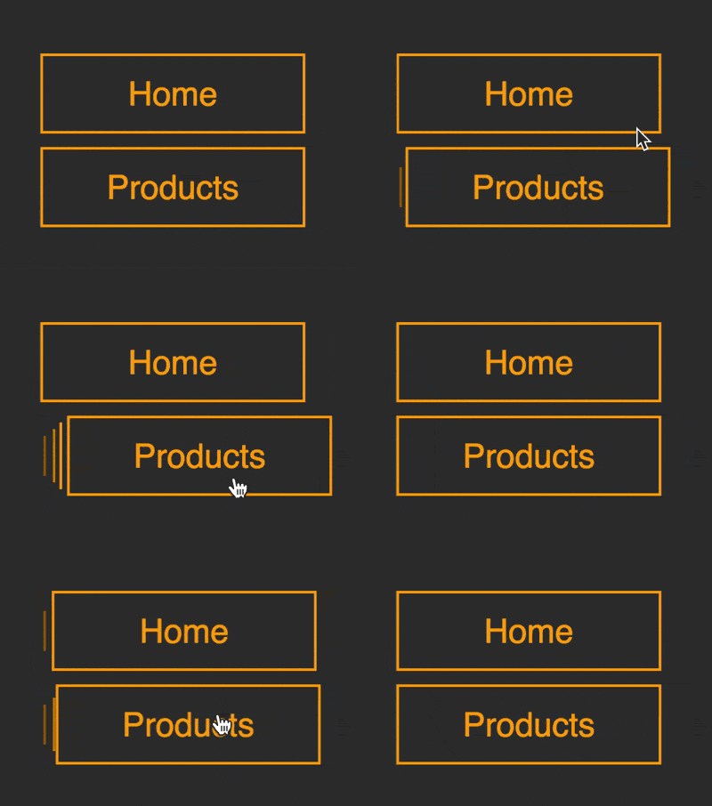
The content of this article is about how to use pure CSS to realize the button effect of moving right when hovering (source code attached). It has certain reference value. Friends in need can refer to it. I hope It will help you.

https://github.com/comehope/front- end-daily-challenges
Define dom, the navigation contains an unordered list, a span is embedded in the list item, and the text is written in span Center:
<nav>
    <ul>
        <li><span>home</span></li>
    </ul>
</nav>
Centered display:
body {
    margin: 0;
    height: 100vh;
    display: flex;
    align-items: center;
    justify-content: center;
    background-color: #333;
}Hide the guide symbol on the front end of the list item:
nav ul {
    padding: 0;
    list-style-type: none;
}Set the size and color of the button:
nav li {
    width: 8em;
    height: 2em;
    font-size: 25px;
    color: orange;
}Set text style, note that the height is 120%, span is higher than its parent's li:
nav li span {
    position: relative;
    box-sizing: border-box;
    width: inherit;
    height: 120%;
    top: -10%;
    background-color: #333;
    border: 2px solid;
    font-family: sans-serif;
    text-transform: capitalize;
    display: flex;
    align-items: center;
    justify-content: center;
}willspan Move the element slightly to the right:
nav li span {
    transform: translateX(4px);
} Use the left border of the list item li to draw a vertical line:
nav li {
    box-sizing: border-box;
    border-left: 2px solid;
}Use the left border of the list item The pseudo element draws two more vertical lines, and their heights are reduced in sequence. At this point, there are a total of three vertical lines on the left side of the button:
nav li {
    position: relative;
}

nav li::before,
nav li::after
 {
    content: '';
    position: absolute;
    width: inherit;
    border-left: 2px solid;
    z-index: -1;
}

nav li::before {
    height: 80%;
    top: 10%;
    left: -8px;
}

nav li::after {
    height: 60%;
    top: 20%;
    left: -14px;
}Gradually darken the color of the two vertical lines of the pseudo element and increase A little layering:
nav li::before {
    filter: brightness(0.8);
}

nav li::after {
    filter: brightness(0.6);
}Add the mouse hover effect. The default state is that the button covers 3 vertical lines. When the mouse is hovered, the button moves to the right, revealing 3 vertical lines:
nav li:hover span {
    transform: translateX(4px);
}

nav li span {
    /* transform: translateX(4px); */
    transform: translateX(-16px);
    transition: 0.3s;
}Because the default position of the button is to the left, in order to offset this offset, move the list items slightly to the right:
nav ul {
    transform: translateX(16px);
}Add a few more buttons to the dom:
<nav>
    <ul>
        <li><span>home</span></li>
        <li><span>products</span></li>
        <li><span>services</span></li>
        <li><span>contact</span></li>
    </ul>
</nav>
Set the spacing of the buttons:
nav li {
    margin-top: 0.8em;
}You’re done!
Related recommendations:
How to draw a beating heart using pure CSS? (Code example)
How to use CSS and GSAP to implement multiple keys Continuous animation of frames (source code attached)The above is the detailed content of How to use pure CSS to achieve the effect of moving the button to the right when hovering (source code attached). For more information, please follow other related articles on the PHP Chinese website!