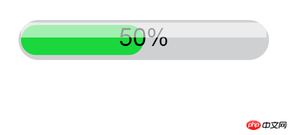
When playing music and videos, you can not only check the playback time directly, but also check the playback time by observing the progress bar. Observing the progress bar will tell the user more intuitively how long it will take to end, so the progress bar is A very useful special effect. This article introduces how to use css3 to achieve the progress bar effect, and focuses on the specific steps. The content of this article is compact, and I hope everyone can gain something.
Using css3 to realize the principle of bar progress bar effect
First use HTML to build the two required divs. Use position:absolute to overlap the two divs and distinguish different colors as required.
Use the keyframe attribute to move the overlapping progress bars, and then use animation for animation control. The syntax is @keyframes animationname {keyframes-selector {css-styles;}}
ps: If there are friends who do not know the above knowledge, please check the relevant articles on this site.
How to use css3 to realize the automatic carousel effect of images (complete code attached)
##Use css3 to realize the bar progress bar effect Code
<!DOCTYPE HTML PUBLIC "-//W3C//DTD HTML 4.01//EN" "http://www.w3.org/TR/html4/strict.dtd">
<html>
<head>
<title> new document </title>
<meta http-equiv="Content-Type" content="text/html; charset=utf-8"   />
<meta name="viewport" content="initial-scale=1">
<style>
.process-bar
{
    width:100px;
    display:inline-block;
    *zoom:1;
}
.pb-wrapper
{
    border:1px solid #cfd0d2;
    position:relative;
    background:#cfd0d2;
    border-radius: 8px;
}
.pb-container
{
    height:12px;
    position:relative;
    left:-1px;
    margin-right:-2px;
    font:1px/0 arial;
    padding:1px;
}
.pb-highlight
{
    position:absolute;
    left:0;
    top:0;
    _top:1px;
    width:100%;
    opacity:0.6;
    filter:alpha(opacity=60);
    height:6px;
    background:white;
    font-size:1px;
    line-height:0;
    z-index:1
}
.pb-text
{
    width:100%;
    position:absolute;
    left:0;
    top:0;
    text-align:center;
    font:10px/12px arial;
    color:black;
    font:10px/12px arial
}
</style>
</head>
<body>
    <div class="process-bar skin-green">
        <div class="pb-wrapper">
            <div class="pb-highlight"></div>
            <div class="pb-container">
                <div class="pb-text">50%</div>
                <div class="pb-value" style="height: 100%;width: 50%;background: #19d73d;border-radius: 8px;"></div>
            </div>
        </div>
    </div>
</body>
</html>The effect is as shown in the picture

The above is the detailed content of How to use css3 to achieve bar progress bar effect (complete code attached). For more information, please follow other related articles on the PHP Chinese website!