This article brings you an introduction to what Flex layout is? Flex layout related properties. It has certain reference value. Friends in need can refer to it. I hope it will be helpful to you.
Web page layout (layout) is a key application of CSS. The traditional layout method is float position display. It is very inconvenient for those special layouts. For example, vertical centering is not easy to achieve.
In 2009, W3C proposed a new solution - Flex layout, which can realize various page layouts simply, completely and responsively. Currently, it is supported by all browsers, which means it is now safe to use this feature.
Flex is the abbreviation of Flexible Box, which means "flexible layout" and is used to provide maximum flexibility for box-shaped models. Any container can be designated as a Flex layout. Note that after setting to Flex layout, the float, clear and vertical-align attributes of child elements will be invalid.
display: flex; //块元素
display: inline-flex; //行内元素
Elements that adopt Flex layout are called Flex containers (flex containers), or "containers" for short. All its child elements automatically become container members, called Flex items (flex items), or "items" for short.
Containers have two axes by default: the horizontal main axis (main axis) and the vertical cross axis (cross axis). The starting position of the main axis (the intersection with the border) is called main start, and the ending position is called main end; the starting position of the cross axis is called cross start, and the ending position is called cross end.
Items are arranged along the main axis by default. The main axis space occupied by a single item is called main size, and the cross axis space occupied by a single item is called cross size.
The flex-direction property determines the direction of the main axis (that is, the arrangement direction of items). <span class="token property">flex-direction<span class="token punctuation">: column-reverse | column | row | row-reverse<span class="token punctuation">; (flex-direction<span class="token punctuation">:</span>row is not written by default)</span></span> </span>

flex-wrap attribute definition, if one axis cannot be arranged, usage:
flex-wrap: nowrap | wrap | wrap-reverse;
nowrap (default): no line wrapping
wrap: Wrap, with the first line at the top.
wrap-reverse: Wrap, the first line is below.
The flex-flow property is the abbreviation of the flex-direction property and the flex-wrap property. The default value is row nowrap.
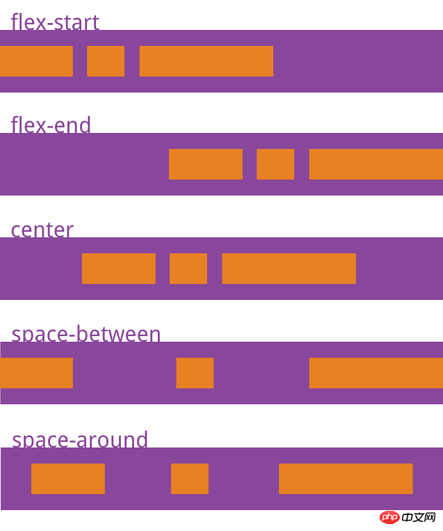
justify-content property defines the alignment of the item on the main axis.
Usage:
justify-content: flex-start | flex-end | center | space-between | space-around;

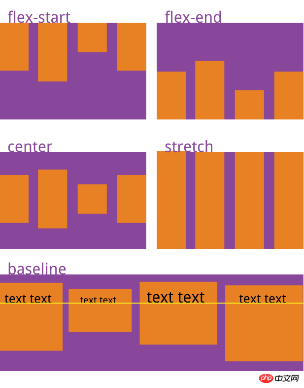
align-items: flex-start | flex-end | center | baseline | stretch;

Usage:
align-content: flex-start | flex-end | center | space-between | space-around | stretch;

1, order property
2, flex-grow property
3, flex-shrink attribute
4, flex-basis attribute
5, flex attribute
6. align-self attribute
order attribute: Define the order of items. The smaller the value, the higher the ranking. The default is 0.
flex-grow attribute: Defines the magnification ratio of the item, the default is 0, that is, if there is remaining space, it will not be enlarged.
flex-shrink attribute: Defines the shrinkage ratio of the item, the default is 1, that is, if there is insufficient space, the item will shrink.
flex-basis property: Defines the main axis space (main size) occupied by the item before allocating excess space. The browser uses this attribute to calculate whether there is extra space on the main axis. Its default value is auto, which is the original size of the project.
flex attribute: It is the abbreviation of flex-grow, flex-shrink and flex-basis. The default value is 0 1 auto. The last two properties are optional.
align-self attribute: allows a single item to have a different alignment than other items, and can override the align-items attribute. The default value is auto, which means inheriting the align-items attribute of the parent element. If there is no parent element, it is equivalent to stretch.
The above is the detailed content of What is Flex layout? Flex layout related properties. For more information, please follow other related articles on the PHP Chinese website!