Theperspective attribute is used to define the distance of the 3D element from the view, in pixels; it allows you to change the 3D element's view of the 3D element.

CSS3 perspective attribute
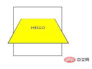
Function: perspective attribute defines 3D element distance The distance of the view, in pixels. This property allows you to change the 3D element's view of the 3D element. When you define the perspective attribute for an element, its child elements get the perspective effect, not the element itself.
Note: perspective attribute only affects 3D transformation elements.
Syntax:
perspective: number|none;
number: The distance of the element from the view, in pixels.
none: Default value. Same as 0. No perspective is set.
Note: This attribute should be used together with the perspective-origin attribute, so that the bottom position of the 3D element can be changed.
Example of using CSS3 perspective attribute
<!DOCTYPE html>
<html>
<head>
<style>
#div1
{
position: relative;
height: 150px;
width: 150px;
margin: 50px;
padding:10px;
border: 1px solid black;
perspective:150;
-webkit-perspective:150; /* Safari and Chrome */
}
#div2
{
padding:50px;
position: absolute;
border: 1px solid black;
background-color: yellow;
transform: rotateX(45deg);
-webkit-transform: rotateX(45deg); /* Safari and Chrome */
}
</style>
</head>
<body>
<div id="div1">
<div id="div2">HELLO</div>
</div>
</body>
</html>Rendering:

The above is the entire content of this article, I hope it will be helpful to everyone's study. For more exciting content, you can pay attention to the relevant tutorial columns of the PHP Chinese website! ! !
The above is the detailed content of How to use perspective attribute. For more information, please follow other related articles on the PHP Chinese website!
 css3 tutorial
 What are the css3 gradient properties?
 Interview assessment tools
 Detailed explanation of nginx configuration
 Regular expression tool
 How to solve the problem that suddenly all folders cannot be opened in win10
 What are the data analysis methods?
 How to check deleted call records
 How to use mysql workbench