【Recommended Tutorial: CSS Video Tutorial】
Responsive Web Design is designed to work for a variety of devices (from Desktop monitors to mobile phones) provide the best browsing experience. This article has compiled some of the best HTML and CSS frameworks for responsive web design. These frameworks are open source and free.
Comparing responsive web frameworks is not that easy. Some frameworks are suitable for designing faster and more streamlined websites with certain features, while others may provide a lot of features, plug-ins and add-ons, but may be bulky and difficult to get started.
1. Bootstrap
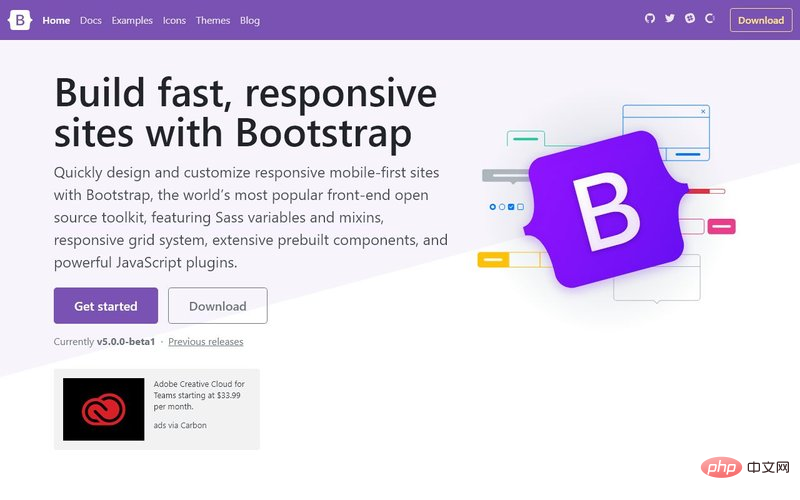
Bootstrap is the most popular HTML, CSS and JS framework , for developing responsive, mobile-first projects on the web. Bootstrap makes front-end development faster and easier. They provide extensive documentation, examples, and demos to help you get started with responsive web development quickly. Some major changes were made in Bootstrap 5, such as the liberal use of jQuery and the addition of RTL support, coupled with ready-made components and tool classes, making Bootstrap one of the best choices for web developers.
You can also find many free premium bootstrap templates and UI kits, which make your development process easier.
Official website: https://getbootstrap.com/
2. Tailwind CSS
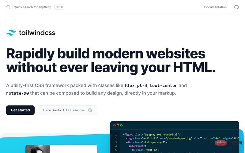
Tailwind provides a modern, utility-based approach to building responsive sites. It has tons of utility classes to build modern websites without writing CSS. What makes it different from other frameworks is that you need to use development settings to reduce the size of the final CSS, because if you use the default values, you will end up with a large CSS file. Tailwind can quickly add styles to HTML elements and provides a large number of design styles out of the box. There are tons of Tailwind CSS resources here https://superdevresources.com/best-tailwind-css-resources-for-developers/.
Official website: https://tailwindcss.com/
3. Tachyons
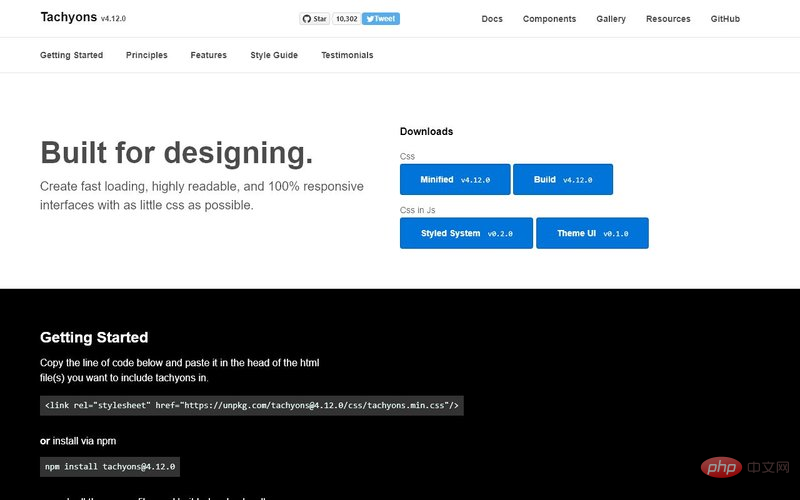
Tachyons is also a utility-based CSS library that provides many complex features out of the box without having to write a lot of CSS yourself. The benefit of this is that Tachyons' out-of-the-box styling is lightweight and requires no additional setup. There are still ways to reduce the size if needed. If you need an easy-to-use utility library, this should be a good choice.
Official website: https://tachyons.io/
4. Foundation
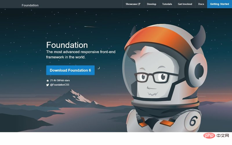
Foundation is an adaptive front-end framework produced by product design company ZURB. This framework is the result of their experience building web products and services since 1998. Foundation is the most advanced responsive front-end framework and offers many customization features.
Official website: http://foundation.zurb.com/
5. Material Design for Bootstrap (MDB)
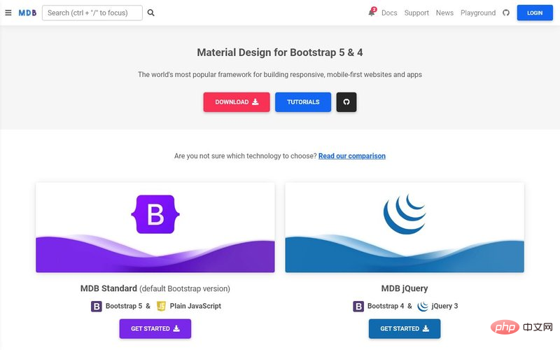
MDB is built on Bootstrap and provides a Material Design look and feel out of the box. It has an excellent CSS library and is compatible with most popular JavaScript frameworks like jQuery, Angular, React, and Vue.js. Its core library is completely free to use.
Official website: https://mdbootstrap.com/
6. 15 Great HTML and CSS Frameworks for Responsive Web Design
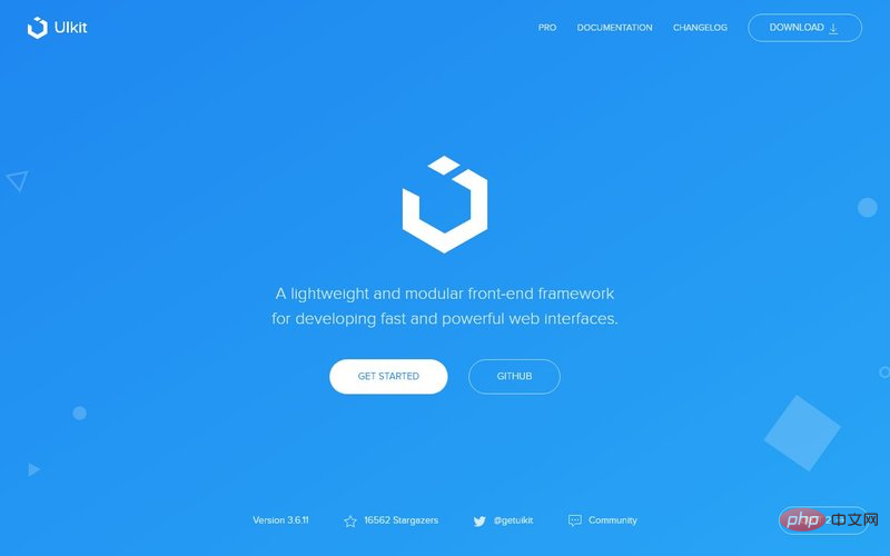
15 Great HTML and CSS Frameworks for Responsive Web Design is a lightweight modular front-end framework for developing fast and powerful web interfaces. 15 Great HTML and CSS Frameworks for Responsive Web Design provides a comprehensive collection of HTML, CSS, and JS components that are easy to use, customize, and extend. 15 Great HTML and CSS Frameworks for Responsive Web Design takes a mobile-first approach to deliver a consistent experience from phone to tablet to desktop.
Official website: http://getuikit.com/
7. 15 Great HTML and CSS Frameworks for Responsive Web Design CSS
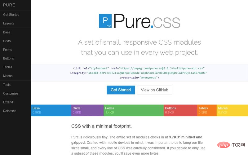
15 Great HTML and CSS Frameworks for Responsive Web Design.css is a set of small responsive CSS modules that can be used in any web project. The 15 Great HTML and CSS Frameworks for Responsive Web Design's small size is simply too small. For example, the minimum compressed version of the complete clock module is only 4.0 KB. 15 Great HTML and CSS Frameworks for Responsive Web Design is built on Normalize.css and provides native HTML elements as well as layout and styling for the most common UI components. 15 Great HTML and CSS Frameworks for Responsive Web Design is responsive out of the box, so elements look great on all screen sizes.
Official website: http://purecss.io/
8. Material Design Lite Framework (MDL)
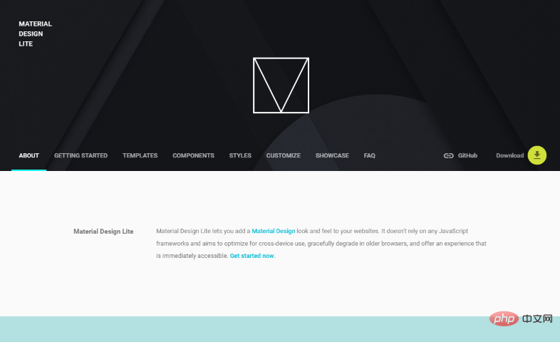
Google’s Material Design Lite framework is one of the most popular CSS frameworks for adding a Material Design look to your website. It doesn't rely on any JavaScript framework, works across devices, and can be downgraded for older browsers. It's built with accessibility in mind and comes with rich documentation and starter templates.
Official website: https://getmdl.io/
9. Materialize

Materialize is a modern responsive front-end framework based on Material Design. Google Material Design is a popular design trend involving cards, shadows, and animations.
Official website: http://15 Great HTML and CSS Frameworks for Responsive Web Designcss.com/
10. 15 Great HTML and CSS Frameworks for Responsive Web Design
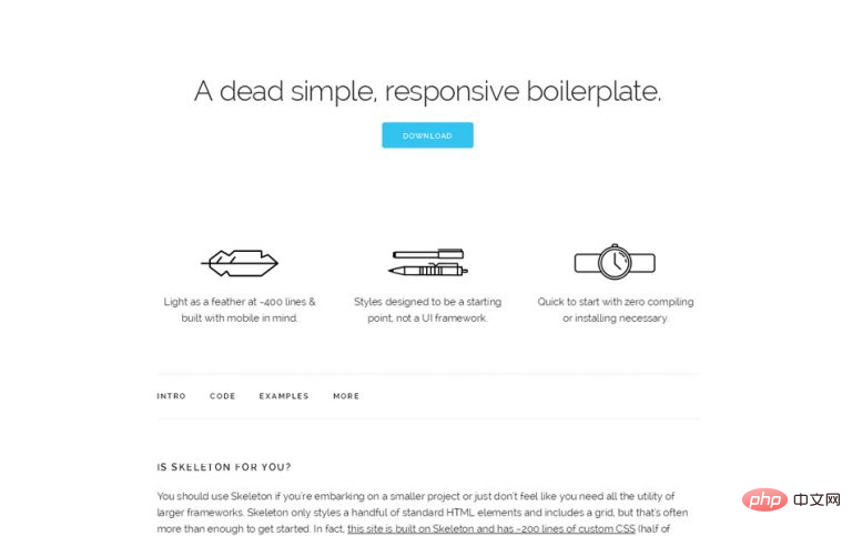
If you're developing smaller projects, or just don't feel you need all the utilities of a larger framework, you can try 15 Great HTML and CSS Frameworks for Responsive Web Design. 15 Great HTML and CSS Frameworks for Responsive Web Design styles only a few standard HTML elements and contains a grid.
The grid in 15 Great HTML and CSS Frameworks for Responsive Web Design is a 12-column fluid grid with a maximum width of 960px that shrinks as the browser or device shrinks. The maximum width can be changed with a single line of CSS and all columns will be resized accordingly. Its syntax is simple, making responsive coding easier.
Official website: http://getskeleton.com/
11. Bulma
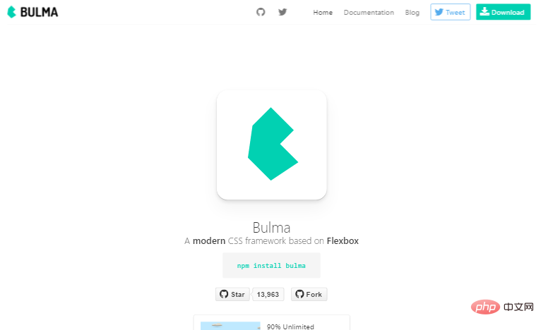
##Bulma is a modern CSS framework based on flexbox. It offers responsive design and mobile-first UI components, and has a modular structure that lets you import only what you want to include in your web design. Bulma also provides a modern grid system based on flexbox.
Official website: http://bulma.io/
12. Semantic UI
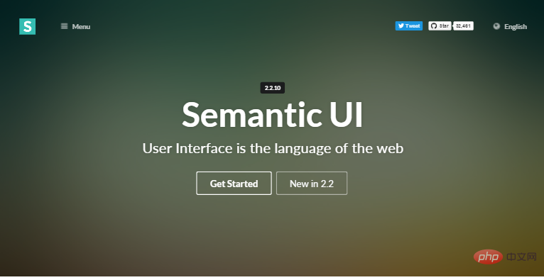
Semantic UI is an advanced CSS framework that provides 50+ UI elements, 300+ CSS variables for customization, and is built with EM values for responsive design. It's also Flexbox ready.
Semantic is a CSS framework that can be used in production environments and can be integrated with frameworks such as React, Angular, Meteor, and Ember. You can organize the UI layer and application logic together by integrating with these frameworks.
Official website: https://semantic-ui.com/
13. Milligram
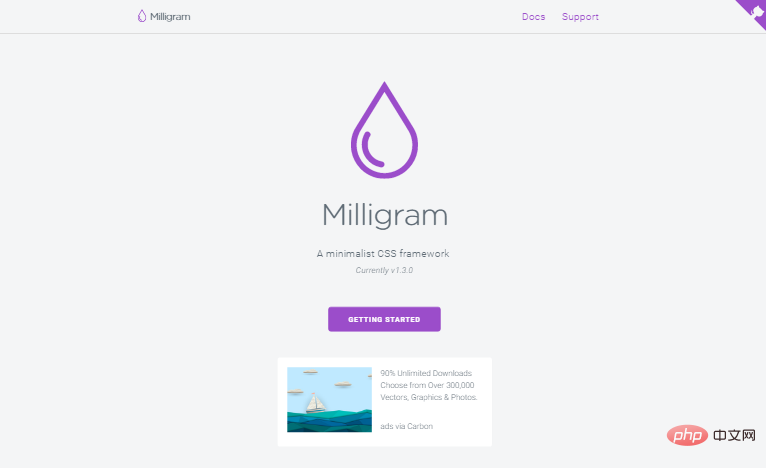
Milligram is a minimalist CSS framework that does not rely on JavaScript. It is used to create responsive websites quickly and cleanly with minimal styling. It also provides a flexbox based grid system.
Official website: https://milligram.github.io/
14. Spectre.css
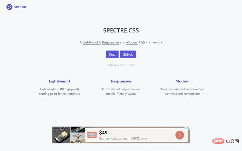
Spectre.css is a lightweight library that provides flexbox-based responsive and mobile-friendly layouts out of the box. You can add styling and responsive utilities on top of it to suit your needs.
Official website: https://picturepan2.github.io/spectre/
15. Base CSS Framework
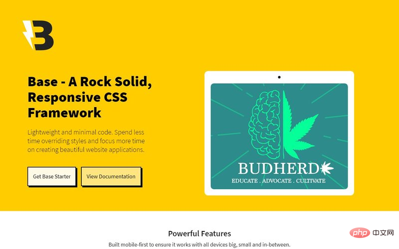
Base is also a lightweight CSS framework that can be used to build responsive websites. It offers free basic starter software as well as many paid ready-made templates for website projects.
Official website: https://getbase.org/
If you compare these frameworks, you will find that the popularity of Bootstrap, Tailwind and Foundation is far ahead of other frameworks.
Design agencies often choose Bootstrap because it provides out-of-the-box components and is easy to customize. This is why there are so many Bootstrap themes and libraries.
For more programming-related knowledge, please visit: Programming Video! !
The above is the detailed content of 15 Great HTML and CSS Frameworks for Responsive Web Design. For more information, please follow other related articles on the PHP Chinese website!


![[Web front-end] Node.js quick start](https://img.php.cn/upload/course/000/000/067/662b5d34ba7c0227.png)


