 Web Front-end
 CSS Tutorial
 Teach you how to use css3 to add gradient effects to images (detailed code explanation)
Teach you how to use css3 to add gradient effects to images (detailed code explanation)
In the previous article "Teach you step by step how to use CSS3 to achieve animation effects (code sharing)", I will introduce to you how to use CSS3 animation effect setting experience. The following article will introduce to you how to use css3 to add gradient effects to images. Let’s take a look.

The first time I came into contact with css3 gradient was a long time ago. I thought this thing was very interesting. It is like playing PS and you can make many gorgeous things.
Browser support
| IE | FF | Chrome | Safari | Opera | iOS | Android | Android Chrome |
|---|---|---|---|---|---|---|---|
| 6-9(no) | 2-3.5(no) | 4-9(part-webkit-) | 3.1-3.2(no) | - | 3.2-4.3(Part) | 2.1-3.0(-webkit-) | 10-25(-webkit-) |
| 10 | 3.6-15(-webkit-) | 10-25(-webkit-) | 4-5(part)5-6.1(-webkit-) | - | 5 | 4-4.3(-webkit-) | 26 |
| - | 15 | 25 | 5-6 | 15 | - | 4.4 | - |
linear-gradient linear-gradient
Use syntax
linear-gradient([ [ [| to [top | bottom] || [left | right] ],]?[,]+);
The following codes can be run, and the execution results are the same
linear-gradient(#fff, #333);
linear-gradient(to bottom, #fff, #333);
linear-gradient(to top, #333, #fff);
linear-gradient(180deg, #fff, #333);
linear-gradient(to bottom, #fff 0%, #333 100%);
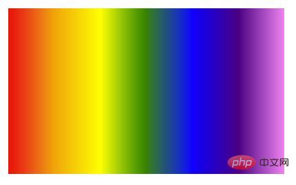
You can define the angle, starting direction, color, and color proportion
demo
<div style="width: 200px; height: 200px;"></div>
<style>
  div {
    background: linear-gradient(
      to right,
      red,
      orange,
      yellow,
      green,
      blue,
      indigo,
      violet
    );
  }
</style>
<div class="g"></div>
<style>
  .g {
    background: repeating-linear-gradient(
      -45deg,
      transprent,
      transprent 25px,
      #fff 25px,
      #fff50px
    );
  }
</style>
Use syntax
radial-gradient( [ circle ||][ at]? , | [ ellipse || [|]{2}][ at]? , | [ [ circle | ellipse ] ||][ at]? , | at,[ ,]+ )radial-gradient(circle, #f00, #ff0, #080); radial-gradient(circle at center, #f00, #ff0, #080); radial-gradient(circle at 50%, #f00, #ff0, #080); radial-gradient(circle farthest-corner, #f00, #ff0, #080);
You can quickly locate the position of the shape through length closest-side The edge shape of the gradient and the container are closest to the gradient center point is tangent to one side (circle) or at least to the vertical and horizontal sides closest to the center point of the gradient (ellipse).
closest-corner The edge shape of the gradient intersects the corner of the container closest to the center point of the gradient. farthest-side The opposite of closest-side, the edge shape is tangent to the side of the container farthest from the center point of the gradient (or the furthest vertical and horizontal sides). farthest-corner The edge shape of the gradient intersects the corner of the container farthest from the center point of the gradient.You can use at to quickly determine the position of the center of the circlecircle at left topThe center of the circle is in the upper left corner
- circle at right top circle center at the upper right corner
- circle at left bottom circle center at the lower left corner
- circle at right bottom The center of the circle is in the lower right corner ##circle at center | at 50% The center of the circle is in the middle
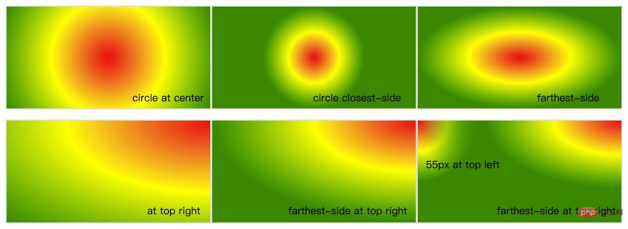
- Code example
<style>
  div {
    width: 200px;
    height: 100px;
    margin-top: 10px;
    border: 1px solid #ddd;
  }
  .g1 {
    background: radial-gradient(circle at center, #f00, #ff0, #080);
  }
  .g2 {
    background: radial-gradient(circle closest-side, #f00, #ff0, #080);
  }
  .g3 {
    background: radial-gradient(farthest-side, #f00 20%, #ff0 50%, #080 80%);
  }
  .g4 {
    background: radial-gradient(at top right, #f00, #ff0, #080);
  }
  .g5 {
    background: radial-gradient(farthest-side at top right, #f00, #ff0, #080);
  }
  .g6 {
    background: radial-gradient(
        farthest-side at top right,
        #f00,
        #ff0,
        #080,
        transparent
      ), radial-gradient(60px at top left, #f00, #ff0, #080);
  }
</style>
<div class="g1"></div>
<div class="g2"></div>
<div class="g3"></div>
<div class="g4"></div>
<div class="g5"></div>
<div class="g6"></div>Get the following
 Filled radial gradient repeating-radial-gradient
This is similar to repeating-linear-gradient, which is to fill in the gradient.
Code example
<style>
  div {
    width: 200px;
    height: 100px;
    border: 1px solid #ddd;
    float: left;
    margin: 10px;
  }
  .g1 {
    background: repeating-radial-gradient(circle, #f00 0, #ff0 10%, #f00 15%);
  }
  .g2 {
    background: repeating-radial-gradient(
      at top left,
      #f00,
      #ff0 10%,
      #080 15%,
      #ff0 20%,
      #f00 25%
    );
  }
  .g3 {
    background: repeating-radial-gradient(
      circle closest-corner at 20px 50px,
      #f00,
      #ff0 10%,
      #080 20%,
      #ff0 30%,
      #f00 40%
    );
  }
</style>

<div class="g1"></div>
<div class="g2"></div>
<div class="g3"></div>Get the following
 You can use gradients to create many effects
Code example
<style>
  @keyframes up {
    0% {
      top: 100%;
    }
    100% {
      top: -100px;
    }
  }
  .blister {
    position: absolute;
    width: 80px;
    height: 80px;
    display: block;
    border-radius: 50%;
    // left: 300px;
    overflow: hidden;
    animation: up 20s linear infinite;
    bottom: -100%;
    background: rgba(255, 255, 255, 0.1);
    cursor: pointer;
    &:hover {
      animation-play-state: paused;
    }
    &::before {
      content: "";
      left: 0;
      top: 0;
      height: 100%;
      width: 100%;
      box-shadow: 0 0 20px #fff inset;
      position: absolute;
      border-radius: 50%;
    }
    .light {
      border-radius: 50%;
      width: 75px;
      height: 54px;
      transform: rotate(140deg);
      top: -24px;
      position: absolute;
      left: -18px;
      display: block;
      background: radial-gradient(farthest-side, #fff, rgba(255, 255, 255, 0));
    }
    .light2 {
      width: 24px;
      height: 15px;
      position: absolute;
      bottom: 9px;
      right: 15px;
      transform: rotate(-25deg);
      border-radius: 50%;
      display: block;
      background: radial-gradient(farthest-side, #fff, rgba(255, 255, 255, 0));
    }
  }
</style><span class="blister"> <span class="light"></span> <span class="light2"></span> </span>
As shown below, you can make a beautiful bubble
 and then use the animation from the previous article to make it move.
Click here to see the effect https://k-ui.cn The animation is delayed and will take a while to appear.
Recommended learning:
CSS3 video tutorialThe above is the detailed content of Teach you how to use css3 to add gradient effects to images (detailed code explanation). For more information, please follow other related articles on the PHP Chinese website!

Hot AI Tools

Undresser.AI Undress
AI-powered app for creating realistic nude photos

AI Clothes Remover
Online AI tool for removing clothes from photos.

Undress AI Tool
Undress images for free

Clothoff.io
AI clothes remover

Video Face Swap
Swap faces in any video effortlessly with our completely free AI face swap tool!

Hot Article

Hot Tools

Notepad++7.3.1
Easy-to-use and free code editor

SublimeText3 Chinese version
Chinese version, very easy to use

Zend Studio 13.0.1
Powerful PHP integrated development environment

Dreamweaver CS6
Visual web development tools

SublimeText3 Mac version
God-level code editing software (SublimeText3)

Hot Topics
 1653
1653
 14
14
 1413
1413
 52
52
 1306
1306
 25
25
 1251
1251
 29
29
 1224
1224
 24
24
 Table Border in HTML
Sep 04, 2024 pm 04:49 PM
Guide to Table Border in HTML. Here we discuss multiple ways for defining table-border with examples of the Table Border in HTML.
 Nested Table in HTML
Sep 04, 2024 pm 04:49 PM
This is a guide to Nested Table in HTML. Here we discuss how to create a table within the table along with the respective examples.
 HTML margin-left
Sep 04, 2024 pm 04:48 PM
Guide to HTML margin-left. Here we discuss a brief overview on HTML margin-left and its Examples along with its Code Implementation.
 HTML Table Layout
Sep 04, 2024 pm 04:54 PM
Guide to HTML Table Layout. Here we discuss the Values of HTML Table Layout along with the examples and outputs n detail.
 HTML Input Placeholder
Sep 04, 2024 pm 04:54 PM
Guide to HTML Input Placeholder. Here we discuss the Examples of HTML Input Placeholder along with the codes and outputs.
 HTML Ordered List
Sep 04, 2024 pm 04:43 PM
Guide to the HTML Ordered List. Here we also discuss introduction of HTML Ordered list and types along with their example respectively
 HTML onclick Button
Sep 04, 2024 pm 04:49 PM
Guide to HTML onclick Button. Here we discuss their introduction, working, examples and onclick Event in various events respectively.
 Moving Text in HTML
Sep 04, 2024 pm 04:45 PM
Guide to Moving Text in HTML. Here we discuss an introduction, how marquee tag work with syntax and examples to implement.


