 Web Front-end
 CSS Tutorial
 Teach you step by step how to use css3 to create a cool navigation bar effect (detailed code explanation)
Teach you step by step how to use css3 to create a cool navigation bar effect (detailed code explanation)
In the previous article "Teach you to use css3 to add three-dimensional effects to fonts (with code)", I introduced how to use css3 to add three-dimensional effects to fonts. The following article will introduce to you how to use CSS3 to create a cool navigation bar effect. Let’s see how to do it together.

The cool navigation bar effect is as follows

CSS3 to create a cool navigation bar effect Method
1. Create a new html file. First write the div tag and enter <ul></ul> to call this style item, which is the style defined in the CSS of your website. You can edit the content inside, class is a class selector, and you can control the font color in the web page purely statically.
Code example
<div>
<ul>
    <li><a href="#">首页</a></li>
<li><a href="#">图片</a></li>
<li><a href="#">视频</a></li>
<li><a href="#">地图</a></li>
<li><a href="#">游戏</a></li>
<li><a href="#">关于</a></li>
</ul>
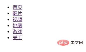
</div>Code effect

2. To set the navigation bar special effects css global setting, add it between the head tags. style css=”text/cssString code and then write the outer margin, inner margin, paragraph setting font in the style tag, heightdefine the height as 2000px.
Code example
body{
margin: 0px;
padding: 0px;
font-family: sans-serif;
height: 2000px;

}3. Next, add a background to the navigation bar and enter the background color, height and width settings innav.
Code example
.nav{
width: 100%;
height: 100px;
background-color: red;
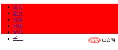
}Code effect

4. Next, fix the navigation bar to the top of the page.
Code example
.item{
position: fixed;
top:50px;
right:100px;
margin: 0;
padding: 0;
display: flex;Code effect

5. The image is set as a list item mark in the list.
Code example
.item li{
list-style: none;}6. Then add relative positioning, outer margins, inner margins, convert characters to uppercase, color, thickness, underlinedefine a line under the text.
Code example
.item li a{
position: relative;
display: block;
padding: 10px 20px;
margin: 20px 0;
text-decoration: none;
text-transform: uppercase;/*将字符转为大写*/
color: #262626;
font-weight: bold;
/* transition: 0.5s; */}7. Use hover mouse pointer floating style
}
.item li a:hover{
color:#fff;
}Code effect

8. Add edge settings to the navigation bar , use the transition attribute to set the time of the transition effect, use transgorm to lengthen the border twice, and then use opacitythe margin is not displayed.
Code example
.item li a:before{

content:'';
position: absolute;
top: 0;
left: 0;
width: 100%;
height: 100%;
border-top:1px solid #000;
border-bottom:1px solid #000;
transform: scaleY(2);/*拉长边框两倍*/
opacity: 0;/*边距不显示*/
transition: 0.5s;
z-index: -1;
}
.item li a:hover:before{
transform: scaleY(1);/*拉长边框两倍*/
opacity:1;

}
.item li a:after{
content:'';
position: absolute;
top: 1px;
left: 0;
width: 100%;
height: 100%;
background: #000;
transform: scale(0);
transition: 0.5s;
z-index: -1;9. The last setting, hoverMouse over and change the color to black to add rotation and scaling.
Code example
.item li a:hover:after{
transform: scale(1);}ok , html css editing code is completed.
Recommended learning: CSS3 video tutorial
The above is the detailed content of Teach you step by step how to use css3 to create a cool navigation bar effect (detailed code explanation). For more information, please follow other related articles on the PHP Chinese website!

Hot AI Tools

Undresser.AI Undress
AI-powered app for creating realistic nude photos

AI Clothes Remover
Online AI tool for removing clothes from photos.

Undress AI Tool
Undress images for free

Clothoff.io
AI clothes remover

Video Face Swap
Swap faces in any video effortlessly with our completely free AI face swap tool!

Hot Article

Hot Tools

Notepad++7.3.1
Easy-to-use and free code editor

SublimeText3 Chinese version
Chinese version, very easy to use

Zend Studio 13.0.1
Powerful PHP integrated development environment

Dreamweaver CS6
Visual web development tools

SublimeText3 Mac version
God-level code editing software (SublimeText3)

Hot Topics
 1653
1653
 14
14
 1413
1413
 52
52
 1306
1306
 25
25
 1251
1251
 29
29
 1224
1224
 24
24
 Table Border in HTML
Sep 04, 2024 pm 04:49 PM
Guide to Table Border in HTML. Here we discuss multiple ways for defining table-border with examples of the Table Border in HTML.
 Nested Table in HTML
Sep 04, 2024 pm 04:49 PM
This is a guide to Nested Table in HTML. Here we discuss how to create a table within the table along with the respective examples.
 HTML margin-left
Sep 04, 2024 pm 04:48 PM
Guide to HTML margin-left. Here we discuss a brief overview on HTML margin-left and its Examples along with its Code Implementation.
 HTML Table Layout
Sep 04, 2024 pm 04:54 PM
Guide to HTML Table Layout. Here we discuss the Values of HTML Table Layout along with the examples and outputs n detail.
 HTML Input Placeholder
Sep 04, 2024 pm 04:54 PM
Guide to HTML Input Placeholder. Here we discuss the Examples of HTML Input Placeholder along with the codes and outputs.
 HTML Ordered List
Sep 04, 2024 pm 04:43 PM
Guide to the HTML Ordered List. Here we also discuss introduction of HTML Ordered list and types along with their example respectively
 HTML onclick Button
Sep 04, 2024 pm 04:49 PM
Guide to HTML onclick Button. Here we discuss their introduction, working, examples and onclick Event in various events respectively.
 Moving Text in HTML
Sep 04, 2024 pm 04:45 PM
Guide to Moving Text in HTML. Here we discuss an introduction, how marquee tag work with syntax and examples to implement.


