How to create a 3D shuttle effect? Implement an accelerated animation effect? The following article will introduce to you how to use pure CSS to easily do it! I hope to be helpful!

I habitually log in to Apex at home on weekends and prepare to play a few games. During the process of logging in to the accelerator, I found that the accelerator had expired.
I have been using Tencent Online Game Accelerator, but when I clicked the recharge button, it prompted that the client had recently been upgraded and recharge was not supported for the time being (this operation shocked me~). You can only turn around and download NetEase UU Accelerator.
When you open the UU Accelerator homepage, you will see this picture:

In an instant, you are attracted by its background image.
Out of sensitivity to CSS, I blindly guessed that this would be implemented using CSS, at least it should be Canvas. Open the console, a little disappointed, it is actually a .mp4 file:
)
Look at the Network panel again, this .mp4 The file actually needs 3.5M?
)
emm, I don’t want to play games anymore. Can’t CSS handle such a background image??
Use CSS 3D to realize the interstellar 3D shuttle effect
Suppose we have such a graphic:
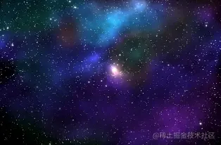
This picture will be kept for later use . Before using this picture, we will first draw such a graph:
<div class="g-container">
  <div class="g-group">
      <div class="item item-right"></div>
      <div class="item item-left"></div>
      <div class="item item-top"></div>
      <div class="item item-bottom"></div>
      <div class="item item-middle"></div>
  </div>
</div>
Copy after login
body {
  background: #000;
}
.g-container {
  position: relative;
}
.g-group {
  position: absolute;
  width: 100px;
  height: 100px;
  left: -50px;
  top: -50px;
  transform-style: preserve-3d;
}
.item {
  position: absolute;
  width: 100%;
  height: 100%;
  background: rgba(255, 255, 255, .5);
}
.item-right {
  background: red;
  transform: rotateY(90deg) translateZ(50px);
}
.item-left {
  background: green;
  transform: rotateY(-90deg) translateZ(50px);
}
.item-top {
  background: blue;
  transform: rotateX(90deg) translateZ(50px);
}
.item-bottom {
  background: deeppink;
  transform: rotateX(-90deg) translateZ(50px);
}
.item-middle {
  background: rgba(255, 255, 255, 0.5);
  transform: rotateX(180deg) translateZ(50px);
}
Copy after login
A total of 5 sub-elements are set, but if you look carefully at the CSS code, 4 of them are set to rotateX/Y(90deg /-90deg), that is, rotated 90° around the X-axis or Y-axis, it is visually a plane vertical to the screen, so visually we cannot see it and can only see one plane.item-middle.
I set different background colors for the five sub-items, and the results are as follows:
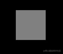
Now it seems that it is ordinary, and it is indeed.
However, the time has come to witness the miracle. At this time, we set a very small perspective to the parent element .g-container, for example, set a perspective: 4px, look at the effect:
.g-container {
  position: relative;
+ perspective: 4px;
}
// ...其余样式保持不变
Copy after login
At this time, the painting style suddenly changed, and the entire effect became like this:
)
Since perspective takes effect, the original plane effect becomes a 3D effect. Next, we use the starry sky image prepared above, replace the background color above, and replace everything with the same image. Something magical happens:
)
Due to the settings The perspective is very low, and the transform: translateZ(50px) of each item is set relatively large, so the image is visually stretched very much. But the whole thing fills the entire screen.
Next, we only need to make the perspective move, add an animation to the parent element, and change it by controlling the translateZ() of the parent element:
.g-container{
  position: relative;
  perspective: 4px;
  perspective-origin: 50% 50%;
}

.g-group{
  position: absolute;
  // ... 一些定位高宽代码
  transform-style: preserve-3d;
  + animation: move 8s infinite linear;
}

@keyframes move {
  0%{
    transform: translateZ(-50px) rotate(0deg);
  }
  100%{
    transform: translateZ(50px) rotate(0deg);
  }
}
Copy after login
Look, the magical and wonderful starry sky shuttle effect is coming out, Amazing:
)
The only shortcoming is that the animation cannot be infinitely connected, and there are big differences between the beginning and the end. The problem.
Of course, this does not trouble us, we can:
By superimposing two groups of the same effect, one group is more negative than the other group through negative animation -delay Advance the animation in advance to connect the two groups of animations (when one group ends, the other group is still moving)
Then hide it by changing the transparency item-middle The sudden feeling flying towards you
Finally, you can control the color change of the image through the filter of the parent elementhue-rotate
We try to modify the HTML structure as follows:
<div class="g-container">
  <div class="g-group">
      <div class="item item-right"></div>
      <div class="item item-left"></div>
      <div class="item item-top"></div>
      <div class="item item-bottom"></div>
      <div class="item item-middle"></div>
  </div>
  <!-- 增加一组动画 -->
  <div class="g-group">
      <div class="item item-right"></div>
      <div class="item item-left"></div>
      <div class="item item-top"></div>
      <div class="item item-bottom"></div>
      <div class="item item-middle"></div>
  </div>
</div>
Copy after login
The modified core CSS is as follows:
.g-container{
  perspective: 4px;
  position: relative;
  // hue-rotate 变化动画,可以让图片颜色一直变换
  animation: hueRotate 21s infinite linear;
}

.g-group{
  transform-style: preserve-3d;
  animation: move 12s infinite linear;
}
// 设置负的 animation-delay,让第二组动画提前进行
.g-group:nth-child(2){
  animation: move 12s infinite linear;
  animation-delay: -6s;
}
.item {
  background: url(https://z3.ax1x.com/2021/08/20/fLwuMd.jpg);
  background-size: cover;
  opacity: 1;
  // 子元素的透明度变化,减少动画衔接时候的突兀感
  animation: fade 12s infinite linear;
  animation-delay: 0;
}
.g-group:nth-child(2) .item {
  animation-delay: -6s;
}
@keyframes move {
  0%{
    transform: translateZ(-500px) rotate(0deg);
  }
  100%{
    transform: translateZ(500px) rotate(0deg);
  }
}
@keyframes fade {
  0%{
    opacity: 0;
  }
  25%,
  60%{
    opacity: 1;
  }
  100%{
    opacity: 0;
  }
}
@keyframes hueRotate {
  0% {
    filter: hue-rotate(0);
  }
  100% {
    filter: hue-rotate(360deg);
  }
}
Copy after login
The final complete effect is as follows, the effect of starry sky shuttle, the entire The animation is connected end to end and can continue indefinitely with almost no flaws. It is very praiseworthy:
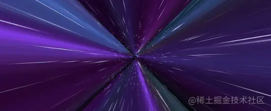
For the complete code above, you can click here: CSS inspiration-- 3D universe time travel effect
https://csscoco.com/inspiration/#/./3d/3d-css-galaxy-shuttle
这样,我们就基本还原了上述见到的网易 UU 加速器首页的动图背景。
更进一步,一个图片我都不想用
当然,这里还是会有读者吐槽,你这里不也用了一张图片资源么?没有那张星空图行不行?这张图我也懒得去找。
当然可以,CSS YYDS。这里我们尝试使用 box-shadow,去替换实际的星空图,也是在一个 div 标签内实现,借助了 SASS 的循环函数:
<div></div>
Copy after login
@function randomNum($max, $min: 0, $u: 1) {
	@return ($min + random($max)) * $u;
}

@function randomColor() {
    @return rgb(randomNum(255), randomNum(255), randomNum(255));
}

@function shadowSet($maxWidth, $maxHeight, $count) {
    $shadow : 0 0 0 0 randomColor();

    @for $i from 0 through $count {
        $x: #{random(10000) / 10000 * $maxWidth};
        $y: #{random(10000) / 10000 * $maxHeight};


        $shadow: $shadow, #{$x} #{$y} 0 #{random(5)}px randomColor();
    }

    @return $shadow;
}

body {
    background: #000;
}

div {
    width: 1px;
    height: 1px;
    border-radius: 50%;
    box-shadow: shadowSet(100vw, 100vh, 500);
}
Copy after login
这里,我们用 SASS 封装了一个函数,利用多重 box-shadow 的特性,在传入的大小的高宽内,生成传入个数的点。
这样,我们可以得到这样一幅图,用于替换实际的星空图:
)
我们再把上述这个图,替换实际的星空图,主要是替换 .item 这个 class,只列出修改的部分:
// 原 CSS,使用了一张星空图
.item {
  position: absolute;
  width: 100%;
  height: 100%;
  background: url(https://z3.ax1x.com/2021/08/20/fLwuMd.jpg);
  background-size: cover;
  animation: fade 12s infinite linear;
}

// 修改后的 CSS 代码
.item {
  position: absolute;
  width: 100%;
  height: 100%;
  background: #000;
  animation: fade 12s infinite linear;
}
.item::after {
  content: "";
  position: absolute;
  top: 0;
  left: 0;
  right: 0;
  bottom: 0;
  width: 1px;
  height: 1px;
  border-radius: 50%;
  box-shadow: shadowSet(100vw, 100vh, 500);
}
Copy after login
这样,我们就实现了这样一个效果,在不借助额外资源的情况下,使用纯 CSS 实现上述效果:

CodePen Demo -- Pure CSS Galaxy Shuttle 2:
https://codepen.io/Chokcoco/pen/NWvYOqW
通过调整动画的时间,perspective 的值,每组元素的 translateZ() 变化距离,可以得到各种不一样的观感和效果,感兴趣的读者可以基于我上述给的 DEMO 自己尝试尝试。
最后
好了,本文到此结束,希望本文对你有所帮助 :)
(学习视频分享:web前端教程)
The above is the detailed content of Create a 3D shuttle effect using pure CSS (code attached). For more information, please follow other related articles on the PHP Chinese website!


)
)


)
)
)

)


![[Web front-end] Node.js quick start](https://img.php.cn/upload/course/000/000/067/662b5d34ba7c0227.png)


